
International logo contest/Final logo variants: Difference between revisions
KRS~metawiki (talk | contribs) No edit summary |
KRS~metawiki (talk | contribs) No edit summary |
||
| Line 194: | Line 194: | ||
* Better than original logo: [[User:Tillwe|Tillwe]] |
* Better than original logo: [[User:Tillwe|Tillwe]] |
||
* About as bad/good as current logo: [[User:Eloquence|—Eloquence]] |
* About as bad/good as current logo: [[User:Eloquence|—Eloquence]], [[User:KRS|KRS]] |
||
* Worse than original logo: [[User:Fruggo|Fruggo]] |
* Worse than original logo: [[User:Fruggo|Fruggo]] |
||
Revision as of 18:18, 4 October 2003
This final logo variants is to formalize the process of selecting user-created variants of the winning PM logo, for use on all language Wikipedias. Separate development of rasterized text for each language should be done at Wikipedia raster name. (rasterized is important so that people without fonts for all the types can still import text for their logo variants.
- Note: This process is ongoing, with no set deadline. The logo ratification process is parallel and distinct from this one--This process is only concerned with making the winning logo better-- and most widely acceptable.
technical
- See PM logo for details about how Paul made his original logo.
Please remember:
- filesize.
- how will is scale?
- how will it look in greyscale?
- avoid including the text "wikipedia"
For runner up variants, see secondary logo variants
Revisions of original
![]()
![]()

![]()
Discussion moved to Final logo variants/Paullusmagnus
Third-party variants
Dgrant's variant
This logo just uses white instead of grey on the uncoloured pieces. Many have complained that the logo is too dark. It doesn't go well with the very white look of the english wiki site. Actually transparent would be the best way to do it, then it would go well any site.
The logo on the right has the Kallo blue instead of black (I did this really quiclky so it looks rather shoddy). Dgrant 20:55, 29 Sep 2003 (UTC)
|
|
|
Gutza's variant
![]()
- Better than original logo: Diftong (de)
- About as bad/good as current logo: —Eloquence, JDG, Stevertigo, Tillwe, KRS
- Worse than original logo: Fruggo

- Better than original logo: —Eloquence, KRS(except that the colours need some changing), Karl Stas, Fruggo
- About as bad/good as current logo:
- Worse than original logo: JDG, Diftong (de), Stevertigo, Tillwe

- Better than original logo: KRS (except that the colours need some changing), Tillwe (except that the concept is much better than the actual way it is done with all that white spots etc. ;-))
- About as bad/good as current logo: Fruggo
- Worse than original logo: —Eloquence, JDG, Diftong (de), Stevertigo
Discussion moved to Final logo variants/Gutza
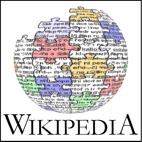
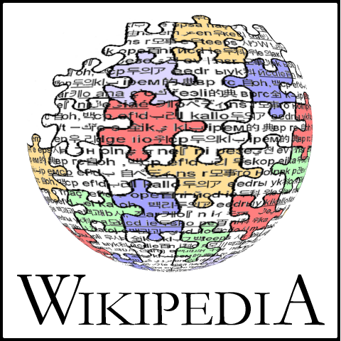
Nohat's variant
![]()
- Better than original logo: —Eloquence (much), Nohat (I like all my logos :-), MH (beautiful and doesn't dominate the page as much as the color logos do), User:anthere, Menchi, JDG, Diftong (de), Head, Maveric149 (me like), Angela, KRS(surface a bit too shiny, more improved in other versions), Dysprosia (different caption font?), Tillwe
- About as bad/good as current logo:
- Worse than original logo: Fruggo
![]()
- Better than original logo: —Eloquence (much), Nohat, JDG, Diftong (de), Angela,KRS, Karl Stas
- About as bad/good as current logo: Tillwe
- Worse than original logo: Fruggo
![]()
- Better than original logo: Nohat, Robert Lee, Menchi, JDG, Diftong (de), Tillwe, Fruggo
- About as bad/good as current logo: —Eloquence
- Worse than original logo:
![]()
- Better than original logo: Nohat, Menchi, JDG , Diftong (de), —Eloquence, Angela,KRS
- About as bad/good as current logo: Tillwe
- Worse than original logo: Fruggo
![]()
- Better than original logo: Nohat, Robert Lee (my fav so far, superb), grin (I like that one), Menchi, JDG, Diftong (de), Fantasy (wow),KRS( could be a good option if the colours and surface treatment are rethought), Tillwe
- About as bad/good as current logo: —Eloquence,
- Worse than original logo: Fruggo

- Better than original logo: Nohat, Hemmer, Angela
- About as bad/good as current logo:
- Worse than original logo: JDG, —Eloquence (much), Tillwe, KRS, Fruggo
Discussion moved to Final logo variants/Nohat
Robert Lee's variant

- Better than original logo:
- About as bad/good as current logo:
- Worse than original logo: Tillwe, KRS, Fruggo
Discussion moved to Final logo variants/Robert lee
Matthewmayer's variant


- Better than original logo: Tillwe, Fruggo
- About as bad/good as current logo:KRS
- Worse than original logo:
Discussion moved to Final logo variants/Matthewmayer
Sansculotte's variant

- Better than original logo: Tillwe
- About as bad/good as current logo:KRS
- Worse than original logo: Fruggo
Discussion moved to Final logo variants/Sansculotte
Jamesday's variant
![]()
- Better than original logo:
- About as bad/good as current logo:
- Worse than original logo: Tillwe, Fruggo,KRS
Discussion moved to Final logo variants/Jamesday
- I like this one the best so far. Its a little rough around the edges just like the wikipedia itself. In fact, the quality of the antialiasing in your logo kinda reminds me of the quality of wikipedia's articles themselves. Especially the missing puzzle pieces in the middle of the sphere just like the missing information in the middle of each of the articles. I would make one suggestion though. Could you put little hangy Chads on the edges of some of the pieces to represent the useless and trivial information that makes up about 80% of the 300,000+ articles? Actually I think I was bit by the w:sarcasm bug and think I should use this opportunity to apologize to you and for the guys at Microsoft who wrote MS Paint in the first place, because I have to hold them at least partially responsible. Robert Lee
KRS's variant

- Better than original logo:
- About as bad/good as current logo: Tillwe
- Worse than original logo: —Eloquence, Fruggo

- Better than original logo:
- About as bad/good as current logo:
- Worse than original logo: Tillwe, —Eloquence, Fruggo
Using PM's and Gutza's. I know that this looks more cluttered but someone technically good can transform it into a much better image-colours could be changed, outline made crisper.It combines 2 ideas- PM's and all the other's who had used brackets. Also the brackets give a frame/ reference/ order to a floating jigsaw world- could mean both the bracket as order containing, or jigsaw puzzle world as freedom breaking out.KRS 16:57, 29 Sep 2003 (UTC)
K's variant

- Better than original logo:
- About as bad/good as current logo: Tillwe
- Worse than original logo: —Eloquence, Fruggo(very cool logo, I love the colours, but not for Wikipedia),KRS
Much larger version(850K)
Yeah, I know it's big. But you can resize it. I think it looks pretty cool. The old one was a bit bland in my opinion, which is why this one looks so... colorful? Well, it's different, anyway.
K
- Its (was) way too big-- and with all that clutter, looks way too cluttered, when small. Stevertigo 01:07, 1 Oct 2003 (UTC)
- Agreed. It is still kinda cool though. The dark, brooding neon of wikilogos, if you will :) -- Pde
Stephane's variant
This is my first attempt at an improved version of Paulusmagnus' great logo idea.
File:PMLogoColorSmallFramed Stephane.png

Stephane Simard 09:23, 3 Oct 2003 (UTC)
This is a second attempt. This one is more colorful, and the puzzle pieces are less regular. I think it looks just right.

Stephane Simard 17:04, 3 Oct 2003 (UTC)
- Better than original logo: Bo (the white one), Tillwe (the first one)
- About as bad/good as current logo: Tillwe (the second attempt), KRS
- Worse than original logo: —Eloquence, Fruggo
Elian's variant


Discussion and other versions moved to Final logo variants/Elian
- color can be chosen at will, last letter in the arabic version should be an Alif or Ta' marbuta instead of Ya (I have no Kufiscript on my computer). --Elian
- Better than original logo: Tillwe
- About as bad/good as current logo: —Eloquence, KRS
- Worse than original logo: Fruggo
Guillôme's variant
File:Logo Guillaume Bokiau.png File:Small Logo Guillaume Bokiau.png
I've kept the idea of puzzle pieces, but addapted it to an unwinning project. Guillôme 11:40, 4 Oct 2003 (UTC)
Discussion on User:Guillôme/Logo
- Better than original logo:
- About as bad/good as current logo: Tillwe, —Eloquence
- Worse than original logo: Fruggo
Nonlogo addons
The suggestions here are for other purposes (splash screen, illustration) or no purpose at all and can be safely ignored. Ideas that aren't going to get used could be moved here to be used for other purposes, or just to keep from losing them.
Imagine the box that the puzzlesphere came in ("Wikipedia - pieces"), with the incomplete puzzlesphere hovering over a pile of pieces of varying size. That could look pretty neat in POV-Ray with the right lighting/background... Paullusmagnus 03:19, 28 Sep 2003 (UTC)

- This is a good point-- which reminds us that puzzle pieces may not exactly be what we are looking for-- but evocative of what we are looking for-- a puzzle of unorthodox shaped "puzzle" pieces might be interesting.Stevertigo 17:10, 29 Sep 2003 (UTC)
Also, see en:User:paullusmagnus#Proxy commentary if you dislike the puzzlesphere.
External References
(Cross posted here...) FYI, the following "puzzle logos" may be useful for reference (and a reason for caution). I think they did a pretty good job of stylizing it. MDLF and Campware Fuzheado
A linking idea
I raised this idea on the mailing list, where Stevertigo suggested that I put it here.
- Use the puzzle piece logo (with modifications) as the logo for Wikimedia.
- Get rid of the meaningless text from the surface of the globe.
- In each pussle piece include the 2-letter ISO639-1 code for some language, oriented to conform with the position of that piece on the globe. These letters can be omitted from scaled down versions of the logo.
- The centre puzzle piece should preferably be blank to generically represent all the non-Wikipedia projects. The worst thing you could put in the centre piece would be "en"
- Each project could design its own logo, use the one it already has or use a temporary generic logo while it is designing its own.
- A key required element of each logo would be a single puzzle peice. It would be up to the participants of that project to determine how that puzzle piece would be worked into aesthetic conformity with the existing design.
- The puzzle piece would either be blank or contain the 2-letter code for that language.
- The underlying concept is that Wikimedia brings together the diverse puzzle pieces to form a single world. Each project is one piece of that puzzle.
- As an extension of this idea our front page could show the Wikimedia logo in the centre with all the separate project logos randomly around it. A curved line joining the individual project puzzle piece at one end and going into the open top part of the sphere at the other could represent the connectivity of the projects. Eclecticology 01:09, 28 Sep 2003 (UTC)
Some thoughts
I don't have time to try and generate any images (and have only fiddled with POV-ray for an hour or so a few months back). But I have a couple of negative symbolism issues with the puzzle sphere, which might inspire someone:
- Both the puzzle and the sphere are closed, finite systems. To me, wikpedia is open-ended and infinite. It will not be "finished" like a jigsaw. Perhaps, rather than a sphere, we need some infinite surface: a spiral or helix, parabaloid, etc.
- A jigsaw has no permanence - it is "perfect" for a brief moment and is then destroyed. This doesn't fit in with the wiki concept, but I haven't yet thought of an adaptation which might fit.
dramatic 219.88.89.155 10:37, 28 Sep 2003 (UTC)
- As I agree to a big part of this, and as I also regret that eastheticly, and especially in the matter of the colour-scheme, I don't find the logo brilliant, I'll just also share the idea I've just had. It is to blend the concepts of the puzzle of this logo and of dynamism that was given by the one that won the fourth place in the secound round (logo 4d). So, basicly, just a few puzzle pieces, all separate and of different sizes, kind of flowing in the air, but moving towards the center and forming a central W. And in order not to make it to heavy, the pieces should all be in just one colour and not be wearing any writings.