
Logo suggestions: Difference between revisions
No edit summary |
No edit summary |
||
| Line 9: | Line 9: | ||
---- |
---- |
||
http://meta.wikipedia.com/upload/newlogo2.png (from [[user:Magnus Manske|Magnus Manske]]) <br> |
http://meta.wikipedia.com/upload/newlogo2.png http://meta.wikipedia.com/upload/newlogo2a.png (from [[user:Magnus Manske|Magnus Manske]]) <br> |
||
'''Comments''': I "almost" really like this one. The "W" in the background is very nice, but I think the main font text doesn't look "serious and dignified" enough. If it looked less like handwriting, it would be excellent, IMHO. - [[MMGB]] |
'''Comments''': I "almost" really like this one. The "W" in the background is very nice, but I think the main font text doesn't look "serious and dignified" enough. If it looked less like handwriting, it would be excellent, IMHO. - [[MMGB]] |
||
:I agree 100% with Manning's comments on this. |
:I agree 100% with Manning's comments on this. |
||
New version. Better? --[[user:Magnus Manske|Magnus Manske]] |
|||
---- |
---- |
||
http://meta.wikipedia.com/upload/newlogo3.png (from [[user:Magnus Manske|Magnus Manske]])<br> |
http://meta.wikipedia.com/upload/newlogo3.png (from [[user:Magnus Manske|Magnus Manske]])<br> |
||
'''Comments''': This needs something. I don't know what. --[[user:Larry_Sanger|Larry_Sanger]] |
'''Comments''': This needs something. I don't know what. --[[user:Larry_Sanger|Larry_Sanger]] |
||
Looking at it now, what it needs is probably to be removed ;) --[[user:Magnus Manske|Magnus Manske]] |
|||
---- |
---- |
||
Revision as of 07:46, 22 November 2001
This is where suggestions for a new Wikipedia logo should go
(The old logo is 113x110 pixel, the new one should be about the same size)
http://meta.wikipedia.com/upload/newlogo1.png (from Magnus Manske)
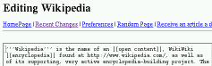
Comments: Nov 20 - I dislike the emphasis that this logo (and the ones below) places on "Editing" - Wikipedia is ultimately a knowledge resource. - MMGB
- As I have the vector format "sources", all the "Editing" parts can be easily removed.--Magnus Manske
I like this one, as it offers a concise description of the project. --Stephen Gilbert
- I kind of like this one myself. "The free encyclopedia" doesn't stand out enough, though. --Larry_Sanger
http://meta.wikipedia.com/upload/newlogo2.png http://meta.wikipedia.com/upload/newlogo2a.png (from Magnus Manske)
Comments: I "almost" really like this one. The "W" in the background is very nice, but I think the main font text doesn't look "serious and dignified" enough. If it looked less like handwriting, it would be excellent, IMHO. - MMGB
- I agree 100% with Manning's comments on this.
New version. Better? --Magnus Manske
http://meta.wikipedia.com/upload/newlogo3.png (from Magnus Manske)
Comments: This needs something. I don't know what. --Larry_Sanger
Looking at it now, what it needs is probably to be removed ;) --Magnus Manske
http://meta.wikipedia.com/upload/sodiumlogo1.png (early attempt by sodium)
Comments: I quite like this one - understated yet distinctive. Well worth developing as an idea - MMGB
I like this one best so far. --Stephen Gilbert
- Gimp layered source if anyone wants to play with it - [[1]]. I'll try another one soon probably :-) I think we should wait a while before deciding what logo to use, to get more people entering --sodium
- ¶ Of the suggestions here, I like this one. Logotypes need to convey a simple message very fast. Several of the other suggestions have too many small details in them. Also, the childishness/humor/irony of some other suggestions do not quite work in a logo. Companies don't have logos that say their products barely work.--user:LA2
- Apart from my own logos, I like this one best, although it doesn't include hints on "everyone can edit", "encyclopedia", "free" etc. --Magnus Manske
- This is a pretty one, but it does seem to need "the free encyclopedia," anyway. --Larry_Sanger
http://meta.wikipedia.com/upload/sodium_var.png (Stephen's small modification of sodium's first logo)
Comments:
The upload page doesn't like me, and the script can't parse my link right, so click to see it. I just added "The Free Encyclopedia" to sodium's logo above. Could someone upload it for me? --Stephen Gilbert
- Uploaded. Nice one! --Magnus Manske
http://meta.wikipedia.com/upload/Image1.gif (SJK has a go)
Comments: Nice and simple, has kind of a grassroots feel to it. --Stephen Gilbert
- Ow, that green. :-) As if drawn in crayon...well, that's not the effect I'd be after. --Larry_Sanger
http://meta.wikipedia.com/upload/newlogo4.png (Robert Brook has a go too)
Comments:
I think this one would be good with slightly bolder colours and some kind of motif (eg the MSN butterfly) --sodium
- I like this one a lot, for the simplicity, but needs "free encyclopedia." --Larry_Sanger
http://meta.wikipedia.com/upload/newlogo5.png (from Magnus Manske)
Comments: This one and sodium's one are my favourites - MMGB
- I agree, one of the best.
http://susning.nu/wikipedia1.gif (from user:LA2)
Comments: This image is interesting. I'm not sure about using it as a logo, but I like the image. --Stephen Gilbert
http://susning.nu/wikipedia2.gif (from user:LA2)
http://susning.nu/wikipedia3.gif (from user:LA2)
http://susning.nu/wikipedia4.gif (from user:LA2)
Comments:
Well, they are too large to replace the current logo. That said, they are nice by being plain and direct, but IMHO a little too plain (what is that blue bar trying to tell us?), and they remind me of the [Bayer] logo, which might lead to copyright problems ;) --Magnus Manske
The logos are wide but not very high (522 x 42), intended to be left-justified at the top of the screen (just like I've done at http://susning.nu/). The blue is a little too dark, and the logos are perhaps a bit over-simplistic, but you might use them as inspiration.--user:LA2
http://meta.wikipedia.com/upload/sodiumlogo2.png (second attempt by sodium)
Comments: This is just about my favorite so far. Some minor reservations, though: "the free encyclopedia" font seems a bit messy. The apples might help a bit, but something else up there might be better. Other ideas: book spine; old-fashioned key; a rocket; the outline of a forest, city, or college campus skyline; a quill; a stylized web. --Larry_Sanger
I get associations to fruit-flavored chewing gum. I would restrict the use of colors to white and just two more.--user:LA2
http://meta.wikipedia.com/upload/sodiumlogo2.1.png (sodium's second attempt at his second attempt) Comments: The whole 'series' is nice, though I still couldn't figure out what the apples or the city are for. The latter could be the 'wikipedia community'? --Magnus Manske
- Well if you understood Magnus, the logo would immediately disappear and be replaced by something far more complicated (a bad Hitchhiker's Guide paraphrase). - MMGB