
Wikipedia talk:WikiProject Countries
 Archives | |
|---|---|
| Archive 1 | Archive 2 |
| Archive 3 | Archive 4 |
| Archive 5 | Archive 6 |
| Archive 7 | |
RE: Subdivisions and names
It would be better to have the section titled as "Administrative Divisions" for each and every country, rather than the title as the name of the respective division/subdivision - only for the main page. Corresponding pages could then be the name of the appropriate division/subdivision. Would you agree? I only speak from the standpoint of standardization... with a small input from working with the UN. Rarelibra 13:13, 24 July 2006 (UTC)
- Wouldn't it have been better if you had discussed it here before making mass changes to the pages? This apart from the minor MoS violation of having "Division" in upper case. =Nichalp «Talk»= 15:53, 24 July 2006 (UTC)
- I think the point is that I DIDN'T KNOW until now, but the changes have been happening. As stated, the wiki project isn't an "end all, be all" of things - and for standardization ease, it would make more sense to call it "Administrative Divisions". As for the "minor MoS violation" you mention - again, it isn't an "end all, be all". I can definitely show you in an official MoS that it is proper to title as such, not to leave a lower case name in the title. So two things - one, this discussion comes at a time when the wiki project has been pointed out to me, and two, same with the "MoS" you mention. Be careful with assumptions, as your "wouldn't it have been better..." statement suggests. I work with this type of data on a daily basis, thus, I think it qualifies for me to have at least an input. Rarelibra 17:01, 24 July 2006 (UTC)
- Well, the purpose of a Wikiproject is to standardise related topics. Considering the magnitude of the change, consensus must be sought to effect the changes; that's part and parcel of wikipedia functioning. (See Wikipedia:Consensus) Secondly, I don't believe that I have mentioned anywhere above that it is an "end all, be all" as you have put it. Neither have I denied your right to post proposals. Your contributions (Uzbekistan, Greece, Ethopia, Bulgaria, India) suggest that you have made unilateral changes before waiting for more input from the community.
- Correct, however - when one is working with Wiki on a daily basis - as I have for over a year now, and making additions or changes, etc. without the knowledge of such projects, well, you can't point a finger of 'blame and shame'. Fact is, I have helped a lot in having to touch almost every country page as I go, and helping to alphabetize, add wiki links, correct spelling, correct format... the list goes on and on. In the meantime, you accuse me of a blanket-style effort like my only motive is to visit these pages just to change this. As far as the "magnitude" of the change - remember, Wiki is a living and breathing environment, full of constant change. Be very careful as to take personally my edits of standardization as I work with the pages on a daily basis (and it makes sense for the user to find the information quickly, as is one of the reasons I need such). A user may not know right away the name of the division of a country, and it is quite easy to find as an "administrative division". Give me credit, please. A good example of this, too, is the fact that I wasn't aware of such a wiki project until now (this week). Other users of the 'community' you speak of may also not know. Just FYI - your verbage of "unilateral changes" and "waiting for more input" etc DO speak of "end all, be all" solutions. Rarelibra 16:34, 25 July 2006 (UTC)
- Well, the purpose of a Wikiproject is to standardise related topics. Considering the magnitude of the change, consensus must be sought to effect the changes; that's part and parcel of wikipedia functioning. (See Wikipedia:Consensus) Secondly, I don't believe that I have mentioned anywhere above that it is an "end all, be all" as you have put it. Neither have I denied your right to post proposals. Your contributions (Uzbekistan, Greece, Ethopia, Bulgaria, India) suggest that you have made unilateral changes before waiting for more input from the community.
- As for the Manual of Style, please see this: Wikipedia:Manual of Style#Wording: Capitalize the first letter only of the first word and of any proper nouns in a heading, and leave all of the other letters in lowercase. Use "Rules and regulations", not "Rules and Regulations". Regards, =Nichalp «Talk»= 15:22, 25 July 2006 (UTC)
- Just for your benefit, I will go ahead and get you the proper reference of rules of style in regards to headings and such. I worked as an editor for several years for US Government publications, so again - I know a little bit about style. 16:34, 25 July 2006 (UTC)
- So here you go:
- I think the point is that I DIDN'T KNOW until now, but the changes have been happening. As stated, the wiki project isn't an "end all, be all" of things - and for standardization ease, it would make more sense to call it "Administrative Divisions". As for the "minor MoS violation" you mention - again, it isn't an "end all, be all". I can definitely show you in an official MoS that it is proper to title as such, not to leave a lower case name in the title. So two things - one, this discussion comes at a time when the wiki project has been pointed out to me, and two, same with the "MoS" you mention. Be careful with assumptions, as your "wouldn't it have been better..." statement suggests. I work with this type of data on a daily basis, thus, I think it qualifies for me to have at least an input. Rarelibra 17:01, 24 July 2006 (UTC)
3.49. In matter set in caps and small caps or caps and lowercase, capitalize all principal words, including parts of compounds which would be capitalized standing alone. The articles a, an, and the; the prepositions at, by, for, in, of, on, to, and up; the conjunctions and, as, but, if, or, and nor; and the second element of a compound numeral are not capitalized. (See also rule 8.129.)
8.129. To enclose titles of addresses, articles, awards, books, captions, editorials, essays, headings, subheadings, headlines, hearings, motion pictures and plays (including television and radio programs), operas, papers, short poems, reports, songs, studies, subjects, and themes. All principal words are to be capitalized.
3.51. In a heading set in caps and lowercase or in caps and small caps, a normally lowercased last word, if it is the only lowercased word in the heading, should also be capitalized.
- As you can see, the CORRECT MoS is to capitalize ALL in a heading or subheading. The Wiki MoS is INCORRECT, according to proper references. Rarelibra 16:42, 25 July 2006 (UTC)
- And one other thing for you to READ and REMEMBER - this is directly from the Wiki MoS - "Wikipedia does not require writers to follow all or any of these rules, but their efforts will be more appreciated when they do so: the joy of wiki editing is that Wikipedia does not require perfection.". This also goes for Wiki projects - "Remember that everything below are guidelines. Not all countries are the same, and not everything can be pushed into a framework in the same way. However, having the same "look & feel" for the country articles would be great." So please - stop sharpshooting me, and concentrate on those people out there who exist only to ruin and vandalize our joint efforts to make Wiki a great place. Rarelibra 16:47, 25 July 2006 (UTC)
I really don't like this idea that all country articles shoudl have a standardised "Administrative divisions" heading. It is much better to have a heading specific to the country. This attempt at standardisation seems to have been done without consensus, and so changes to the project guidelines shoudl be reverted. JPD (talk) 12:58, 16 August 2006 (UTC)
- It's not clear and "user friendly" to use the country-specific heading, as it is easier and clear when looking at the administrative division/subdivision of each country, whereby there is a definition of what it is called, how many, and background information, etc. Just FYI read above - "Remember that everything below are guidelines. Not all countries are the same, and not everything can be pushed into a framework in the same way. However, having the same "look & feel" for the country articles would be great." Also reference the statement "This structure is advisory only, and should not be enforced against the wishes of those actually working on the article in question." Rarelibra 14:05, 16 August 2006 (UTC)
There are two points here - firstly that I disagree with your unilateral change to the guideline here. It may only be a guidleine, but it does purport to represent some sort of community view and so should not be changed without consensus. I find it more user-friendly to use the country-specific heading, at the very least where the names of the subdivisions are English words. Secondly, despite the statements that you draw my attention to, you are trying to enforce your idea of a standard against the wishes of those actually working on the article in question. Please stop. JPD (talk) 14:16, 16 August 2006 (UTC)
- Words like 'unilateral' are funny, really. I mean, I was working on the titles for a while and then suddenly there was this 'consensus' and my work started to be changed around - so who was or is right and who was or is wrong? And by what authority? Think about the common user going to a country page - it is easiest to access the information by finding it in a common place. YOU may find it 'more user friendly' to be country-specific, but can you tell me what the administrative division name is for Seychelles or Mongolia, for example? See the point. I am not trying to 'enforce' anything, I am trying (like many others) to standardize. And please don't 'order' people around, thank you. Rarelibra 15:59, 16 August 2006 (UTC)
- You made some changes which were intended to be helpful, and some of them were reverted because others did not agree. There is nothing wrong with any of that, and it is a matter of opinion, so there is no point talking about right and wrong. Changing the guideline is another matter. The guideline is only a guideline, so noone should be enforcing either version of it (note that standardising according to a guideline and enforcing a guideline are exactly the same thing). The guideline should, however, reflect a close to consensus view, rather than one person's opinion of what is right. Otherwise, there is no point to having any guidelines at all. Yes, I do think it is more user-friendly that way, and I find the Seychelles page better than the Mongolia page for that reason, even though I didn't know what the divisions were called before looking at them. I am not claiming to be right, or even to have a consensus, simply disagreeing with your changing and pointing out that you are not indisputably right and do not have a consensus for your change. JPD (talk) 17:16, 16 August 2006 (UTC)
Territorial limits
Hello, I had a question regarding the territorial limits of countries as operationally defined on Wikipedia. With respect to Wikipedia categories that categorize things by if they are "in" a country, are the territorial limits of countries either a) Its land borders, not extending to sea, b) Limited by its furthest internal waters as defined in the article territorial waters, or c) something else? I believe b, but I sought confirmation. Any assistance with answering this question of what constitues a country's ultimate territorial limits would be greatly appreciated. Kurieeto 22:32, 28 July 2006 (UTC)
I have applied {{Navigation Template}} to some of the navigational templates (mostly continental ones). I think other such templates would benefit from this format.
I haven't invented anything, this format was used for templates for europe asia etc, I just collected the elements into a single generic template for easier use (so as to evade the usage of a number of easy to break <div>s).
--Cat out 01:13, 30 July 2006 (UTC)
Scotland peer review
Hi, I've just listed Scotland for peer review: Wikipedia:Peer review/Scotland - your comments on improving this coutry article are welcomed. Thanks/wangi 15:06, 2 August 2006 (UTC)
Hi
In want to join this wikiproject and it said leave a comment on the talk page, well here it is! Jamie|C ![]() 01:13, 15 August 2006 (UTC)
01:13, 15 August 2006 (UTC)
Mass content adding to small Wikipedias
Hi, I am starting again to work on the project m:Mass content adding. One of the points of the project is to use templates from bigger Wikipedias (in general, from English Wikipedia), to localize them and to make bot-commiting to the small Wikipedias. For that purpose, I think that countries should be the first pilot-project. --millosh (talk (sr:)) 20:04, 15 August 2006 (UTC)
In the developed situation I think that parts of that project should be leaded by projects like this. I.e., if you make some changes to the structure of template and/or data, you should commit that changes into multilingual project, too. --millosh (talk (sr:)) 20:04, 15 August 2006 (UTC)
Project Mass content adding is not developed yet and I would like to hear your input, at least. There are a number of open questions related to organization of localization. Also, I am sure that some communities from bigger Wikipedias want to cooperate, too. For example, this would mean that all Wikipedias which participate in such project would have one, central organized templates for countries and data inside of that templates; etc. --millosh (talk (sr:)) 20:04, 15 August 2006 (UTC)
First of all, I would like to get some help from some of you related to the countries because I am sure that you are much better introduced into this field then me. --millosh (talk (sr:)) 20:04, 15 August 2006 (UTC)
You can contact me via my talk page or, better, here. --millosh (talk (sr:)) 20:04, 15 August 2006 (UTC)
- One more information (I was a long time out of this project and I forgot that I made some text about countires there): look at m:Mass content adding/Countries of the world. --millosh (talk (sr:)) 20:27, 15 August 2006 (UTC)
Please add me
Hi, as an active participant in Malta article and in various geographical articles, I would like to join the wikiproject countries. Please add me to the members list. Also advise whether a userbox to this respect is available. Maltesedog 08:48, 27 August 2006 (UTC)
Hello!
I just wanted to say hello to everyone in the wikiproject. I just joined the project and will be adding mostly to 3 countries. These countries are Cyprus, Switzerland and my favorite Thailand (Needs a lot of work!). If I can ever be of assistance just contact me on my discuss page and I will respond hopefully within 24 hours unless you post on the weekend. Felixboy 12:40, 31 August 2006 (UTC)
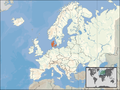
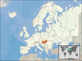
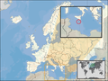
Location Maps for European countries
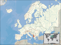
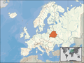
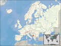
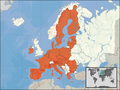
A few days ago, I added a newly created series of maps to wikipedia, showing the location of European countries. The new maps are of higher quality than the old ones and I am of the opinion that they should replace the old location maps in the country infoboxes. The maps are available for all EU states and will soon be available for every other European state. The maps are already in use on the German wikipedia.
Examples
(Old Maps):


(New Maps):


But the new wikipedia user User:Cogito ergo sumo seems to be of an other opinion and reverted the implementation of the maps with the following comment: (revert: while new maps look nicer, restoring locator maps that are consistent among all country infoboxes, per Wikipedia:WikiProject_Countries/Templates#Article_template)
As a consequence of that the below shown discussion started. I would ask the other members of this project here to state their opinions to that and I'd be grateful to have a final decision on the subject whether those maps also shall be used in the English wikipedia - or not. --David Liuzzo 18:39, 4 September 2006 (UTC)
Copied Discussion
______________________
(revert: while new maps look nicer, restoring locator maps that are consistent among all country infoboxes, per Wikipedia:WikiProject_Countries/Templates#Article_template)
- Of course the new maps are not consistent to the old location maps, since they are nicer and more exact than their predecessors. The only thing you achieve by reverting those changes is preventing innovation and improvement in wikipedia. If all users thought that way, wikipedia would have to use the same old and bad pictures and materials for the next two decades, just because of their consistency among each other. Your argument of consistency among all infoboxes is already a very weak one for a revert, and becomes even weaker considering that those new maps with their common style are consistent to each other. Further they are available for all 25 EU states and they will soon be available for the whole continent. --David Liuzzo 21:32, 3 September 2006 (UTC)
- Hello! Thank you for your note; I'm sorry to have reverted your contributions, but your argument is not wholly compelling. While your maps are potential improvements on the preceding locator maps, they are not necessarily innovations. As with any publication, standards are in place to ensure a degree of consistency for users when perusing Wp: the country wikiproject prescribes a certain layout for all country infoboxes (with consistent locator maps); this is no different than an almanac or other compendium. I see little reason to treat EU constituents differently; if so, perhaps it would be better to use the maps or variants already available. I also note that at least one other Wikipedian reverted your map change (at least for the UK); being bold notwithstanding, perhaps you should join the wikiproject, propose and discuss a new map style/change before going ahead and implementing wholesale changes that may not be agreeable and reverted again.
- If you require assistance, please feel free to ask. I hope this helps. Cogito ergo sumo 22:00, 3 September 2006 (UTC)
- Well those new maps do not only include the EU countries but all European states (for examples see:Image:Europe location CH.png). And I don't think that I'll require assistance. As far as I could see, you are quite new to wikipedia, so I should ask you that question. furter I should point out that reverting articles in that number without dicussing the topic before may be regarded as great impoliteness and as sort of vandalism. --David Liuzzo 17:26, 4 September 2006 (UTC)
- Yes: I'm fairly new but have joined the country wikiproject. That being said, I was equally bold and restored the status quo for reasons stated (and apologise for not discussing it beforehand): your maps are not agreeable to not only me but at least one other editor, so I'm not totally off base here. Through prior discussion, you may get buy-in and suggestions for improvement. Locator maps are not just to exhibit countries in and outside Europe/the EU (noted) but to exhibit territories in relation to others around them -- yours are too Eurocentric; for example, some of your maps exhibit territories less clearly than do the other maps, particularly for smaller territories (e.g., Luxembourg) or those on the periphery of Europe (e.g., Greece, Malta). They are also quite large and (IMO unnecessarily) detailed for locator maps and can be compressed. And I have provided sufficient edit summaries and discussion regarding this, so accusations of impoliteness and vandalism are non-starters. Cogito ergo sumo 17:53, 4 September 2006 (UTC)
__________________________
--David Liuzzo 18:39, 4 September 2006 (UTC)
- As an outside observer I do think it is about time that the country locator maps were replaced, they are many years old and of low quality. Nonetheless, any change to 200 extremely high profile articles needs some discussion before it is introduced. We need better maps, but if we are going to change them let us ensure they are the best possible. I do have a couple problems with the orange ones. The grey outline of the continent follows a weird mix of geographical and political boundaries, and will lead to yet another round of the "what is Europe" debate. It would also be better if the maps did not have the distortion caused by a mercator like projection. The map is also quite inadequate for smaller countries like Luxembourg and Malta. - SimonP 18:57, 4 September 2006 (UTC)
- Actually there's a little error in the grey outline, Cyprus lies of course in asia and should be white on the generic map, I'll correct that issue. If considered absolutely necessary I could create special maps for the English Wikipedia without that grey outline and outline of the EU in locations maps of EU states. The main goal is to get rid of those ugly old and grey maps. Regarding those tiny states it would be possible to create special enlarged versions with a small cut-out box containing the europe-map, similar to old maps like Image:LocationGermany.png which show an enlarged section of the continent and the world map in a small box. --David Liuzzo 20:47, 4 September 2006 (UTC)
- If considered absolutely necessary I could create special maps for the English Wikipedia without that grey outline and outline of the EU in locations maps of EU states. What? Surely it would be best to remove such supranational boundaries (such as the EU and different continents), and have land as one colour, sea as another and the specific country highlighted. These maps should be uniform across the whole of wikipedia!! Rob.derosa 10:02, 31 October 2006 (UTC)
- I for one support David Liuzzo in his effort to get rid of those ugly old and grey maps. Since maps are available for all EU member states why dont we start with those. I also agree with the idea of creating special enlarged versions with a small cut-out box containing the europe-map for the tiny states. Aristovoul0s 15:37, 15 October 2006 (UTC)
- Then we should make a decision. Here a last brief overview on all the maps which would replace the old ones:
Non-EU states
-
 Basic Map
 -
 Albania
 -
 Bosnia-Herzegovina
 -
 Belarus
 -
 Switzerland
 -
 Croatia
 -
 Iceland
 -
 Moldova
 -
 Macedonia
 -
 Montenegro
 -
 Norway
 -
Serbia
-
 Ukraine


EU states
-
 European Union
 -
 Austria
 -
 Belgium
 -
 Bulgaria
 -
Cyprus (obsolete map)
-
 Czech Rep.
 -
 Denmark
 -
 Spain
Spain -
 Estonia
 -
 Finland
 -
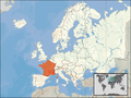 France
 -
 Germany
 -
 Greece
 -
 Hungary
 -
 Ireland
 -
 Italy
Italy -
 Latvia
 -
 Lithuania
 -
 Luxemburg
 -
 Malta
Malta -
 Netherlands
 -
 Poland
 -
 Portugal
 -
 Romania
 -
 Slovenia
 -
 Slovakia
 -
 Sweden
 -
 United Kingdom


Small states
-
 Andorra
 -
 Liechtenstein
 -
 Monaco


--David Liuzzo 22:47, 17 October 2006 (UTC)
Location Maps for European countries-- discussion continues
So shall they be used in the English wikipedia (as it is already the case in the German and French wiki) or not?
- As there seems to be (after waiting almost 2 weeks) no objection against the implementation of the new maps and due to the fact that the user "Cogito Ergo Sumo" who prevented the implementitions with his contraproductive reverts has been banned because of malicious actions and socket-puppetery I'll just implement them now. --David Liuzzo 18:36, 28 October 2006 (UTC)
Is there a new map of Uruguay available? Wesborland 18:43, 28 October 2006 (UTC)
Well, as Uruguay is not part of Europe and the new maps just deal with the location of European states there is no new map available. --David Liuzzo 19:59, 28 October 2006 (UTC)
- Personally I like the new maps, I have just some concerns regarding the small countries: The orange magnification (If you see what I mean) is confusing. But I don't know how to make it better to be honest -- lucasbfr talk 01:14, 30 October 2006 (UTC)
I am of the other opinion in that I feel the green on grey of the other maps give a great contrast if you know what I mean. Also I don't understand why the EU is highlighted if your new images become the norm will you also highlight NAFTA or the African Union in the case of Africa? Fabhcún 01:57, 30 October 2006 (UTC)
- mmm you got a point... Being European that didn't shock me. I don't know... But the European Union is a strong entity in Europe so that makes sense having it. -- lucasbfr talk 02:26, 30 October 2006 (UTC)
- I echo the concerns of Fabhcún: Why do you need to hightlight the EU? Keep it simple and just hightlight the country that the article is about. New maps would be nice but I don't think that only Europe should get new maps I hope that you are working on other countries and can convert them over quickly after a concensus is reached. —MJCdetroit 02:37, 30 October 2006 (UTC)
- New location maps I just stumbled upon this after editing a couple of Europe maps. I'm opposed to the new maps for a few reasons: they are inconsistent with other location maps (not just of countries), they arbitrarily include the EU (why not EFTA?), and they are simply visually less appealing. -Justin (koavf)·T·C·M 15:24, 30 October 2006 (UTC)
Why on earth has the EU been highlighted in all of the European maps? The map is going to be a locator map of that particular country within the world, not within the EU. The EU highlighting should be removed (who decided if it should be the EU or NATO etc that should be highlighted - it would just be easier without). And I must say I prefered the old ones, the orange and blue doesnt look particularly attractive. Also should continental-distinctions be present on these maps also? It just seems like your trying to pack too much information onto one little map, when all it is there for is the location of that particular country. 203.114.140.222 09:57, 31 October 2006 (UTC) [This was by me Rob.derosa 09:58, 31 October 2006 (UTC) ]
I completely agree with the above sceptical comments. These maps look extremely uggly and doesn't fit at all with the light-colored Monobook scheme. What we need are high-res SVG versions of the older maps. I also agree that the EU highlighting is not neutral. /Slarre 20:25, 1 November 2006 (UTC)
- I fully disagree, and think that the new maps are a significant improvement. The European Union presumably has been highlighted to demonstrate in which jurisdictions the common European Union law applies. The old maps are an inferior substitute and look very unprofessional.--Tekleni 20:45, 1 November 2006 (UTC)
The old maps were much better, the nation in the article should be proudly placed in the center of the map--Hamparzoum 21:11, 1 November 2006 (UTC)
- The old maps were ugly. These new ones look very professional and are much better. Call a vote or something...--Eupator 21:25, 1 November 2006 (UTC)
- It depends on the country. A small edit dispute at Belarus is going on now due to the map issue; I say that the current map of Belarus (as displayed above) is plenty big for the article infobox. It's big enough to stand out. But, for small states like the ones displayed here, the old maps should be used until we get some kind of zoom function in. User:Zscout370 (Return Fire) 02:25, 2 November 2006 (UTC)
I'm afraid that I'm going to have to agree that the grey/orange/blue colours are as ugly as sin, I much prefer the white/grey/green. Also, it's kind of hard to see some of the smaller countries with these maps. I've got no problem with new maps, I just don't like these ones. Lankiveil 06:23, 2 November 2006 (UTC).
- I prefer the old maps, don't see a reason to highlight Europe or the EU. We should try to convey the information "where on Earth is that country located" with as little distraction by other information as possible. Kusma (討論) 12:44, 2 November 2006 (UTC)
The old maps would clearly benefit from being recreated with greater detail. But the emphasis is on <recreation>. Each individual nation state should be identified alone within a global (or, arguably, continential) context. Membership or otherwise of regional blocs by other nation states in the proximity of the state in question should not be included for the summary maps we're talking about. There is no justification for doing so, not least as this would produce a non-standard practice across all Wikipedia country entries (quite aside from the NPOV considerations).
Me, I'm open to individual countries being shown in a continential context (i.e. Nigeria with Africa, Mexico within North America) though the present standard is to use a global context. Please also be aware that the discussion on this page is largely invisible to editors of and contrubutors to country pages; we should not assume that agreements reached on this page have the wider acceptance necessary to make any other than cosmetic changes to the maps. JamesAVD 13:20, 2 November 2006 (UTC)
- I am strongly opposed to any change in the EU-countries maps that will not show EU as a whole. EU is a political/economic/cultural entity, and membership is permanent (i.e. there are no clauses for EU's possible dissolution or withdrawal of any member). Removing the relative location of these countries in EU can be compared to showing the states of the US independently. See Oregon, Montana, Louisiana etc. •NikoSilver• 14:59, 2 November 2006 (UTC)
- The problem with showing the whole EU is that it is so large compared to its member countries, and also that the maps with the EU show too much detail (rivers and stuff). I think our maps should only show the location information with as little distraction as possible. The maps with the green countries and without the EU do that better than our maps that include the EU. Kusma (討論) 15:04, 2 November 2006 (UTC)
- For exmaple at Slovenia, the non-EU map is clearly superior at any small size. Kusma (討論) 15:06, 2 November 2006 (UTC)


I disagree it is much clearer, and even if it were, (as in the case of Cyprus) then we would definitely be able to do that:

In any case, I propose this situation garners full consensus. There have to be notifications to all portals and country talk pages before any so drastic change. •NikoSilver• 15:29, 2 November 2006 (UTC)
- Always a good idea. I have invited many country talk pages to this discussion as an answer to JamesAVD's comments. I think that the new maps-with-EU need to be displayed larger than they currently are to make much sense, which would necessitate changes to Template:Infobox Country. Note that de:Slowenien has a larger map, which looks better already. Kusma (討論) 15:57, 2 November 2006 (UTC)
- I am opposed to coloring the EU nations in the maps. Why should we do this? Systematic bias? Will we painting other blocs? CARICOM, CSN, NAFTA, NATO? I have no objections to the new maps if the coloring scheme is changed but they should be implemented across Wikipedia, not exclusively to European countries.— Preceding unsigned comment added by Joelr31 (talk • contribs) 17:28, 2 November 2006 (UTC)
- I agree with •NikoSilver• that there should be (or should have been) a consensus on this issue. However, to draw comparison between a U.S. state and a country that is in the EU is a poor example. First of all, while the countries in the EU have given up some sovereignty, they are still independent countries. I don't remember the UK or Poland asking the EU's permission to go war with Iraq or Afghanistan. Does anyone know if Maryland or Oregon has gone to war with anyone lately? Me neither. Secondly, the current Template:Infobox Country has field called Accession to EU which is wiki-linked the EU article. I feel that to have the EU highlighted in the map only complicates things —keep it simple. The article is about the individual country and not about the EU. If the reader wants to know more about the EU, they can click on one of the wiki-links to the EU. —MJCdetroit 17:58, 2 November 2006 (UTC)
- Correct note, but full military cooperation and external policy is just one of the criteria for such an issue, and I only stated my pro-EU biased opinion on this. :-) In any case, you must admit that the EU is the greatest attempt of unity of different nations in the world, as it includes sovereignity/economy/currency/culture and many more I am bored to list. I admit the map is debatable, though. Possibly we could have a poll as soon as we list all options? •NikoSilver• 21:47, 2 November 2006 (UTC)
- Unlike JamesAVD, who seems to want everything EU stripped from the infobox, I think the point of contention is the highlighted maps. I made my position clear on the highlighting of the EU above —the keep it simple argument. However, I may not have made as clear that I think new maps would be nice, but for all countries (and territories). I would consider myself one of the main editors over at Template:Infobox Country and we worked very hard over there to standardize all countries to use one infobox that has a similar look from country to country. The infobox editors probably should have been included a little sooner in the decision to start changing the look of some of the infoboxes. —MJCdetroit 00:46, 3 November 2006 (UTC)
- Correct note, but full military cooperation and external policy is just one of the criteria for such an issue, and I only stated my pro-EU biased opinion on this. :-) In any case, you must admit that the EU is the greatest attempt of unity of different nations in the world, as it includes sovereignity/economy/currency/culture and many more I am bored to list. I admit the map is debatable, though. Possibly we could have a poll as soon as we list all options? •NikoSilver• 21:47, 2 November 2006 (UTC)
- I agree with •NikoSilver• that there should be (or should have been) a consensus on this issue. However, to draw comparison between a U.S. state and a country that is in the EU is a poor example. First of all, while the countries in the EU have given up some sovereignty, they are still independent countries. I don't remember the UK or Poland asking the EU's permission to go war with Iraq or Afghanistan. Does anyone know if Maryland or Oregon has gone to war with anyone lately? Me neither. Secondly, the current Template:Infobox Country has field called Accession to EU which is wiki-linked the EU article. I feel that to have the EU highlighted in the map only complicates things —keep it simple. The article is about the individual country and not about the EU. If the reader wants to know more about the EU, they can click on one of the wiki-links to the EU. —MJCdetroit 17:58, 2 November 2006 (UTC)
- I am opposed to coloring the EU nations in the maps. Why should we do this? Systematic bias? Will we painting other blocs? CARICOM, CSN, NAFTA, NATO? I have no objections to the new maps if the coloring scheme is changed but they should be implemented across Wikipedia, not exclusively to European countries.— Preceding unsigned comment added by Joelr31 (talk • contribs) 17:28, 2 November 2006 (UTC)
- Let me first make it clear that I was kidding about my pro-EU-pov bias (not that I oppose it, but it certainly doesn't govern my behavior). I appreciate your work in the infobox, and everybody elses with all those tedious maps. KISS is nice too. This change came way too WP:BOLD for most of us, and that probably justifies my disproportionate reaction in the first place. Indeed, this is an odd place for a political debate and indeed EU is not as consolidated as the US (obviously). If others too feel that EU is not necessary in the map, I'll go along. •NikoSilver• 01:24, 3 November 2006 (UTC)
A dispute has arisen in relation to the discussion here. It is my belief that the root problem is that none or few of the editors of the country pages were even aware that this discussion was taking place. The result has been that David Liuzzo decided to implement his superbly-crafted and graphically much-improved maps across the pages of countries which are members of the EU without (in my view) sufficient debate. I've been reviewing the UK page for quite a time but had only recently noticed the change. Finding no discussion on the UK talk pages I chose to revert the map (which I think is misleading - I'll expand on this below) on this and all other pages. I've also started a discussion on each of the talk pages; Kusma and others have made us all aware of the discussion (or lack of discussion before the chahges) which have occured (out of view) here. Editors may seek to contribute here or on the country talk pages; we need to allow for this.
It remains my opinion that for an infobox map of Poland (for instance) to also identify several other members of a particular regional grouping (of whatever constintutional form) is a) non-standard and b) potentially putting over a particular point of view. Both of these latter problems should be avoided in Wikipedia. Clearly we need a standard approach for each country, this being an encyclopedia. Clearly also we should avoid potentially POV statements: there is (it goes without saying) much dispute as to the constitutional status of the EU; until there is a consensus on that status we should avoid including elements (such as other EU members on maps, or EU accession dates prominent in the infobox) which give the impression that the debate has been resolved one way or the other.
This is not to say that the EU is either good or bad or inbetween. The goal is not to present something as a fact or give it undue prominence until we know it to be a fact.
Nor is this to say that we should therefore accept the old and less attractive maps which are Wikipedia standard. We should ideally have much better drawn maps (much like David Liuzzo's superb examples) which identify nation states alone and not other members of one regional group or another, which show either a state in a global context, or in a regional context where necessary, perhaps with a separate cut-out for the global picture as happens on some country pages. Clearly smaller countries need more attention paid to how to best identify them. This is a separate debate to whether or not regional blocs should also be shown. Thoughts? JamesAVD 17:29, 2 November 2006 (UTC)
- First, on the EU, why the EU, what about all the other organizations, unions, etc. Since the member countries share a constitution, laws, have reciprocal agreements on everything from taxation to pensions, etc., it can be argued that the EU is a "super-country" and it makes sense to reflect that in a map. Second, however, I cannot support the current maps as proposed because of readability issues. Generally speaking, the map needs to be bigger so as to not shrink countries into unrecognizeable blips. More importantly, the detail needs to be absolutely crisp... when engineering for a small scale, things like aliasing which are used to make big items look smooth now make small things unintelligible. I cut and enlarged the map of Latvia (my main area of interest/expertise/contributions) to get a better look and it's all a blurry mush. The map has do be drawn at its intended scale, not done on a large scale and resized down. It simply doesn't work that way. (I've done a lot of text and image web work, so this is the voice of the school of hard knocks.) —Pēters J. Vecrumba 17:38, 2 November 2006 (UTC)
Exactly, Peters: 'It can be argued', but of course it can be argued either way and to promote the EU as a super country when it might not be is promoting potentially incorrect material in what is supposed to be an encyclopedia. Taking one view point or the other might also cause offence, so we should avoid the potential misleading or POV statement and aim for standardisation, NPOV and good graphics. Can't comment on your sizng points, I quite like the look of the proposed maps in general. JamesAVD 17:51, 2 November 2006 (UTC)
- First of all, David, I like your map of Europe, and I hope that the problems Pēters mentions can be fixed without too much work. I have no problem with a continental context and to me, this kind of map looks a lot more professional than the old white/green maps. However, since the EU is not a nation as such but an association of independent nations, I would personally feel better if the EU was not included. But comparing e.g. the two images for Norway, the new one is a definite improvement. The maps including the EU shouldn't be deleted as such, they would make great illustrations in articles about a nation's relations with the EU. Similar types of maps could be made for e.g. articles about EFTA or the OECD. I also agree with the sentiment that all countries should use a similar type of map, so if the location maps for Europe are to be replaced, the same should apply for the other continents (needless to say, this process can be done in stages starting with the European material). Except for the EU bit, I like the new images. Just my thoughts. And btw, Nikosilver this place might be a bit odd for a political debate about the EU or its future, but "permanent" is a word rarely used in politics - for good reason. In this case, the Supreme Court of Denmark was asked a few years ago by Parliament what would happen should Denmark one day wish to leave the EU. The Court stated that at the end of the day, the national constitution applies over the EU constitution and that such a scenario was hypothetically possible. (It would probably be a bad idea, but that's another story). When Danish politicians informed members of the EP and the Commission that this issue had become a topic in our national debate, everybody they talked to agreed that member states have this right. A right to leave the EU was also included in the (non-ratified) EU constitution (Article I-60) [1]. The constitution also mentioned the possibility of leaving the military cooperation (Article III-312) [2]. Sorry if the last bit bored anybody, but this issue became very dominant in our last national EU debate. Regards. Valentinian (talk) / (contribs) 20:00, 2 November 2006 (UTC)
- I like the new maps, but wish that the subject country could be even easier to distinguish from the EU member countries colour. Jkelly 20:34, 2 November 2006 (UTC)
- The only observation I have is that, whichever maps are used, the colors on the map should be distinguishable by those who are colorblind. --Badger151 20:47, 2 November 2006 (UTC)
A question. Is it the intention that the new-style location map with EU boundaries shown should should be used for all European countries? or just for those within the EU? —Ian Spackman 20:59, 2 November 2006 (UTC)
- It's completely POV to highlight the countries of the European Union and the borders of Europe, furthermore it's also completely useless. The majority of users viewing the page about a country won't be from the European Union, so the difference will be lost upon them. The old maps could be bettered by a non-POV map with a better and more detailed view, however, this map is too POV to do that. nl.wikipedia has already (for the moment) decided not to use them on grounds of POV and being too "Mercator". Niels|en talk-nl talk (faster response)| 02:56, 3 November 2006 (UTC)
- EU placement is reasonable choice, but if the map will be cropped, then showing particular region, (i.e. one of the Baltic States, so probably could be good idea to zoom a bit to this particular state and do not showing some of, lets say, Western Mediterranean and/or Africa line) so in this case we can loose whole picture of EU, which is probably not welcome. Second point how we going to inform readers that the additional color means? M.K. 10:03, 3 November 2006 (UTC)
- I do oppose the new style maps. The EU is not a country, depicting it otherwise is simply POV. Besides, the Spain new map is terrible, it does not even show the Canary Islands. Regards, Asteriontalk 17:52, 4 November 2006 (UTC)
- PS: Any massive scale implementation like this should be consensuated and agreed beforehand. This is not the way.
UK centric comment - In the case of the United kingdom article, a map demonstrating the borders of individual countries within the UK gives far more relevant information, and is a better summary than a map of the UK's geographical position within the EU. This alone should be reason enough not to use these maps in the UK article in preference of a map of the UK itself, as it would better conform to WP:LEDE - it may be an image in an infobox, but it's still a part of the lede section. Crimsone 19:15, 4 November 2006 (UTC)
Can I ask why Turkey has not been included in Europe? Turkey is an official candidate for European Union membership, and will likely become a member in the next decade or so. These new maps - whilst an improvement on the previous versions - must include Turkey as a European country. Ouip 20.22, 5th November 2006 (GMT).
- A few comments from someone who is European...
- These maps are much better looking than the old maps and should become the new standard.
- Where is the map of San Marino and Vatican City? (update SomeHuman March 1, 2007: both available & applied)
- The previous editor Ouip, brought up an interesting point, currently Turkey is correctly shaded, the 3% of Turkey that is actually in Europe is shaded and the rest of Turkey should not be shaded, if and when Turkey joins the EU we can pick up the discussion then, Turkey still has a very long way to go.
- Cyprus is not in Europe but a member of the EU, It should be shaded with a different color.
- A few comments from someone who is European...
However, upon more inspection of the Belarus map, I wish there was a more defined way we can look at the borders. I can see the lines, but not very well (Im using a 1024x768 LCD monitor from dell). While Image:LocationBelarus.png looks drawn in MS Paint, I could see the lines well, and Belarus a bit better and not have to see the African continent below. What I am getting at is this: Can we, at each article's descretion, use the map of our choice and perhaps crop the new map to suit our needs? User:Zscout370 (Return Fire) 18:30, 5 November 2006 (UTC)
Perhaps it's worth us separating the graphical from the political question here? On the graphical side, there seems to be some support for the maps proposed above (in terms of format) but also a certain movement to perhaps more focus on specific smaller areas or better defined borders and so on. Do we like the idea of a similar quality of picture but greater depth? Is anyone formly of the opinion that we should only have global or continental-scale maps? JamesAVD 11:28, 6 November 2006 (UTC)
The maps are wonderful. I fully support their introduction into each European country's map on the main article. One criticism is correct though. Smaller EU countries like Slovenia are hard to see. The orange highlighted area blend with regards to the EU's already-shaded orange. Maybe if it were a different colour scheme? Regardless, I really like it.
My vote, for what it's worth, is strongly in favor of the new maps over the old. Showing fewer rivers would probably help visually, and I think there should be more close-up boxes to bring smaller countries (even Slovenia-sized countries) into better focus.
Regarding the EU, if it is an exclusive gathering of countries (in that its members cannot be members of some other equivalent merger of national interests), and if it is more than just a trade pact (like NAFTA), then I believe it is useful as a supranational entity. I am not European, but my understanding of the EU is that of a group of nations choosing to see themselves as part of a "family" (I cannot think of a better term at the moment). And they choose identification and political association with that family. To the contrary, NAFTA members do not think of their bond in the same way at all.
If there are other equivalent entities in the world, they should be shown as well. I think it's very useful to place a country within this larger context. Saraalan 01:31, 9 November 2006 (UTC)
The maps are graphically a bit nicer than the old maps. But I think for consistency a lot of issues have to be solved:
- For consistency all maps of all countries need to be changed to the new format
- For consistency maps of all provinces and/or regions have to become available for countries sporting the new format (as they are for the old format)

- For consistency maps of all communicties regions have to become available for countries sporting the new format (as they are for the old format)


Until at least a major consensus is reached that the new formats will be expanded to cover all these three issues I am strongly opposed to instating new maps. Arnoutf 14:53, 12 November 2006 (UTC)
I much prefer the old maps. The colour usage is vastly better, and the EU representation is unneccessary. I am also persuaded by the consistency argument. Noisy | Talk 15:58, 12 November 2006 (UTC)
The old maps have been restored to make wikipedia uniform once again, if a new style were to be implemented, an agreemebt should be reached here, and all countries should be changed, not just Europe. Rob.derosa 15:13, 16 November 2006 (UTC)
- I do not agree with you. The new maps are better, and uniformity does not mean we should use the same rule for the whole world.--Panarjedde 15:28, 16 November 2006 (UTC)
- Because you like the new maps better you decide they should be put back up right? Er and uniformitiy means the same style of map for each country, which makes sense - you wouldn't see Encylcopedia Britannica using one map style for Europe and another for the rest of the world would you? Until a decision is reached on which maps should be used the status quo should be restored. Rob.derosa 15:38, 16 November 2006 (UTC)
- I don't see any of your posts complaining when people wrote "I much prefer the old maps". Uniformity can be achieved even using the same kind of map for every EU country. And yes, I would not complain if Britannica adopted this style. Note also that until a decision is achieved, you are not allowed to change the maps at your will.--Panarjedde 15:47, 16 November 2006 (UTC)
- But it would not conform with the maps for the other countries of the world would it. And you make the point that wikipedia is not a democracy below.. who is to make that decision then? It will be us, the people who edit and maintain the pages, and if enough of us want to see the old maps restored then that is what will happen. I would be content with new maps (maybe altered for smaller countries); provided similar attention was paid to the other continents of the world (because I agree that these current maps are lacking in detail), and if mentions of supra-national entities were removed, as they are not relavant. There should not be a haphazard slow move to a new standard, it should be quick and occour for most conuntries at the same time. Rob.derosa 15:54, 16 November 2006 (UTC)
- (1) Take a look at Chicago and Paris: the first uses the "Infobox City" template, which is the generic city template, while Paris uses the "French commune" template, which is specific for French cities. The end result is that there is uniformity, but it is within French cities and the rest of the world. (2) This is not a democracy (WP:DEMOCRACY) means that a vote is not enough to settle the matter, as you meant. And yes, it would require a lot of work, but you were very eager and quick to revert the maps, weren't you?--Panarjedde 16:06, 16 November 2006 (UTC)
- And likewise you were very eager to change them back again weren't you. Why not at least see what the opinion is, and go from there? (In difficult cases, straw polls may be conducted to help determine consensus, but are to be used with caution and not to be treated as binding votes.) Rob.derosa 16:11, 16 November 2006 (UTC)
- Right, because I know very well the "trick" you used: change to your version, then issue a poll, so that in case of tie the situation can't be changed.--Panarjedde 16:55, 16 November 2006 (UTC)
- In case of tie nothing will happen, and some pages will use the new maps, and some pages will use the old maps. At least this way might force one particular version or not. And it is no trick, I genuinely want to see what other people think; don't you? Rob.derosa 19:07, 16 November 2006 (UTC)
- The new maps look better for some large countries and are a lot worse for small countries. The new maps show all European countries in the context of the whole European continent, which means that some small countries become almost invisible blobs of red on a large orange background. The old maps present the right amount of context, and are uniform across all continents. While the new maps look nicer, they are simply less useful for the task they are intended to perform - show at a quick glance where a country is located. The old maps are not as pretty, but get the point across more efficiently. So the old maps are better, and we get uniformity. Kusma (討論) 15:51, 16 November 2006 (UTC)
- The following discussion is a closed survey. Please do not modify it. Subsequent comments should be made on the appropriate place, further down on this page. No further edits should be made to this section.
Vote
Please vote here, no discussion, on which style of maps should be adopted for the European countries (either Old or New). Then maybe we can resolve this once and for all Rob.derosa 15:41, 16 November 2006 (UTC)
- Wikipedia is not a democracy.--Panarjedde 15:47, 16 November 2006 (UTC)
- It may not be, then call it an opinion poll. It is good to know how opinions are divided anyway Arnoutf 14:21, 17 November 2006 (UTC)
- I (MJCdetroit) think it is a little more complex than old vs. new. The original protest was also over the hightlighting of the EU. I am going to change the vote parameters to three options:
- OLD,
- NEW (EU highlighted & for Europe only), or
- NEW (No EU highlighting and implement for all countries)
- I (MJCdetroit) think it is a little more complex than old vs. new. The original protest was also over the hightlighting of the EU. I am going to change the vote parameters to three options:
OLD Style
- Old - To ensure wikipedia uses a consistent style for all countries. The proposed new style is also inneffective for smaller countries, and does not offer (as other users have stated) the simplicity of the old design. I would be in favour of updating the locator maps, just not using the ones proposed (this was updated by Rob.derosa 19:06, 16 November 2006 (UTC)) Rob.derosa 15:41, 16 November 2006 (UTC)
- The new map style (full continental map for all countries regardless of size) doesn't work well with small countries, and we don't have these maps for continents other than Europe yet. I don't quite see the point in voting for a nonexistent option. Kusma (討論) 19:26, 16 November 2006 (UTC)
- Old - much clearer; the simplicity makes it easier to see the location of the country, especially for the smallest countries. This outweighs the higher resolution of the new images. Eugène van der Pijll 13:38, 17 November 2006 (UTC)
- The old style is far clearer. Noisy | Talk 11:49, 18 November 2006 (UTC)
- weak support allthough the resolution and colour contrast of the old images are less appealing, I prefer them over the new ones. The basic information is: How does this country looks like? Where to find this country on the globe? I would support the old images with the resolution and colour scheme of the new ones.--Donar Reiskoffer 16:01, 21 November 2006 (UTC)
- Old style was far clearer and NPOV. Asteriontalk 23:31, 23 November 2006 (UTC)
- OLD Style is far clearer. Mercator projection and trying to include all of Europe makes small southern countries look tiny and the northern countries look huge.-MarsRover 03:23, 3 December 2006 (UTC)
- Old style - While the new maps are nice, and I may be able to support the change if the maps were available for all the world, and the shading of the European Union was removed, I think the biggest problem with the images are the use of the Mercator projection. -- Jeff3000 04:53, 3 December 2006 (UTC)
former 9. of Dec 42006 scratched: voted again on Jan 132007 Old Style for reasons stated above. —The preceding unsigned comment was added by The Holy Roman Emperor (talk • contribs). - Old style -- strong support As above: the old maps (though of lesser detail) are clearer and consistent. The new maps, however, exhibit a gawd-awful colour scheme, are unnecessarily large, use a horrid Mercator projection, are unnecessarily EUrocentric, are inconsistent with other locator maps, and it is difficult to resolve any number of states. I would support an effort to replicate the current locator maps (or another agreeable standard) to higher-resolution SVGs, though ... but not the new ones proposed. Psychlopaedist 22:10, 30 December 2006 (UTC)
- Old! It's become Wikipedia's signature style, and it just looks a lot better than the Skittles-colored new maps. If resolution is an issue, it shouldn't be too difficult to remake the old-style maps in high resolution. — BrianSmithson 01:31, 7 January 2007 (UTC)
- Old: not only should locator maps be consistent across Wikipedia, there is the issue that nobody's mentioned so far: the new maps require attribution to the copyright holder and commercial use requires prior notice to the copyright holder. This is a significantly more restrictive license than the one for the old maps (public domain) and require that David Liuzzo be informed for any derivative works or commercial redistributions of the maps. The improvement to usability are marginal but the rights restrictions are onerous: bad idea. Kelvinc 07:27, 8 January 2007 (UTC)
- Comment Very good point by Kelvinc. For the new map system to workable it has to be flexibly adaptable (e.g. for regions, historical articles etc etc). The current license seriously limits the possibility to adapt the maps (eg reference to corporate design). There are IMHO two solutions for this: 1) David Liuzzo has to provide a map for every Wikipedians whim on very short notice; and that for as long as the new maps would be standard (this is of course not realistic) or 2) David Liuzzo has to choose a much less stringent copyright license (practically putting his baby in the public domain). Without these conditions (IMHO) the new maps cannot be introduced for practical/legal reasons Arnoutf 08:37, 8 January 2007 (UTC)
- Old, as above. Quizimodo 21:55, 10 January 2007 (UTC)
- Old per Psychlopaedist and Kelvinc. heqs 09:54, 11 January 2007 (UTC)
- Old, for the reasons previously mentioned. The Holy Roman Emperor 21:48, 13 January 2007 (UTC)
- Old - why does the geographical position of, say, Iceland matter to the article about Cyprus, when the geographical positions of Turkey, Lebanon, Syria, Egypt, etc. are far more relevant. Matthew 01:07, 20 January 2007 (UTC)
- Old, while I do like the greater detail of the new maps and think they are certainly prettier, there are however three big turnoffs. A map showing the geographical location of country should rather be centered on the country in question, this is especially the case for countries on the peripheries of the European map, e.g. Cyprus and Iceland. It is far more important to display the western neighbors of Iceland like Greenland and Canada on a location map than countries like Bulgaria and Albania, Cyprus' case is similar. The projection also bugs me severely (although on the behalf of Iceland, I feel flattered that it appears to be about the same size as Spain on this map), it could be forgiven if this was a global map but there is no reason to have it like this on a map that focuses on Europe. The licensing is also an issue, these maps should be GDFL or freer, I don't think there is much room for debate there. --Bjarki 01:08, 21 January 2007 (UTC)
- OLD Style Much easier to see the country that, let's face it, the article it is in is actually about Dave 17:26, 23 January 2007 (UTC)
- OLD style, primarily because of the issues mentioned above on licensing. When a freer alternative is available, it should be used. Keeping it simple is also important - these maps are not there to describe political entities or territorial elevation - they should be flat, and simple. Jobjörn (Talk ° contribs) 21:13, 30 January 2007 (UTC)
NEW Euro only style
- Support Most people outside Europe consider French, Germans etc; as "European". The free trade agreement, the common passports - oh sod it I'm not going into it... you're all blindly patriotic; I'm never going to talk you round and its useless trying... haha.. I don't think everyone's ready for this... yet.... but the fact we're debating it is interesting enough. I'll persuade you next time this issue comes around. Which it will. :P Trip: The Light Fantastic 17:25, 19 November 2006 (UTC)
- Support I support using the new maps with Europe shaded, and expanding that to other parts of the world as such maps are available and such shading is applicable. Showing fewer rivers would help visually, and there should be more close-up boxes to bring smaller countries into better focus. Identifying a country's place within the EU is useful, and if there are other equivalent entities in the world, they should be shown as well. I think it's very helpful to place a country within this larger context. Saraalan 23:47, 21 November 2006 (UTC)
- Support my first choice; second would be NEW Style for ALL M.K. 11:17, 23 November 2006 (UTC)
- Support -- Petri Krohn 02:54, 12 December 2006 (UTC)
- Support -- EU is important enough to show it on the maps of member states Frigo 20:53, 9 January 2007 (UTC)
- Support -- --Ssolbergj 20:50, 10 January 2007 (UTC)
- Support -- Mihai -talk 08:55, 11 January 2007 (UTC)
- Support -- The EU is the main source of law nowadays for the EU members. Its importance on the everyday life of Europeans is indisputable. Luis rib 22:55, 18 January 2007 (UTC)
- Support But us was given a false choice: New maps are to be used for all countries, showing EU countries located in EU (they decided so), non-EU countries without showing the EU borders: NPOV and informative. Keep major rivers and mountain ranges as they are on the new maps: the extra readily availabe info supersedes the minutely more clarity by simpler maps. — SomeHuman 19 Jan2007 22:57 (UTC)
- Support -- New style is far better than current & EU is a major political entity that cannot be ignored if you approve of it or not. Cannot compare it to trading bloc and it is intergral to the member states. We are dealing with facts, not national pride. 161.76.99.156 19:14, 20 January 2007 (UTC)
- Support -- Old maps are really horrible. What I don't understand is why is the vote for new style divided into two categories I think that's a totally undemocratic measure! We should have new style vs old style vote and then decide on tweaks on the new style if it wins. -- AdrianTM 17:18, 28 January 2007 (UTC)
- Support - The EU is a community -and maybe more than it-: it's neither a federation of States (like USA), nor an international organisation (like UN), but it is a sui generis organisation. In fact in the CIA World Factbook there's an entry of the EU because it "continues to accrue more nation-like characteristics for itself". "The EU is not a federation in the strict sense, it is far more than a free-trade association such as ASEAN, NAFTA, or Mercosur, and it has many of the attributes associated with independent nations: its own flag, anthem, founding date, and currency, as well as an incipient common foreign and security policy in its dealings with other nations. In the future, many of these nation-like characteristics are likely to be expanded." For these reasons I think it's a right thing to use the map of the relative Country with the EU highlighted. 151.57.197.243-talk-contribs 13:21, 29 January 2007 (UTC) (was not signed, not dated)
NEW Style for ALL countries without the EU highlighting
- New for all countries. If we are going to change, then we should change every country to ensure consistent style. Keep it simple—no special highlighting. —MJCdetroit 17:34, 16 November 2006 (UTC)
- Support. This will give simple and pretty maps. Valentinian (talk) / (contribs) 18:13, 16 November 2006 (UTC)
- Weak support. New style also needs to be applied to subcountry (province, municipalities) level Arnoutf 18:18, 16 November 2006 (UTC)
- Support. The new maps are not perfect, but they are certainly better than the very low quality old ones. - SimonP 15:20, 17 November 2006 (UTC)
- --cj | talk 09:17, 18 November 2006 (UTC)
- Support, for the reasons above -- lucasbfr talk 02:23, 25 November 2006 (UTC)
- conditional support for new maps with an inset added for position in the world. --Astrokey44 09:14, 28 November 2006 (UTC)
- Support The old maps are just very bad. en:Image:LocationFinland.png, just doesn't look like Finland much, compare to the new map. In my opinion the EU highlightning is bit pointless and it makes it look too colourful. --Pudeo (Talk) 21:33, 6 January 2007 (UTC)
- Support - the articles aren't about the country and its position in the EU so the map shouldn't show it eg Sweden in the Eu, etc. I like the new version though :) Rocket71048576 07:29, 9 January 2007 (UTC)
- Support These are much better maps.UberCryxic 20:30, 10 January 2007 (UTC)
- Support - The new maps look better. We should change every country. Page Up 22:44, 10 January 2007 (UTC)
- Support per above. Baristarim 08:16, 11 January 2007 (UTC)
- Conditional Support – when David Liuzzo chooses a less strict copyright license --Van helsing 09:36, 11 January 2007 (UTC)
- Support for either new style What I don't understand is why is the vote for new style divided into two categories I think that's a totally undemocratic measure! We should have new style vs old style vote and then decide on tweaks on the new style if it wins. -- AdrianTM 17:18, 28 January 2007 (UTC)
- Obviously a fair tallying of the votes will note that most voters approve (as I am writing) the new maps, since you need to take the sum of the votes "with" EU and those "without" EU to compare the new vs. the old style. Luis rib 17:24, 28 January 2007 (UTC)
- I only hope so, but as I've already seen in Talk:Greece#Map that's already used to say that there are more supporters for old style maps. -- AdrianTM 19:42, 28 January 2007 (UTC)
- Obviously a fair tallying of the votes will note that most voters approve (as I am writing) the new maps, since you need to take the sum of the votes "with" EU and those "without" EU to compare the new vs. the old style. Luis rib 17:24, 28 January 2007 (UTC)
Neutral/Unsure
- The older images' appeal is their more straightforward schematic look, while the newer alternatives may be more accurate and/or more informative but therefore less straightforward (more feature-laden, perhaps too feature-laden...?). So, I'm unsure... However, as these images are meant to serve as no more than locator maps rather than reference maps (for which I'd first look in the "See also" and/or "External links" sections of a country's article) then perhaps I slightly favo/ur the older, more schematic look. Regards, David Kernow (talk) 18:08, 16 November 2006 (UTC)
- Neutral User:Zscout370 (Return Fire) 18:37, 19 November 2006 (UTC)
- Neither neutral, nor unsure! But I do think that on the one hand that the new style of map is much more stylish (and should be followed), but also that the scale should in each case be appropriate to locating the country—San Marino has different needs to France. And I don’t think I would want to highlight the borders either of the EU or of Europe. —Ian Spackman 20:11, 19 November 2006 (UTC)
- Well, I support the Rei-artur maps. They look nicer than both the old ones and than the ones by David Liuzzo. They are better licensed than Liuzzo's. They doesn't make the northernmost part so totally out of scale like Liuzzo's Mercator projection. They are in SVG. --Boivie 11:52, 8 January 2007 (UTC)
Results of map poll
(gathered and presented by Arnoutf and SomeHuman)
The poll was open from November 16, 2006 untill January 31, 2007 19:00 UTC.
- 46 (unique) votes were cast:
- 18 votes (39%) to keep the old style maps (including 1 'red' user name; 1 duplicate vote was removed from this count)
- 25 votes (54%) to go for David Liuzzo style maps for which
- 12 votes (26% of total) supported "Euro only style" (including 1 'red' user name and 2 'red' user IPs)
- 13 votes (28% of total) supported "Style for ALL countries without the EU highlighting" (excluding 1 vote as second choice after 'with EU highlighting' at which that user's vote is counted)
- 3 votes (7%) were neutral.
The plurality of voters prefer the old maps (39%) The majority of voters prefer one of the new maps (54% : 26%+28%)
Caveat: January 1 2007 Davil Liuzzo uploaded a new version of his maps, 25 out of 46 (54%) were cast after January 1. This implicitly changed the obect of the poll, and we should be careful that this does confuse interpretation of the outcomes.
The balance pro/contra new maps is (25 + 3/2) / (18 + 3/2) = 26.5 : 19.5 which is a ratio of 1.36 : 1 — or 57.6% 'new' versus 42.4% 'old'
Summary of arguments
Please note that this is a summary of the comments made by all sides. The number of arguments listed here has not relation whatsoever to the tally of the votes, and is merely provided to give an overview of the differences in opinion voiced with the votes.
New maps or old
- Obviously all supporters of the new maps, support a change of map style. It should however be noted that many of the supporters of the old style or the neutral option would support new maps with a higher level of detail. Those editors tended to disagree with several of the choices made in the development of the David Liuzzo maps, which maps were the specific focus of the poll. These opponents indicated they might support new maps if (some) adjustments were made.
Conceptual
- Several supporters of the EU-highlighted maps argumented for the visibly identifiable EU status, in particular for its members; several voters from the three other sections expressed disagreement.
- Opponents mention that while the European continent centricity may work for most countries, a few boundary countries are not presented with a good reference to their region (e.g. the map of Greece, shows the close neighbours of Cyprus not as well depicted as far off Iceland). (This also addresses usability)
Aesthetic
- Many supporters of the new format dislike the plain grey-green; several supporters of the old format dislike the new color scheme.
Usability
- Several supporters of the new maps mention the higher level of detail is an improvement, several opponents agree a better detail level is an improvement, although some opponents mention that the level of detail in the David Liuzzo maps is too specific for the function of the maps, and makes location actually more difficult. The schematic approach of the old maps is favoured by some opponents
- Opponents comment that in the new maps, small countries are difficult to find, and a world locator is not present. (Note: This is adjusted in the second version of the maps - editorial remark by Arnoutf)
Wiki consistency
- Opponents argue that the old maps have become typical of Wiki style and should not be changed.
- Opponents argue that consistency all over Wikipedia is that important, we should only change after maps for each country of the world would be available. (Note: This is not to be expected in a near future - editorial remark by SomeHuman)
- Supporters state both the arguments above would interfere with any innovation in any wiki.
Technical issues
- The current copyright with which the maps were uploaded is not a full release to the public domain. There seems to be agreement that this needs to be changed before the new maps can be adopted. (Note: The maps not highlighting the EU have a new copyright licence since February 2. Licence open for discussion - editorial remark by SomeHuman)
- A few opponents mention that the new maps are in PNG (bitmap) format, while for this type of type of graphics the SVG (vector) format is preferable. (Note that the current locator maps are also in PNG format - editorial comment Arnoutf)
- A few opponents state that the new maps are drawn using the Mercator projection which distorts northern countries (Iceland, Finland etc.).
Alternatives
- One of the neutral voters remarked that there is another alternative, which does not have most of the problems mentioned by the opponents, these are the so called Rei-artur maps.
I hope I have managed to give a fair summary of the arguments given, and that this will help to take the discussion forward. Of course feel free to read the original comments given in the closed poll above for a more detailed account, and the discussion of some topics that are mere mentioned in this summary. Arnoutf 18:17, 31 January 2007 (UTC)
Discussion after 2007-01-31 closing of maps poll
There were no four options given (as Arnoutf said as edit comment to copy/edit towards his former presentation, after my modifications). The 'neutral' votes just appeared, and only two options were given on November 16, 2007 and it was changed to three on that same day, giving improper choices (as several users pointed out but such is not reflected in the summary, see also near the end of this comment). Obviously the primary goal of the poll was to decide between old or new style maps. The change was intended to meanwhile have an answer on precisely which new maps. The poll never showed a supporter of one new style to find the other style of new maps useless. Thus the result should show the main goal/result and secondary goal/result. The mentioning of supporter's votes having a 'red' user and an anon IP user are appropiate, and I just added the opposer's votes having a 'red' user as well; but mentioning 1 unsigned vote is unfair (it was a 'red' IP user as the history shows, who made lots of edits to countries, and forgetting to sign is normally corrected, not blamed, such might perhaps have occured for others but this voter just came last - and offered a comprehensive and informative justification); also biased is the mentioning of 3 'weak or conditional' supports: some of the supporters of 'old' admitted to like aspects of the 'new' maps as well: such detailed considerations must be read in context and not emphasized in the main result summary. The EU highlighting options were dubiously phrased (e.g. after seeing "Euro only style" did a vote for "ALL countries without the EU highlighting" mean "New maps (though I like EU countries having the EU highlighted) not only for the EU countries, but rather new maps for ALL countries (even if it means the EU countries not to be highlighted)" or does it mean "I like the new maps but I certainly do not want to support the EU, never"); therefore the display of results cannot make an interpretation and needs to take the literal phrase under which people voted. — SomeHuman 1 Feb2007 00:37 (UTC)
Proposal to close this poll
The poll has been open for a few months now. I propose to close it per february 1; tally the votes, summarise the argument and afterwards start a discussion what next. Arnoutf 17:17, 28 January 2007 (UTC)
- And what's the conclusion? BTW, the poll was screwed up from the beginning from deviding the option for the new style in two choices. -- AdrianTM 23:54, 28 January 2007 (UTC)
- I have n't closed or tallied yet; my proposal was to wait untill feb 1. I think the conclusion is that there is no consensus at the moment. I will try to summarise the different arguments as well; as these may give a way to the future (but have not done that). Arnoutf 08:07, 29 January 2007 (UTC)
- As there has to be one kind of map anyway, at 25 in favor of the new and 17 in favor of the old style maps, the new style is the democratic choice.
- It is no more than fair and democratic for the 17 opponents and 3 neutral voters also to have their say in how to apply the new style, as for all others — especially because the new maps have been further improved during the survey. Moreover, as several contributors pointed out, the poll was uncarefully formulated as it did not allow to figure out how the new style is to be brought in practice: there are more than just two possibilities:
- I. New map for any country for which the new style map is or becomes available:
- I.a. but only for a member of the European Union with EU highlighted; other country (incl. a candidate or from future date to become EU member) EU area in no way indicated;
- I.b.1.but only for a country at the European continent (including Greenland, Iceland, Turkey) showing the European Union highlighted;
- I.b.2.and even for a country not at the European continent, if a (part of) the EU is in the picture, showing the European Union highlighted;
- I.c. but even for a member of the European Union without indicating the EU in any way.
- II. New map for any country at the European continent (including Greenland, Iceland, Turkey), but maintaining older maps for other continents (pending separate discussions later on):
- II.a. but only for a member of the European Union with EU highlighted; other country (incl. a candidate or from future date to become EU member) EU area in no way indicated;
- II.b. and even for a non-member of the European Union, if a (part of) the EU is in the picture, showing the European Union highlighted';
- II.c. but even for a member of the European Union without indicating the EU in any way.
- The votes for the first group can easily be added into the second if the latter becomes more strongly supported, and vice versa, to show a decision on which countries might have the European Union highlighted or not. All votes including remarks like 'weak', 'strongest' etc are of equal weight. The suboptions a/b/c of the final minority group (I or II) will be counted together with the corresponding a/b/c of the final majority group (II or I); in case the outcome would thus happen to be group I, II.b is split 50% to I.b.1 and 50% to I.b.2. In any case, I.b.1 and I.b.2 are counted together to decide between a/b/c. In case group I option b would thus prevail, all votes for a (I.a and II.a) will be added to b.1 and all votes for c (I.c and II.c) to b.2 to finally determine which of these two. In case c would have more votes than either a or b, then the votes of b are transfered to a [because b wants most general EU highlighting, b can more easily live with the limited EU highlighting of a than with no EU highlighting at all of c; while b cannot prevail for having less votes than c]. In case b would have more votes than either a or c, than the votes of c are transfered to a [because b wants the EU most generally highlighted, but c wants none highlighted thus can more easily live with the limited usage of EU highlighting of a; while c cannot prevail for having less votes than b]. In case a would have more votes than either b or c, a is the determined preference [as the middle position between b and c, b and c cannot support one another versus their compromise a].
- If someone knows a better way of formulating these options, or thinks another option to be appropriate, let him/her do so before February 1; from then onwards the survey on how to apply the new maps can run for 15 days (long enough since a sufficient number of people are by now aware of the situation and arguments have been presented, short enough compared with the duration so far and its relatively inconclusive result). By February 16, the decision will at least be clear and democratically undisputable. — SomeHuman 29 Jan2007 09:39-10:02 (UTC)
- I would also suggest the introduction to my above suggested poll to include the phrase: "In a democracy, a minority is not forced to behave as if it is part of a majority; this may apply for other continents towards Europe, as well as for European Union towards non-EU. Respect for others' choices is expected either way." This could be leading, though I think it to be correctly democratic and relevant as we wish to come to a democratric decision. Else, please offer an argumented opposition against that phrase before February 1. — SomeHuman 29 Jan2007 10:17 (UTC)
- As there has to be one kind of map anyway, at 25 in favor of the new and 17 in favor of the old style maps, the new style is the democratic choice.
- Note that as mentioned above, wikipedia is not a democracy; the aim is to achieve consensus. 18(actually 17 as was found out later, 18 had originally been mentioned in my own comment - SomeHuman.) against 25 is not concensus (aguably a very large majority e.g. 6 against 25 would count as minor consensus). I agree that after February 1st a new survey on how to take it from here sounds like a good idea. To complicate matters further, since the start of this poll; another set of maps has been proposed (see below....) Arnoutf 10:18, 29 January 2007 (UTC)
- You misinterpret WP:NOT#DEMOCRACY: The purpose of the poll is not to enforce a majority's will upon a minority (unfortunately some people simplify 'democracy' as such, though it comes closer to the theoretical basis of 'fascism'): Wikipedia strongly suggests attempting to convince others by proper arguments instead of quickly voting according to one's hunch of the moment, which might be biased and uninformed. Thus the poll fortunately has in fact been more of a survey so as to allow bringing arguments in the hope of reaching a consensus, and arguments were indeed brought forward. But not everyone became quite convinced for the outcome to show a clear consensus. Since nobody suggested to get rid of the maps altogether, and there are no suggestions to let each article have whatever map one or more editors of that article appear to prefer (which would violate WP:NOT#ANARCHY), we cannot avoid making a choice between either all old maps or all new maps. There is no WP guideline that states "whatever exists must stay until everyone agrees to change it", WP is not that specifically conservative. Therefore, the consensus that has been shown so far is the only option left, especially as the 25:18 ratio appears unlikely to become reversed in a near future by keeping the poll open. For now, the new maps will thus be introduced — we only have to find a consensus on how exactly: This was not at all established because 1) the poll did not provide one of the clear options, and 2) the new maps were modified during the poll according to its valid arguments that appeared. In case finally applying the maps causes reactions from readers/contributors who did not as yet took part in the discussion, and such would after a month or so show that the new maps are not appreciated, one may still have to revert to the old maps if that would then prove to be the general consensus. — SomeHuman 29 Jan2007 11:04-11:22 (UTC)
- Note that as mentioned above, wikipedia is not a democracy; the aim is to achieve consensus. 18(actually 17 as was found out later, 18 had originally been mentioned in my own comment - SomeHuman.) against 25 is not concensus (aguably a very large majority e.g. 6 against 25 would count as minor consensus). I agree that after February 1st a new survey on how to take it from here sounds like a good idea. To complicate matters further, since the start of this poll; another set of maps has been proposed (see below....) Arnoutf 10:18, 29 January 2007 (UTC)
- Formulated like that I agree, I just worried the 'democracy' of 18(actually 17 as was found out later, 18 had originally been mentioned in my own comment - SomeHuman.) to 25 would supersede the content given in the explanation with the votes and impose a structure on the minority; but that is clearly not your intention. Actually I think we have to compile the arguments with the 'votes' and take account of the multiple instances of weak or conditional supports. My suggestion to close and summarise was just to give an overview where we are, as the current poll is not giving more insights but merely more votes and more repetition of arguments; and as such seems to be in the way of any progress while it stays open. Arnoutf 11:25, 29 January 2007 (UTC)
- I think we can assume the 'new maps' not to be the Rei Artur maps, but rather the most recent maps by David Liuzzo, samples of which are shown in the section "Creator's comment..." further down. But your first reply makes that as a good point, this is best stated clearly in the lead of the to-be-conducted further survey.
Note: I urged David Liuzzo to make a clear commitment about the proper license for his maps, without such a further survey or discussion is pointless. — SomeHuman 29 Jan2007 12:06-12:29 (UTC)
- I think we can assume the 'new maps' not to be the Rei Artur maps, but rather the most recent maps by David Liuzzo, samples of which are shown in the section "Creator's comment..." further down. But your first reply makes that as a good point, this is best stated clearly in the lead of the to-be-conducted further survey.
- Personally I would suggest a slightly different structure comparing two options at a time. That would be something like; so we get majorities:
- The old maps suffice / The old maps need to be replaced with different ones
- Please comment what properties new maps should have that the old ones don't
- If new maps adopted - New maps should be applied to all countries in the world (and should be made availalbe soon) / New maps should be applied to certain subgroups of countries
- Certain co-operations should be highlighted on the map (the EU) / the map should focus only on the country.
- Certain co-operations should be highlighted on the map (the EU) / the map should focus only on the country.
- If new maps adopted - New maps should be applied to all countries in the world (and should be made availalbe soon) / New maps should be applied to certain subgroups of countries
- In my opinion if we do a stepwise poll like I suggest above, we have a much clearer decision at every turning point. (Of course the question are still open for suggestion).Arnoutf 14:02, 29 January 2007 (UTC)
- Personally I would suggest a slightly different structure comparing two options at a time. That would be something like; so we get majorities:
- Sorry Arnoutf, your suggestion cannot work properly for three reasons:
- By your first query, you are going to do the previous survey over again, but it is already clear that a large consensus will not appear unless people are completely fed up voting for the same thing; we simply accept the current outcome as it is.
- There is no point in putting the clearly impossible demand of having maps available for all countries in the world: the creator appears to be working at the Middle East but clearly states that other areas may have to wait a really long time, and unless you volunteer to create those in a gippy... That's why I let people be aware that maps can only be used as far as these are/become available. Those who prefer the maps for any continent besides Europe only in case all that continent's countries have a map, will vote for 'European continent only' (my group II).
- I do not see how anyone would only want to apply new maps for subgroups other than the one group available (European continent) since a more narrow selection (e.g. only European Union) is not suggested and does not make sense: I think everyone wants to see Switzerland and Austria in a similar style of map, be it that only some will prefer the map of Austria to highlight the European Union. I do not see which other cooperation than the EU could become practically used because most countries, including those of the European Union, are members of many cooperations (e.g. Belgium is member of the EU, the Schengen Agreement, the SIS, the NATO, the Francophonie, the Nederlandse Taalunie, the Benelux, etc). Only the EU has a government, parlement, makes laws, has means to enforce these upon members, etc comparable with what makes a country; it is more comparable with the United States or with the former Soviet Union. The US is a country and for the SU, well, we don't have to worry about our maps any more.
- In other words, we would only keep discussions going and running in circles, and no decision would ever be made.
- The advantage of my suggestion is bifold:
- Independant of future availability or the speed of becoming available: no need to lose time discussing fictional what ifs.
- In case there clearly appear to be more votes in group II, we have only have to establish whether and if so for which countries the EU is to be highlighted. The votes from suboptions a/b/c of group I can directly be counted into matching a/b/c suboptions of that group II. And the other way around if the sum of votes in each group establishes group I to obtain the more general consensus. As my proposal is now formulated with the few sentenses underneath the options, not the least further interpretation is required to determine the final decision (unless some deus ex machina would come with an entirely new idea).
- In other words, a decision has been in the pipeline long enough, we must move on and by February 16th, all is clear.
- — SomeHuman 29 Jan2007 16:54-17:48 (UTC)
- Fair points. I will do the tally and summaries Wednesday. In the summaries think we should focus on conceptual issues (attitudes etc) and technical issues (ease of use, correctness of maps etc). Let's see what comes out of that. Arnoutf 17:33, 29 January 2007 (UTC)
- (We had another edit conflict while saving my modifications of my suggestion and final phrase in my last comment, intended to make everything clear from start so that no later discussion as how to interpret voting should be required.)
- When starting the final survey, best create a subsection "Suggestion for technical improvements of maps" but clearly stating in the lead of the final survey, that improvements will not be awaited as suggestions can only be passed towards the creator of the maps, mostly at his discretion and of the other language Wikipedias using the maps; as for our concern, we can only vote for the style that we know to exist (that shown in the section "Creator's comment..." further down).
- Also, when the final survey starts on Wednesday after 23:30 UTC, I think it is best to wait till Friday after 23:30 UTC (allowing hopefully minor modifications in presentation etc) before dropping a clear invitation on the talk page of every participant. — SomeHuman 29 Jan2007 18:09-18:17 (UTC)
- I'm not sure I understand what you mean by conceptual issues or attitudes. I hope it not to mean changing the phrasing of options: there has been a survey open for concepts to be explained and those were compared, points of view have been presented and discussed. It is now the moment for concrete decisions, which require a closed-options survey as I suggest. Even minor changes in text or visual rendering of the 7 options, or major additions or omissions for the final survey, should be agreed upon before starting it. — SomeHuman 29 Jan2007 21:00 (UTC)
- Mind you I am talking about the summary of the above; not about the new survey. Examples: Conceptual-I think EU is important / Attitude - I don't like the colours / Technical - License. The 7 options were compiled by you; I am not sure whether I agree and whether it is workable. Besides that I disagree with your argument that putting the question do the old maps suffice would be replication - as you state yourself; polls are for opinion formation, and people may have changed their opinion after all the debate. Let me think about it, summarise the current survey on wednesday and then design the new survey. Arnoutf 21:32, 29 January 2007 (UTC)
- (We had another edit conflict while saving my modifications of my suggestion and final phrase in my last comment, intended to make everything clear from start so that no later discussion as how to interpret voting should be required.)
- Fair points. I will do the tally and summaries Wednesday. In the summaries think we should focus on conceptual issues (attitudes etc) and technical issues (ease of use, correctness of maps etc). Let's see what comes out of that. Arnoutf 17:33, 29 January 2007 (UTC)
- Sorry Arnoutf, your suggestion cannot work properly for three reasons:
Do I understand you correctly that since you don't like the results of the above survey, you propose to do a new survey "in case people changed their minds after the discussion"? And will you continue to do new surveys until one of them yields the result you want? Luis rib 21:44, 29 January 2007 (UTC)
- For now all I want is to close the survey and summarise the results; because if we don't do that we will never get further. How to interpret the results may be discussed later on, but as it is now there were 3 options put to the vote and neither had a majority (although it there is support for a new map format). If you don't agree with my (future) summary you are free to respond Arnoutf 21:48, 29 January 2007 (UTC)
- Interpretation of results? 25 (14+12 but one put a vote in each as the choice was not clear) against 17 spoke in favor of new maps; if people would have changed their mind, it could only be towards even further support of new maps because these have been improved in order to meet objections that had been made by opponents.
We do not need a summary; all is clear. Except that for new maps 12:14 (of the 12, voters 3., 9. and 11 explicitly expressed dismay for having been given incorrect choices, and of the 14 the 14th is identical to the 11th of the former 12) cannot give any valid answer on which of 7 (see my suggestion) possibilities instead of so far offered 2 options would be preferred. And the 17 other voters will have a say in that choice just as well. But we do not want another round that may not allow to go ahaed or that would make a final choice arbitrary or made by a few closing contributors.
My suggestion does not have any loose ends (any more, see my latest detailed stating of how votes are going to be taken into account). Each voter will know from start how his/her vote is going to influence the outcome. I will create the final survey presentation while declaring it not open before February 1 (thus allowing criticism and according improvement before voting starts), OK? — SomeHuman 29 Jan2007 23:26 (UTC) - Well, as it cannot harm, I already created the "Final survey" but stated clearly it not yet to be open. This makes it easier to see what I mean and possibly to present accurate criticism in time. — SomeHuman 30 Jan2007 01:57 (UTC)
- Interpretation of results? 25 (14+12 but one put a vote in each as the choice was not clear) against 17 spoke in favor of new maps; if people would have changed their mind, it could only be towards even further support of new maps because these have been improved in order to meet objections that had been made by opponents.
Criticism on ongoing new survey
(Please first read the above, and also section #Stop forcing map change and in particular its subsection) SomeHuman February 5, 2007 00:10 (UTC).
Though this place was and is linked in the green box at top of the 'Final survey', several users dispersed criticism along several sections on this talk page. I'll try to give a few anwers:
- There was little discussion about the Rei-artur maps and those maps appear not to have been properly criticized at all on the Project Countries talk page (though see Middle East Maps and subsequent Solution? and Technical). I just commented on those on another user's talk page, it will probably interest you. Without discussion comparable with what has been brought forward on the David Liuzzo maps, it was not proper to put the Rei-artur maps as an option in the survey (and for several reasons, see θ, it would not have been possible to get a desired one-round survey). I doubt if these could stand a chance if people would start discussing them, they look very nice for some countries but a closer look at those that actually are available for countries around the world, shows their qualities to be very uneven and disputable. Anyway, it would take much more time than what is given to the "Final" survey and one should first have a look at a proper projection as that Patagonia map I had linked on forementioned user's talk page — I'm not talking about its detail or about the size of the area (just a part of Argentina), just about the technical projection — and I hope some day we will see someone presenting such minimum distortion maps but in Scalable Vector Graphics and adapted for country location purposes. It will not be this month, I guess...
- Several issues regarding the current survey had been discussed, and unlike the first poll that was misconstrued by dividing 25 supporters in two blocks while keeping opposers in a single one, this survey had been timely presented in detail and was open for criticism and suggestions. We all know that 18 voters did not favor the David Liuzzo maps, though after being open for a few days, some put up a motion to strike — how different from that first poll: though several David Liuzzo map supporters had expressed concern about the more than dubious presentation of options, they contributed to the poll. There was not even a clear plurality (see Result summary of the first poll on 'plurality' and 'majority'): 'Euro only style' votes #3,#9,#10,#11 explicitly prefer new above old style independent from EU issues, which already gives (13+4) 17 people surely preferring the other 'new' maps option above 'old' maps and I do not think anyone can be seriously suggesting that none of the other 8 'Euro only style' voters would have that second choice as well.
- I waited a few days to allow people that were recently following this talk page to act upon the presented 'Final survey' and to further allow criticsm, before calling in the troops. The next were then notified on their talk pages (the obviously missing ones being the three that had by then already voted and three of the earlier poll's 'red' voters that have no talk page):
Amjra, Aristovoul0s, Asterion, Astrokey44, Badger151, Baristarim, Biekko, Boivie, BrianSmithson, Christopher Parham, Corticopia, Crimsone, Cyberjunkie, Donarreiskoffer, Eugene van der Pijll, Eupator, Fabhcún, Felixboy, Flakeloaf, Frigo, Grcampbell, Hamparzoum, Heqs, Ian Spackman, Internazionale, Jamie C, Jeff3000, Jkelly, Jobjörn, Joelr31, Kelvinc, Koavf, Kurieeto, Kusma, Lankiveil, Lucasbfr, Luis rib, M.K, Majabl, Maltesedog, MarsRover, MJCdetroit, NielsF, NikoSilver, Noisy, Orioane, Ouip, Page Up, Panarjedde, Petri Krohn, Psychlopaedist, Pudeo, Quizimodo, Rob.derosa, Rocket71048576, SimonP, Slarre, Ssolbergj, Tekleni, The Holy Roman Emperor, Thulium, ThuranX, Trip the Light Fantastic, UberCryxic, Valentinian, Van helsing, Vecrumba, Yellowmellow45, Zscout370.
- Only a few hours ago, I made more explicitly clear that it was not a mere report on the former poll, but an invitation and I put in a direct link to the 'Final survey' (I would rather have had people scrolling down the earlier discussions and seeing what had changed since they contributed to this talk page, before being tempted to vote — but such appears a bit too tedious for some who are naturally curious to see the new event presented before doing some reading-up).
— SomeHuman 9 Feb2007 02:34-03:26 (UTC)
- On 19 Feb2007 before 00:53, I put a similar invitation on the talk pages of the territories and regions listed under population of European countries.
On the talk page of France, I answered on a question about such short notice:
The outcome of the survey cannot offer a perfect solution, which is why it is given a short run-time. The reason for a very short notice here is more complex: the maps are available for Europe and as such it concerns mainly European countries, but also readers from other countries have some interest as the questions ask what to do if maps for those might become available and some prefer an identical style for all countries; notifying all countries of the world would be rather time-consuming and might not be fair towards the question on indicating the European Union (not their concern and thus not very likely to be considered or supported). Thus the survey was given sufficient time after calling in people that had been involved in the previous poll and discussions. But as the number of votes remained under what some may consider a decent treshold for drawing conclusions, addressing the population of European countries including several at Europe's periphery, may deliver a sufficient number of varied responses: the larger part of reactions usually follows shortly after people being called. — SomeHuman 19 Feb2007 22:40 (UTC)
— SomeHuman 20 Feb2007 23:25 (UTC)
- The following discussion is a closed survey. Please do not modify it. Subsequent comments should be made on the appropriate place, further down on this page. No further edits should be made to this section.
Final survey
This presentation is made according to earlier discussion in section Proposal to close this poll.
Please make suggestions or formulate criticism about this ongoing final survey in its subsection.
Voting was open till February 20, 2007 23:59:59 (UTC)
The survey is closed.
Less restricted licencing by David Liuzzo e.g. Italy, EU not highlighted, Italy, EU highlighted, no longer appears or jeopardize the continued availability of the new maps on Wikimedia Commons, allowing this survey to start. The survey has a section for comments on this new licence.
Explanation
As there has to be one kind of map for European countries anyway, and as only for new maps other options could become relevant, it must first of all be determined whether old or new maps are prefered. The former poll at 25 (12 + 14 but one person voted in each new map section as the choice was unclear) in favor of the new and 18 in favor of the old style maps, determined the new style as the democratic choice.
It is no more than fair and democratic for the 18 opponents and 3 neutral voters also to have their say in how to apply the new style, as well as all others — especially because the new maps have been further improved during the survey. Moreover, as several contributors pointed out, the poll was uncarefully formulated as it did not allow to figure out how the new style is to be brought in practice: there are more than just two possibilities that had been offered.
From February 5, 2007 till the end of February 20, 2007 this final closed-options type survey will ensure a precise determination for which countries which of the most recent David Liuzzo maps (samples at this section) will become in use, while voters will from the start be aware how exactly their vote will be determining the outcome.
Presentation
As points of view and argumentations have been presented and discussed before, and the most likely participants of the final survey are aware of such, this survey will mainly be a vote count. Newcomers are invited to read the discussions and the former poll before making up their mind and introducing their vote accordingly.
Here is an overview of all seven possibilities — (Only choices I.a, I.c, II.a and II.c have maps of all European countries already available):
- I. New map for any country for which the new style map is or (with equally appropriate licence) becomes available:
- I.a. but only for a member of the European Union with EU highlighted; other country (incl. a candidate or from future date to become EU member) EU area in no way indicated;
- I.b.1.but only for any country at the European continent (including Iceland, Ireland, GB, Cyprus, Turkey) showing the European Union highlighted;
- I.b.2.and even for a country not at the European continent, if a (part of) the EU is in the picture, showing the European Union highlighted;
- I.c. but even for a member of the European Union without indicating the EU in any way.
- II. New map for any country at the European continent (including Iceland, Ireland, GB, Turkey, and Cyprus), but maintaining older maps for other continents (pending separate discussions later on):
- II.a. but only for a member of the European Union with EU highlighted; other country (incl. a candidate or from future date to become EU member) EU area in no way indicated;
- II.b. and even for a non-member of the European Union, if a (part of) the EU is in the picture, showing the European Union highlighted';
- II.c. but even for a member of the European Union without indicating the EU in any way.
The votes for the first group will be added into the second if the latter becomes more strongly supported, and vice versa, to show a decision on which countries might have the European Union highlighted or not. No vote recorded in the history after 23:59:59 (UTC) of the 16th full 24-hour day following the 'Voting is open' declaration in the announcement box at top of the 'Final survey' section, or before that declaration, is accepted. All votes including remarks like 'weak', 'strongest' etc are of equal weight. The suboptions a/b/c of the final minority group (I or II) will be counted together with the corresponding a/b/c of the final majority group (II or I); in case the outcome would thus happen to be group I, II.b is split 50% to I.b.1 and 50% to I.b.2. In any case, I.b.1 and I.b.2 are counted together to decide between a/b/c. In case group I option b would thus prevail, all votes for a (I.a and II.a) will be added to b.1 and all votes for c (I.c and II.c) to b.2 to finally determine which of these two. In case c would have more votes than either a or b, then the votes of b are transfered to a [because b wants most general EU highlighting, b can more easily live with the limited EU highlighting of a than with no EU highlighting at all of c; while b cannot prevail for having less votes than c]. In case b would have more votes than either a or c, than the votes of c are transfered to a [because b wants the EU most generally highlighted, but c wants none highlighted thus can more easily live with the limited usage of EU highlighting of a; while c cannot prevail for having less votes than b]. In case a would have more votes than either b or c, a is the determined preference [as the middle position between b and c, b and c cannot support one another versus their compromise a]. In the unlikely event of such delivering an exact tie, the chronologically very last vote that weights in the final outcome is nulled, and all others recalculated. This does not leave any loose ends: exact preference gets fully determined, provided voting can be opened (just) before the 5th 00:00, as of February 21, 2007 00:00 (UTC).
Note: You may express in subsection "New suggestions for technical improvements of maps" relevant concerns that have not yet been addressed. For applying the outcome of the final survey, improvements will not be awaited as suggestions can only be passed towards the creator of the maps, mostly at his discretion and of the other language Wikipedias using the maps; as for our concern, we can only vote for the style that we know to exist (samples of which are shown in the section "Creator's comment... New maps with and without EU-marking" further down).
Your vote under only one of the seven options:
Please read the discussions and the former poll, and study the above overview, before making up your mind and introducing one vote accordingly signed with four tildes ~~~~.
Please keep in mind: In a democracy, a minority is not forced to behave as if it is part of a majority; this may apply for other continents towards Europe, as well as for European Union towards non-EU. Respect for others' choices is equally expected in both directions. — Only choices I.a, I.c, II.a and II.c have maps of all European countries already available
I.a. for any country for which the new style map is or (with equally appropriate licence) becomes available
but only for a member of the European Union with EU highlighted; other country (incl. a candidate or from future date to become EU member) EU area in no way indicated;
- Sounds best to me. —Nightstallion (?) 13:08, 11 February 2007 (UTC)
- Support. Nowadays, many laws are decided at the EU level and member countries have to apply them, almost like in federal states. Therefore, I am inclined to see the EU highlighted in the background for member state only. --Huygens 25 09:20, 19 February 2007 (UTC)
- Support - 50 years of european integration has made EU an object much closer to a country than any other supra-national organisation.Jmnil 10:03, 19 February 2007 (UTC)
- Support - agreed EU should be presented. M.K. 12:04, 20 February 2007 (UTC)
I.b.1.for any country for which the new style map is or (with equally appropriate licence) becomes available
but only for any country at the European continent (including Iceland, Ireland, GB, Cyprus, Turkey) showing the European Union highlighted;
- ...
I.b.2.for any country for which the new style map is or (with equally appropriate licence) becomes available
and even for a country not at the European continent, if a (part of) the EU is in the picture, showing the European Union highlighted;
- ...
I.c. for any country for which the new style map is or (with equally appropriate licence) becomes available
but even for a member of the European Union without indicating the EU in any way.
- Weak support I think the proposed maps are an improvement, but too minor an improvement to implement right now. I would like completely new maps where: Direct neighbours should be visible (Cyprus issue); and for future continents Turkey and Russia may have the same problem, Mercator projection should not be used, and the maps are in vector (SVG format). I also have some problems with the level of detail (sea depth and mountain ranges and in my opinion most importantly rivers, that seem to be included at a random whim of the creator - e.g. why is Guadalquivir 650km/165cubic metres in and the larger Meuse River 920km/230 cubic metres not?). I can live with I.a as well, but think I.b is not a good idea (those option would also be an argument to highlight e.g. the US for the locator map of Cuba; the question is why another geopolitical entity would be important for a country that is not part of that enityt). For consistentcy of Wiki, I would prefer all maps to be changed at the same time, however, starting with Europe and working from there (as both David Liuzzo and Rei Artur seem to be doing right now) may be a reasonable strategy for a slow change throughout Wiki, this should however always be the endpoint of this exercise: a new style for all of Wiki. I think a one-by-one addition of those countries coming availabe would be preferable (under the condition that the EU maps are accepted).
- Summarised: I think new maps are in order and would agree starting from Europe and developing outwards, but I seriously doubt whether the DavidLiuzzo maps are a step forward or more of a step sidewards, because of the reasons above. Arnoutf 18:15, 5 February 2007 (UTC)
- Support, though I would much rather see the Rei-artur maps used over those by David Liuzzo. The Holy Roman Emperor 00:47, 9 February 2007 (UTC)
- Support. No special highlighting. Highlight only the country that the article is about and keep it simple stupid. —MJCdetroit 00:59, 9 February 2007 (UTC)
- Support, we should wait until after the approval of a EU Constitutional Treaty to use the maps with all EU member-states highlighted.Page Up 03:05, 9 February 2007 (UTC)
- Support I tend to agree with the other sentiments Dave 16:17, 9 February 2007 (UTC)
- Support this one + reasoning of Arnout above. --Van helsing 13:44, 11 February 2007 (UTC)
- Support Keep it simple. Valentinian T / C 00:56, 17 February 2007 (UTC)
- Support pretty much, the focus of the maps should be on the country, not some super-union that some countries cannot be a part of, like Belarus. User:Zscout370 (Return Fire) 06:07, 19 February 2007 (UTC)
- Support but concur with The Holy Roman Emperor that the Rei-artur maps are generally better than the ones we're talking about right now. (Had I been here, I'd have voted "keep the old maps" in the previous survey, per the reasons presented by Kusma.) KissL (via Talk:Hungary) 10:47, 19 February 2007 (UTC)
II.a. for any country at the European continent (including Iceland, Ireland, GB, Turkey, and Cyprus), but maintaining older maps for other continents [*]
but only for a member of the European Union with EU highlighted; other country (incl. a candidate or from future date to become EU member) EU area in no way indicated;
- My preference. Difficulties in gaining any consensus for European countries prevent suggesting new maps for other continents without even seeing such presented.
All normally expected questions on the location of any European country, references its location in Europe (Northwestern Europe, Eastern Europe, etc) but only for European Union members one likes to see where it is in that entity. Just like we only see the relevant country (strongly) highlighted, the EU should only be highlighted if the country made it relevant.
For EU members, we respect their decision to definitively pass authority to the supranational level, as we do not contest largely authonomous regions to be part of a country either. The only NPOV attitude: even the clearly not Europe-centric CIA World Factbook mentions besides 'normal' countries, in particular the EU —no other supranational and no international organization. According to the CIA, the European Union was added because the EU "continues to accrue more nation-like characteristics for itself" and provided an explicit reasoning. — SomeHuman 5 Feb2007 00:56 (UTC)
- Support. I agree with the point made above, it might be too difficult to gain consensus for other continents too. As for EU region it makes sense to be highlighted for countries that belong to it. -- AdrianTM 18:08, 5 February 2007 (UTC)
- BTW, the amount of crap that goes on this page is amazing, I will cease to watch it. How do you expect that any decision that is taken here to be bindign for other pages? -- AdrianTM 14:41, 8 February 2007 (UTC) — Replied on voter's talk page by SomeHuman 2007-02-08 19:24 (UTC)
- Support Mihai -talk 08:54, 9 February 2007 (UTC)
Support SPUJ 20:32, 17 February 2007 (UTC)- Banned user. Lexicon (talk) 16:00, 28 April 2007 (UTC)
II.b. for any country at the European continent (including Iceland, Ireland, GB, Turkey, and Cyprus), but maintaining older maps for other continents [*]
and even for a non-member of the European Union, if a (part of) the EU is in the picture, showing the European Union highlighted';
- ...
II.c. for any country at the European continent (including Iceland, Ireland, GB, Turkey, and Cyprus), but maintaining older maps for other continents [*]
but even for a member of the European Union without indicating the EU in any way.
- ...
- [*] As noted in the presentation overview, votes for II.a., II.b., II.c. do not permanently forbid later usage of David Liuzzo style maps for other continents, but do forbid to automatically apply these as soon as some maps become available: their possible usage should depend on discussion(s) at the appropriate time(s).
Results of this 'final survey'
There were 4 votes for I.a, 9 votes for I.c and 4 votes for II.a ; other options obtained no votes.
Strictly following the instructions stipulated in the presentation of the now closed survey:
Group II was clearly less supported than group I:
New (David Liuzzo style) map for any country for which the new style map is or (with equally appropriate licence) becomes available.
I.a + II.a delivered 8 votes in favour of EU highlighting for the members of the European Union only; I.c delivered 9 votes against EU highlighting on any map.
Strictly according to the set-up of this survey, this would allow replacing all location maps with EU highlighting by the David Liuzzo version without such highlighting. Whether it would be wise to do so solely based on this survey's minute 9 versus 8 majority for 25 out of 27 member states of the EU by now having adopted the EU highlighting without awaiting the outcome of this survey (only Sweden has the other version of David Liuzzo map, Spain does not show the other David Liuzzo map either)... that is more than the total number of voters (17) of this survey.
— SomeHuman 21 Feb2007 00:19-00:46 (UTC)
New suggestions for technical improvements of maps
For suggestions that have not been made earlier; these can only be passed towards the creator of the maps, mostly at his discretion and of the other language Wikipedias using the maps. — (Currently identified technical issues are/were the license, the Mercator projection, and the use of bitmap (PNG) rather than vector (SVG) image format. [editorial comment by Arnoutf 22:18, 9 February 2007 (UTC)])
- Think of an objective criterion to include rivers; this seems arbitrary as it is now. Perhaps parameters such as length; or number of cubic metres per second; and then add all rivers that make that level (and none that don't). Arnoutf 16:18, 8 February 2007 (UTC)
- Another one I picked up elsewhere. The Spain talk page demands that the Canary Islands are depicted on the map of Spain; the David Liuzzo maps don't (both the old and the Rei Artur ones do); actually this demand of editor committee goes beyond mere discretion, and if we decide to go on with the D-L maps, someone should make sure the Canaries are included. Arnoutf 22:16, 9 February 2007 (UTC)
- "Comunidad Autónoma de Canarias" is one of many overseas territories. Requiring such depicted for other countries, would make their location map the size of the whole world. — SomeHuman 12 Feb2007 14:49 (UTC)
- The Canary Islands are generally considered a part of Spain (see Autonomous communities of Spain), and are not so far from the Spanish mainland. I guess their status would be comparable to that of Hawaii in the US. --Boivie 15:24, 12 February 2007 (UTC)
- It is not an overseas territory but an autonomous community of Spain as any other. --Asteriontalk 20:30, 21 February 2007 (UTC)
- There should be a limit to POV... The Canaries were conquered during the 15th century, the days of the Spanish Armada, and its natives were enslaved. Morocco still disputes the Spanish claims, which is not the case for most of the autonomous communities. The people of the Canaries even have their own nationality. Hence your totally ignoring of highly particular facts illustrates that choosing a map for Spain with islands off the West coast of Africa highlighted appears rather nationalistically motivated. I'm not disputing the Spanish claims, but to any plain language standard the Canaries are overseas territories; it's not quite like the Island of Tura aka Leila aka Perejil immediately to the North of the Spanish enclave Ceuta at the Moroccan coast that is just a bit closer to Gibraltar than to the Spanish coast. Geographically, Isla Perejil is to Spain like Jersey and Guernsey to the United Kingdom; as it belongs to the European continent, Gibraltar happens to be on the David Liuzzo maps but I don't think one would actually demand such for a location map of the UK.
One can consider the David Liuzzo maps as a diplomatic NPOV because logically cutting off under Europe and thus leaving the Canaries just out of the depicted area, avoids disputes whether on the map of Spain the Canaries should be shown highlighted like Spain or not; and then perhaps Gibraltar highlighted on the UK map, etc. Note that Jersey and Guernsey cannot be seen on the Liuzzo maps and the UK map has no highlighted tip of Gibraltar either; the maps were clearly discussed on the UK talk page and neither island or rock was mentioned. — SomeHuman 23 Feb2007 00:33-01:19 (UTC)- It's difficult to compare British crown dependencies with Spanish autonomous communities, since the Channel Islands and Isle of Man are not part of the United Kingdom, while the Canary islands are a part of Spain in every technical and political aspect. About nationalities, I believe the people of Andalusia, Basque Country, Catalonia and Galicia have a stronger strong nationalist or regionalist tradition than the Canarians. Also Scotland and Wales have their own nationalities, but they still belong to the United Kingdom. Anyway, the location maps should show the readers where a country is, and there exist location maps that show the location of entire Spain. Why not use one of them? --Boivie 10:27, 23 February 2007 (UTC)
- If you read the comments about Cyprus you will realize that the DavidLiuzzo maps are Central-European POV (nothing wrong with that for certain applications but not truly neutral, Cypriotan editor would never have made the maps this way - hence a non neutral POV) Arnoutf 10:41, 23 February 2007 (UTC)
- Please Arnoutf, keep your inexhaustibly varied POV against Liuzzo maps relevant to a discussion. A map of any area is bound to put the centre of that area in the middle... and that's all Liuzzo does. The most convincingly large majority of countries adopted the Liuzzo maps, EU members and non-members alike: they are aware of people there living in Europe and finding it logical to be located therein. By the way, would your hypothetical Cypriot be one that claims Cyprus to be European or to be Asian?
Now Boivie, I'm trying to find out whether the Spanish demand on showing the Canaries is rather nationalistic or a for the English Wikipedia sufficiently important reason to deflect from the map style other European countries have adopted; and whether the contributors at 'Spain' realize and accept that such deflection might give the impression as if Spain finds promoting the Canary Islands more important than being seen as a part of Europe (not to mention the EU) - hence I put a link in the 'Spain' talk page to the discussion here. In case one can convince us that showing the Canaries is a must for WP:NPOV, we might also convince David Liuzzo to rebuild his maps (at least for Spain) with just a tiny bit larger part of Africa in the picture. — SomeHuman 25 Feb2007 04:08 (UTC) - What I'm trying to explain, is: e.g. the UK might have a policy to easily allow a part of what has been conquered or otherwise came into the possession of the Crown, to be distinguished from the actual nation-state formally named the United Kingdom of Great Britain and Northern Ireland, and call it a "possession of the The Crown in Right of the United Kingdom", as opposed to "overseas territories of the United Kingdom" or "colonies of the United Kingdom", and of course as opposed to the UK proper's regions as Wales, Scotland, Northern Ireland. Another nation e.g. Spain might be inclined to state all possessions to be of equal and identical status, hence "autonomous regions". As far as the international community and diplomacy respects the formal status, whenever and for whatever reason as elsewhere given in 2002, e.g. Moroccan soldiers would set foot on a Canary island, Spain —being a EU and NATO member— can be sure such soldiers to get their a•• out on the double or Morocco would find itself in deep sh••. Thus areas that in the eyes of the world have a very similar or even identical history and political relation with what in the eyes of the world is the mother-nation state —especially in regard of its geographical location— could formally have a very different status. It is not evident that the English language Wikipedia would follow formal thought for a location map. — SomeHuman 25 Feb2007 06:03-06:23 (UTC)
- Yes that is exactly the Cyprus issue. What should be the Cyprus area - Cyprus + its neighbours OR Europe. The choice of centering on Europe as the area for all the countries is just as much a POV decision as would be centering on the country itself.
- What you are proposing in your comments Boivie sounds a lot like original research to me Arnoutf 11:28, 25 February 2007 (UTC)
- What do the Falklands or Kamchatka or Cyprus have in common? Could it be that none is strictly in Europe? Could it be that there is no 'Europe location' David Liuzzo map for these areas? Stop fishing behind the net, David Liuzzo realized on this talk page that Cyprus is in Asia on the 4th of September. In case you did not spot that, nor NikoSilver's work-around mentioned on the 2nd of November and another contributor's comment in that section three days later, nor the later withdrawal of the map by its own comment, nor my edit with edit comment at the maps's link in this talk page naming it '(obsolete map)' and there later the black image instead of a map, or my hint on your hypothetical Cypriot in my comment here above (at least you could have started reading the article on Cyprus that holds it mainly as a transcontinental island between Europe [mainly culturally], Asia [closest] and Africa); there only remains the 'EU location' Liuzzo map that of course must depict Cyprus with the EU which is rather hard to do with the island in a more central position. You create havoc and dozens of sections and numerous comments but appear to forget to read the answers for information that does not immediately strengthen your preset viewpoint, while continously repeating the identical criticism regardless what remains of it after discussions and argumentations, of whatever had seemed to fit that viewpoint.
Perhaps that's in line with your last paragraph (assumedly not directed to Boivie's comment but on my comment on his), your paragraph reads as "do not start to gather information on something, do not read-up on a topic, that's original research". To present an insight that is new to the world, in an article: yes ; to learn more on a topic so as to speak sensibly on a talk page: no ; to look for sources on what the world thinks and knows about a topic: never. To find out what Wikipedians think about a Wikipedia matter: that's seeking for a consensus. — SomeHuman 25 Feb2007 14:05-16:27 (UTC)- If Cyprus is not in Europe, then I agree the issue is indeed irrelevant. However, if this is the case the Cyprus article should not have a Europe or EU locator map but an Asian one (which it does not have).
- About answers, if you look how you treat with immediate problems listed with your arguments that is a nice example of the pot calling the kettle black. Many of my questions and arguments have just not been answered (or if answered with statements like - 'that's just the new status quo').
- Sorry, I may have misread your intention about the Canary Islands issues; I thought you would only be looking for sources allowing you to exclude the canaries from the map (which seems your current position); apparently you have a much more open outlook on the issue. You are welcome to read into the relevant issues, but please be careful to use only good quality sources and not opinion articles in the formation of your opinion. Arnoutf 16:51, 25 February 2007 (UTC)
- I can come out of the corner rather harshly at times, please understand that this long series of discussions etc eats me alive — but still kicking I'm afraid ;-) — especially since a solution to bring the matter at rest for a while appears possible, which after your findings of 'stalemate', 'anarchy' etc is the best we can obtain for now.
About Cyprus, as it is a EU member it should follow the map style of other member states so as not to make an incorrect suggestion, but in this most exceptional island (in many respects: geographically as a transcontinental location and as a rock emerged upside-down from the seabed [simply put], politically towards Greece and Turkye and as a not quite European EU member), there might better be two location maps, the other depicting it in the centre of a smaller area. Best would probably be a hybrid redesigned map of the Liuzzo style with an 'inset' of an area that would extend out of what the other Liuzzo maps depict. Food for thought. — SomeHuman 25 Feb2007 17:45 (UTC)
- I can come out of the corner rather harshly at times, please understand that this long series of discussions etc eats me alive — but still kicking I'm afraid ;-) — especially since a solution to bring the matter at rest for a while appears possible, which after your findings of 'stalemate', 'anarchy' etc is the best we can obtain for now.
- What do the Falklands or Kamchatka or Cyprus have in common? Could it be that none is strictly in Europe? Could it be that there is no 'Europe location' David Liuzzo map for these areas? Stop fishing behind the net, David Liuzzo realized on this talk page that Cyprus is in Asia on the 4th of September. In case you did not spot that, nor NikoSilver's work-around mentioned on the 2nd of November and another contributor's comment in that section three days later, nor the later withdrawal of the map by its own comment, nor my edit with edit comment at the maps's link in this talk page naming it '(obsolete map)' and there later the black image instead of a map, or my hint on your hypothetical Cypriot in my comment here above (at least you could have started reading the article on Cyprus that holds it mainly as a transcontinental island between Europe [mainly culturally], Asia [closest] and Africa); there only remains the 'EU location' Liuzzo map that of course must depict Cyprus with the EU which is rather hard to do with the island in a more central position. You create havoc and dozens of sections and numerous comments but appear to forget to read the answers for information that does not immediately strengthen your preset viewpoint, while continously repeating the identical criticism regardless what remains of it after discussions and argumentations, of whatever had seemed to fit that viewpoint.
- Please Arnoutf, keep your inexhaustibly varied POV against Liuzzo maps relevant to a discussion. A map of any area is bound to put the centre of that area in the middle... and that's all Liuzzo does. The most convincingly large majority of countries adopted the Liuzzo maps, EU members and non-members alike: they are aware of people there living in Europe and finding it logical to be located therein. By the way, would your hypothetical Cypriot be one that claims Cyprus to be European or to be Asian?
- If you read the comments about Cyprus you will realize that the DavidLiuzzo maps are Central-European POV (nothing wrong with that for certain applications but not truly neutral, Cypriotan editor would never have made the maps this way - hence a non neutral POV) Arnoutf 10:41, 23 February 2007 (UTC)
- It's difficult to compare British crown dependencies with Spanish autonomous communities, since the Channel Islands and Isle of Man are not part of the United Kingdom, while the Canary islands are a part of Spain in every technical and political aspect. About nationalities, I believe the people of Andalusia, Basque Country, Catalonia and Galicia have a stronger strong nationalist or regionalist tradition than the Canarians. Also Scotland and Wales have their own nationalities, but they still belong to the United Kingdom. Anyway, the location maps should show the readers where a country is, and there exist location maps that show the location of entire Spain. Why not use one of them? --Boivie 10:27, 23 February 2007 (UTC)
- There should be a limit to POV... The Canaries were conquered during the 15th century, the days of the Spanish Armada, and its natives were enslaved. Morocco still disputes the Spanish claims, which is not the case for most of the autonomous communities. The people of the Canaries even have their own nationality. Hence your totally ignoring of highly particular facts illustrates that choosing a map for Spain with islands off the West coast of Africa highlighted appears rather nationalistically motivated. I'm not disputing the Spanish claims, but to any plain language standard the Canaries are overseas territories; it's not quite like the Island of Tura aka Leila aka Perejil immediately to the North of the Spanish enclave Ceuta at the Moroccan coast that is just a bit closer to Gibraltar than to the Spanish coast. Geographically, Isla Perejil is to Spain like Jersey and Guernsey to the United Kingdom; as it belongs to the European continent, Gibraltar happens to be on the David Liuzzo maps but I don't think one would actually demand such for a location map of the UK.
- It is not an overseas territory but an autonomous community of Spain as any other. --Asteriontalk 20:30, 21 February 2007 (UTC)
- The Canary Islands are generally considered a part of Spain (see Autonomous communities of Spain), and are not so far from the Spanish mainland. I guess their status would be comparable to that of Hawaii in the US. --Boivie 15:24, 12 February 2007 (UTC)
- "Comunidad Autónoma de Canarias" is one of many overseas territories. Requiring such depicted for other countries, would make their location map the size of the whole world. — SomeHuman 12 Feb2007 14:49 (UTC)
Comments on the February 2007 new licence for David Liuzzo maps
For comments that have not been made earlier, in particular on the validity of the new licence as currently found at Commons - Template:Europe location and Commons - Template:EU location.
- ...
Comments following the 'final survey' that was closed before February 21, 2007
- Moved comment by Arnoutf into this appropriate subsection
- A while ago I checked the discussion pages of these countries. In hardly any of them this adoption was made after discussion. It often just came down to supporter of the DavodLiuzzo maps with high-lighting being more active in reinstating their preference. Hardly adoption I would call this (personally I allowed the map of the Netherlands to be replaced awaiting this outcome; but I will not let it stand as is).
- Note that there was only a relatively minor majority to carry on with any version of the D-L maps to start with (see previous survey); so there is no clear consensus that, and even less clear consensus which version of the maps should be used.
- Over this talk page there has been critisism on the setup of above survey (too complex, not democratic as you can basically vote in favour of the D-L or in favour of the D-L maps)
- Spain does not use the DavidLiuzzo maps because the canaries (part of Spain) are not on the map. This is one of several problems with the maps by David Liuzzo (neighbours of Cyprus, Mercator projection for Scandinavia, bitmap instead of vector etc.)
- With these caveats my only conclusion at this stage can be that every country article is free to decide on its own after due discussion on its own talk page. Arnoutf 08:18, 21 February 2007 (UTC)
- We are both well aware of reverts and edit-wars with respect to the location maps, both the earlier poll and the just closed survey were intended to offer some outcome.
- I resent the continued questioning of the choice between two kinds of Liuzzo maps: the first poll had shown a 25 versus 18 preference between the maps that were known at that poll's start time. It makes little sense to have polls if one does not want to respect the outcome, for matters upon which everyone largely agrees one does not set-up polls. It was already shown that recent Rei-artur maps have very serious flaws and were welcomed by a too limited number of contributors to simply assume a consensus on using those to have been within reach. Tomorrow one can create yet another map, one cannot stop and start polling over again and again without at least offering a solution for the present.
- By now most articles appear to be rather stable for quite a while and 26 EU member states have a David Liuzzo map of which 25 with EU highlighted and Sweden's talk page showing people to await the outcome of the survey. As only 17 votes came in at the latter and had the least possible difference: 9 against versus 8 in favour of EU-highlighting, the survey has no special authority and cannot overthrow what could be a disputed though mild consensus at the article pages, as it appears that in general people can live with the current de facto situation.
- Of articles on EU member states, only Spain uses a non-Liuzzo and non-Artur-rei map that shows the Canary Islands clearly in strong red as simply Spain. Though the Canarians have their own nationality, and the geographical position of the Canaries West of Africa make the islands overseas territories - not disputing those to be Spanish territory of course, but Greenland is undisputed territory of Danmark, yet not coloured on the map for Danmark and we do not want the UK location map showing the Falklands; the map for the Canaries shows their position properly, such is not what I would expect for a location map of Spain, but I might be wrong here - I'm not a specialist but seeing overwhealmingly essential differences might be a rather nationalistic viewpoint. It couldn't hurt if a David Liuzzo style map would be made that shows just a little notch more southwardly. (PS — SomeHuman 23 Feb2007 02:15 (UTC): Perhaps it could hurt, see my comment in another subsection)
- The survey showed two things: 1) Nobody considered indicating the EU for maps of non-members. 2) In case European countries obtain a Liuzzo map, a 12 versus 4 majority (including several people who do not like Liuzzo maps) prefer using Liuzzo style maps for countries outside Europe as well as soon as such maps would become available; this clearly demonstrates what was already seen at the first poll: a uniform style is a major issue.
- That of course contradicts your last remark as if each country could choose its map freely: one mustnot have randomly or arbitrarily chosen different map concepts for a similar purpose. It is entirely unacceptable for some EU member states to show the EU and others that don't, precisely as if those would not be EU member states: such is highly misleading and utterly unencyclopaedic. The countries have chosen to be EU members, dissatisfied people mustnot make Wikipedia appear to contradict that fact, no more than a would-be member's location map could show the EU highlighted as if it already were a member.
- — SomeHuman 21 Feb2007 22:30 (UTC)
- I considered you poll ill-informed but nevertheless in good faith. However, now that the results vote against you (yes by a small margin, but that was no reason to reject the first poll for you); you go to a completely new argument. Just give in; your option did not come out on top in this poll; hence accept it should not be implemented. Arnoutf 21:53, 23 February 2007 (UTC)
- You are acting from unbelievably bad faith and unilaterally revert-warring till even what is normally considered vandalism. Perhaps you did not realize that, but making Wikipedia articles state a clearly and undisputedly false "fact" is generally seen as vandalism. I'll show you what I mean...
The poll intended to find consensus, but there were only 17 votes, being 9 versus 8 as most minute difference as the outcome. Meanwhile 25 (twenty-five) of the 27 EU countries had effectively obtained the map supported by the 8 voters at the survey. (And the only 2 other EU members did not use the same type of map). I can conduct a survey, but that is all: The survey and its outcome has no special superpower above the editors of the articles. Because on most articles, the map appears well received without big fuss, and the EU-highlighted map appeared stable in use, the de facto consensus cannot be disputed. I did not put the EU map or any other map on any article before today: reverting your map change and one on Malta, because there simply is no other solution: - 1. David Liuzzo maps obtained a majority of 25 against 18 + these became used and remained in nearly all the articles; that means there is a poll's and a de facto consensus for David Liuzzo maps.
- 2. The survey did show clearly than no-one wants a EU-highlighted map for any non-EU member country, to my knowledge such map was not brought on a non_EU country article either.
- 3. 9 against 8 in the survey but 1 against 25 in the EU countries' articles make a very clear majority for at least 25 (assuming the 8 belong to the 25) against 10 (9 + 1 assuming the one is not even in the nine) on which type of Liuzzo map is to be used for what countries. (The 27th EU country had a non-Liuzzo map, which is in conflict with point 1.) - I agree with you that not all 25 choices would have been made by all entirely different people, but clearly there were several people inserting the Liuzzo EU-highlighted maps and most importantly at nearly all articles these became accepted (sometimes easily, sometimes after discussion or even edit-warring, but it finally remained), just like any other edit to an article appears accepted if regular contributors do not keep reverting it. That is what 'consensus' is all about in daily practice.
- 4. It is thus unavoidable to have most EU member states with a EU-highlighted map, all non-EU members with an identical map except for the EU not being highlighted.
- 5. From 4 it is very clear that normal readers must assume that a country showing the EU highlighted is a EU member, a country without EU highlighted is not a EU member. Therefore, introducing a map without EU-highlighting for a EU member state, is definitely a false statement, totally unencyclopaedic. That is why I state such to be considered vandalism, just a much as one would knowingly write the lie in so many words into the article text. I think you might not have realized the consequences of your actions at the Netherlands, but you should realize it now.
- 6. Note that there is only one solution that respects the above points (at least untill a new consensus would be shown, but it appears very clear that such is not likely to happen in the near future. Theoretically one could also decide to remove all maps, but there is absolutely no indication that such could find even a little support.
- 7. That one solution is also in line with another outcome from both the poll and the survey: regardless the map one personally preferred, many contributors pointed out that a consequent usage of maps for all countries (at least within one large area, better world-wide) is a major issue. That also does not allow countries picking whatever map the 'local' contributors happen to prefer.
- Thus your accusation is utterly false, there simply is no choice for European countries; just one logical possibility. It does happen to be close to my preference (though not quite, I lost big on keeping the Liuzzo maps limited to countries at the European continent, 12 versus 4 say one is free to use Liuzzo style maps that would become available for other countries without awaiting a discussion. And that is where you won. I'll accept that of course.
- — SomeHuman 23 Feb2007 22:46 (UTC)
- You are acting from unbelievably bad faith and unilaterally revert-warring till even what is normally considered vandalism. Perhaps you did not realize that, but making Wikipedia articles state a clearly and undisputedly false "fact" is generally seen as vandalism. I'll show you what I mean...
- I considered you poll ill-informed but nevertheless in good faith. However, now that the results vote against you (yes by a small margin, but that was no reason to reject the first poll for you); you go to a completely new argument. Just give in; your option did not come out on top in this poll; hence accept it should not be implemented. Arnoutf 21:53, 23 February 2007 (UTC)
- We are both well aware of reverts and edit-wars with respect to the location maps, both the earlier poll and the just closed survey were intended to offer some outcome.
- Ie the first poll showed some majority but not consensus. This whole polling exercise was meant to make an informed decision which maps should be used after the original grey-green ones. That some editors have put up new maps while the issue was being discussed is of no relevance.
- I agree it has not been you, but neither have I reverted them; which would have been my right according to Wikipolicies since the issue was still being discussed. If I had used that rigt and called any reinstatements vandalism (again, within the letter of WP for issues under debate); your conclusion after te poll could not have been anything else than: All EU countries stay with the old Grey-Green map. Therefore I say that the new argument (almost all have not protested against the change [which is how I interpret you acceptance]) is invalid in this discussion. Arnoutf 09:43, 24 February 2007 (UTC)
- If just before closing the survey, one person would have run along all countries' articles to put the personally preferenced location map in each one like your dear friend Corticopia did today (except where you already had made a switch), I would not have considered the maps to show any consensus. But as the maps were (at least on the for each article's last occasion) often put in at different times by a number of different people and did not become reverted for quite a while and such for 25 out of 27 EU countries and 1 other awaiting the end of the survey [and it then too decided to put the proper Liuzzo map in], than those originally bold edits have proven to cause or confirm a de facto consensus.
Arnoutf and Corticopia appear the only people that actively disturb that still fragile consensus, not just by POV edits in nearly every relevant section of this and other talk pages and by putting all blame on me and the second survey and by continuously rejecting the 25 against 18 outcome of the first poll which I had not organized, but now even by highly disruptive editing:- Arnoutf at the 'Netherlands' article by instating first a Rei-artur map (that not merely had some flaws, but was not available when the first polling started and was never properly discussed and is even today not available for some in the English-language Wikipedia obviously minor countries such as the United Kingdom; then after my revert by enforcing the absolutely inacceptable Liuzzo map design for non-EU members while 24 (of all 27 EU countries minus Spain [Rei-artur for depicting the Canaries], minus the UK [changed by above-mentioned User:The Proffessor who had never attributed to that article, shortly before an unrelated protection had made reverting by regular contributors impossible] minus then your Netherlands edit) had the Liuzzo version visually stating "this country is a member the EU" which should cause any normal reader to assume this one of the six founding fathers to have left the EU. And Arnoutf knows very well from both the first poll and the survey that a major concern of voters had been a certain uniformity for location maps.
- Corticopia by inserting the "old Grey-Green" map for which weeks ago was clearly shown support by a minority group of 18 individuals' and on top of that completely disregarding the fact of the much higher number of forementioned 24 EU countries plus all the non-EU countries that had just as well adopted the for those countries appropriate Liuzzo maps in articles (each continuously edited and supervised by numerous regulars who improve or revert improper edits such as an inappropriate map).
- All because these two continue to find support from each other. And it couldn't be vandalism after I've spent two months talking to Arnoutf trying to explain and demonstrate every detail by argumentations, after which for days now since the survey ended, I've seen only highly disruptive edits and incorrect suggestions and false accusations on my address and on David Liuzzo's efforts to present and on request improve maps, on other article's talk pages and on this one in just about every far related section; each time knowing that accusations and criticism have been rebutted, repeating them in other sections or pages; after having seen so much done to destroy the only chance for a solution to a problem at which on this talk page nearly a hundred, and on countries' talk pages many more contributors had been working, because two people refuse, either to believe in that decent chance (while both continue to cry everywhere that there is no consensus and that we've landed in total anarchy - wishfull thinking can be made true if one sets oneself such low goals), or to accept that this chance does not happen to be their personal preference.
Can anyone see a proper logical argumentation that shows flaws in my 7-point logical rebuttal here above? (or more to the top of this section?) Arnoutf calls the undisputable facts irrelevant, most points are entirely disregarded; that allows for many, relatively short comments, and one can continue pretending as one wishes, and finally to act as one wishes.
And I'm surely misunderstanding all this just as the WP:personal attacks in the section 'No outcome, stay with old maps' will be figments of my wild imagination. And I should keep assuming even more good faith after seeing their actions on articles to mismatch what they suggest in that section.
— SomeHuman 25 Feb2007 10:39-10:54 (UTC)- You can say what you want; but the facts are:
- There is no consensus (18-24 is not consensus);
- All protests against the democratic level of your poll; and whether a poll could be used to force any decision were disregarded by you
- After the poll you used an apparent status-quo as new argument, where you prior to your poll said nothing about this
- @ Personale attacks, as soon as I made a justified revert of a German legend on the Netherlands page that was re-reverted with the edit summary - 'Bad faith edit - beware of 3RR rule' - accusing me of bad faith is getting close to a personal attack. Ok I may have overreacted (which I acknowledge in the section below); but also look at yourself; you have taken up the role of supreme guardian of the David Liuzzo maps with a mandate based on arguments chosen only to support your POV. Arnoutf 11:36, 25 February 2007 (UTC)
- You can say what you want; but the facts are:
- If just before closing the survey, one person would have run along all countries' articles to put the personally preferenced location map in each one like your dear friend Corticopia did today (except where you already had made a switch), I would not have considered the maps to show any consensus. But as the maps were (at least on the for each article's last occasion) often put in at different times by a number of different people and did not become reverted for quite a while and such for 25 out of 27 EU countries and 1 other awaiting the end of the survey [and it then too decided to put the proper Liuzzo map in], than those originally bold edits have proven to cause or confirm a de facto consensus.
- Again, there is the Wikipedia tenet of ignoring all rules -- numerous editors have commented on the morass of the polls, and a clear consensus has not materialized from them despite your contraindications, SH. Fundamentally, editors are not required to agree with you. You continue to frame the last poll as final -- anything but, particularly without consensus -- after all, Wikipedia is dynamic. And your interpretation of the polls and conduct of the latter remains in dispute. Have you given thought that noone else cares to respond because of excessive chat and perceived intransigence? NikoSilver alluded to this -- we all have other things to do. I'm sorry to say. And I was being bold when adding the R-A maps elsewhere (since they are innovations, though imperfect ones, which the polls curiously preclude), just as you have been in trying to devise a poll. There is also the adage: if it ain't broke, don't fix it ... which just about describes the situation before the David Liuzzo maps came along. A Wikiproject for ALL countries (including the contents of their infoboxes) is moot if editors can't agree on standards for them, which the DL maps have done and which has been exacerbated by (mis)interpretation of the flawed polls. Pull out any reputable publication listing/depicting countries and you will likely note a consistency in maps/style throughout; this WikiProject, with the current hodge-podge of infobox maps (unlike before), bucks that. That is not to say that change isn't good, but change for the better obviously isn't. Otherwise, I fall back to my prior comments and recommend an independent review of the situation. Until then, the poll contents herein (IMO) cannot be authoritative. (Note though: that the 'evil' comments etc. below allow for a degree of introspection/self-application, and shouldn't be taken personally.) :) Corticopia 11:49, 25 February 2007 (UTC)
Creator's comment on the whole long lasting discussion/New maps with and without EU-marking available
Im writing this bold so that you won't overlook it: Instead of discussing my maps to death it would have been nice if ANYBODY informed me, the Creator of that new maps about this...well extremely long discussion which developed here Nevertheless: With the beginning of 2007 there are two series available: Europe location XXX and EU location XXX. The new EU location series still contains the EU marking, the other one doesn't. So every Wikipedia may make its own choice between the two. Further there is finally a world map on both and the issue of the slightly wrong border around the Ural River area has been corrected.
-
Europe location series
-
 EU location series
 -
Europe loc for small states
-
 EU loc for small states.


- It is interesting to see that these maps
- are really welcomed on wikipedias which are written in languages of the newer EU countries;
- generally acceppted on wikipedias in languages of older EU members (which were founders of the EC) with a more-or less positive attitude towards Europe and the EU
and
- completely rejected and discussed to death on more international wikis such as the Spanish or well...my favorite...the english wikipedia. (But at top of that the english wikipedia reminds me of that lovely Great Britain, with its negative attitude towards Europe; not taking part in the Euro, people strictly separating GB and 'the continent' in conversations...)
It's also very funny to read that demands for the creation of corresponding maps for the rest of the world completely ignoring that I did that damn Europe thing voluntarily spending my personal free time on it and I wanted to see my continent represented in an optical better form than before. Further it was also interesting that there were many varities of misuse in combination with that maps. Some users created maps violating the common design of the series. (The first Europe location TUR.png showed Tukey and the European Union which (if you followed the logic of the other ~20-25 EU images) implied Tukey belonging to Europe and the EU - oO - which is of course just wrong.) Seems that some people want to have Turkey as part of Europe and the EU at all costs. Another user even made a socket puppet "DLiuzzo" on commons pretending to be me to cause some problems on the maps other users had created for the caucasian countries. (btw. a very good solution to delete the grey Europe marking on that the maps for caucasian countries since their status in unclear). That traitor even misused my insignia and damaged my reputation with that "DLiuzzo" socket puppet.
So before I quit any further activity regarding maps on the English wikipedia you are requested to either take that maps or to leave it. But don't mix anything up. My next bigger Europe series and the coming North-Africa/Asia (East Mediterranean) will not be published on commons anymore, but on the wikipedias that want to use and appreciate them. Perhaps I'll come over from time to time to see that good old grey/green pixelthingies. I must admit that they have really some kind of nostalgic charm. --David Liuzzo 18:45, 6 January 2007 (UTC)
Best Regards de:User:David Liuzzo
- It's rather strange that we would have to warn you about a discussion that you yourself started. -- Eugène van der Pijll 20:45, 6 January 2007 (UTC)
What is a "Country"?
Some "country" articles are about geographical regions. According to our NPOV rules this means that the history must give appropriate weight to all the people who have lived in the region.
Other "country" articles are about contemporary Nation States which are dominated by a particular racial group. Their history sections are the history of the dominant race. The history of other races ("aboriginals") is relegated to a subsidiary article.
In the latter case, how does our template treat the non-dominant race? Fourtildas 04:25, 24 September 2006 (UTC)
- A country is defined by its government, not its race. --Golbez 13:06, 24 September 2006 (UTC)
- And when it's dominant race, whether majority or minority, defines its government? Think apartheid... Rarelibra 15:19, 24 September 2006 (UTC)
- The article on South Africa is about South Africa - its government, its people, etc. I don't understand what anyone is getting at here. Should the article on South Africa have (before Apartheid ended) focused only on the whites, with a separate article for the blacks? Or what? Establish what you and fourtildas are talking about, please. --Golbez 04:11, 25 September 2006 (UTC)
- I am responding merely in defense of Fourtildas said compared to your response. How can you possibly state such a thing... "a country is defined by its government". So you are stating that, since I am American, that I am defined by my GOVERNMENT? That the US is defined by a bunch of cowboys throwing the war machine around everywhere? I THINK NOT. Nor did the South African government - especially when they were all white - ever 'define' the country. Unless you think that apartheid was a 'fair definition'. Trouble is, statements like yours lead to only a few things... prejudice, racism, and conflict. I think Fourtildas is merely trying to open up the articles to a broader spectrum of definition and understanding. So along the lines of your 'definition', do you think that if, say, the Hutus were to eliminate all of the Tutsis, that the new Hutu government would 'define' the country? Or hey - even better - do you think a puppet government in Iraq will now 'define' the country? I HOPE not. I don't wish to continue this - it seems illogical to even discuss. Rarelibra 04:34, 25 September 2006 (UTC)
- A government is the single defining aspect of a country, yes. If there were two distinct but equal governments in a region... then there would be two countries. --Golbez 08:42, 25 September 2006 (UTC)
- A) one American isn't America (or rather the USA) and such isn't defined by his government. B) the members of the currently acting administration aren't the government of a country. Lars T. 13:49, 19 February 2007 (UTC)
- And what provision has been made for new yet still unrecognised countries that have de-facto statehood and are awaiting international recognition and/or the sovreignty is under dispute, countries such as abkhazia or south ossetia and transnistria. Buffadren 15:57, 20 February 2007 (UTC)
History of the Netherlands is up for a featured article review. Detailed concerns may be found here. Please leave your comments and help us address and maintain this article's featured quality. Sandy 21:15, 24 September 2006 (UTC)
Native name/long name of the Netherlands
Shouldn't the infobox here say "Nederland/The Netherlands" and not "Koninkrijk der Nederlanden/Kingdom of the Netherlands"? I'm just wondering because Netherlands (nl:Nederland) is not the same as the Kingdom of the Netherlands (nl:Koninkrijk der Nederlanden), it is only the European part. —MC Snowy (Talk | contribs) 17:55, 25 September 2006 (UTC)
WikiProject Belgium
Hi,
just wanted to inform you that this project has a new (actually, ressurected) child, i.e. WikiProject Belgium!
--Steven Fruitsmaak (Reply) 20:10, 4 October 2006 (UTC)
Major code cleanup request
See Wikipedia talk:WikiProject Flag Template#Major code cleanup request ?AzaToth 20:46, 6 October 2006 (UTC)
Currently this discussion pertaining to the kinds of templates found at the foot of articles on countries only has three voices – please add some more so any semblance of a consensus might emerge. Thanks, David Kernow (talk) 23:47, 23 October 2006 (UTC)
Project directory
Hello. The WikiProject Council has recently updated the Wikipedia:WikiProject Council/Directory. This new directory includes a variety of categories and subcategories which will, with luck, potentially draw new members to the projects who are interested in those specific subjects. Please review the directory and make any changes to the entries for your project that you see fit. There is also a directory of portals, at User:B2T2/Portal, listing all the existing portals. Feel free to add any of them to the portals or comments section of your entries in the directory. The three columns regarding assessment, peer review, and collaboration are included in the directory for both the use of the projects themselves and for that of others. Having such departments will allow a project to more quickly and easily identify its most important articles and its articles in greatest need of improvement. If you have not already done so, please consider whether your project would benefit from having departments which deal in these matters. It is my hope that all the changes to the directory can be finished by the first of next month. Please feel free to make any changes you see fit to the entries for your project before then. If you should have any questions regarding this matter, please do not hesitate to contact me. Thank you. B2T2 14:54, 25 October 2006 (UTC)
Greetings
A short note of introduction; I recently found this effort which corresponds well with my interests and academic/professional backgrounds. I look forward to contibuting to the project's efforts - I have an extensive background on European topics with knowledge of the Americas and Southeast Asia as well. Look forward to working with you and joining the debates below. Internazionale 16:10, 26 October 2006 (UTC) (was created at top of this talk page: "below" referred to the now here above and possibly to what could be expected to arrive further below)
Wesborland here
Hi everyone. I joined this project because I'm interested in improving all ![]() Uruguay-related articles.Wesborland 18:46, 28 October 2006 (UTC)
Uruguay-related articles.Wesborland 18:46, 28 October 2006 (UTC)
GDP nominal
Hi, why is only GDP PPP added in the country templates. There is good reason to omit nominal GDP figures. Thus I have taken the liberty of adding the nominal figures to the country templates. I will then start adding nominal GDP figures. Please do, however, check my edits and let me know any suggestions you might have. Thank you. Best Regards, SignaturebrendelNow under review! 18:19, 3 November 2006 (UTC)
- I have already implemented the changes for Germany, Japan and the United States. Adding nominal GDP figure is necceassary to provide our reader with the best info possible. Stating that Japan is the world's fith largest economy is misleading as it is also the world's second largest economy. SignaturebrendelNow under review! 18:50, 3 November 2006 (UTC)
New maps for Middle East
I have started work on new maps for the Middle East based on the new European ones, and I will post them on here when done... only problem is I don't know whether I should post the Mideast as a whole or make a separate, smaller map for GCC countries considering the small size of Bahrain, Qatar and Kuwait and how they would be clearer if we had a separate one... Thoughts? --Amjra 10:50, 4 November 2006 (UTC)
- You should hold off (on posting them) until the Europe maps debate is settled above. Ideally we would like to have similar looking maps for every country in the world. MJCdetroit 01:52, 5 November 2006 (UTC)
Missing and hard to find information in the infobox
This may have come up before and if so my apologies. I was looking at the Australia article to find the legal weights & measures used in the country, are they metric or imperial? After looking at a few others, Canada, US, and the UK, I found that it is not included in any of these. I did check the CIA Factbook but couldn't see it there either. Surely the information could be included in the infobox with the use of a single line.
The hard to find information concerns the GDP (PPP) and GDP (nominal). It lists them in $ but finding out what sort is not the easiest thing. First you need to click on the ranking to go to "List of countries by GDP" to find out that PPP is in "internaltional dollars" but of course "nominal" is in "US dollars". Would it not be a better idea to use the <ref> tag to show what is what. Cheers. CambridgeBayWeather (Talk) 19:40, 5 November 2006 (UTC)
- According to the National Measurement Institute of the Austrilian government, 1988 was the last year of legal general use of imperial units . However, I am sure that just like the US, UK, and Canada, in everyday life there is probably somewhat of a metric/imperial mix used. You may find this article helpful: Metrication in Australia. I don't really think that measurement systems should be included in the infobox. As all but three countries require "legal" use of the metric system anyway and it's difficult to know/measure how much the imperial system is used in the metric countries. Hope that helps with the measurement part of your question. —MJCdetroit 01:03, 6 November 2006 (UTC)
- Thanks that did help. And while while the information probably shouldn't go in the infobox should there not be something in the article about a country (and not just Australia) that indicates if they are metric. I don't think that the series "Metrication in country" is linked to from the country articles. At the same time I must admit that I'm not that excited about the subject to try and do it myself. The question has to do with what figures are used first in the infoboxes for airports because a lot of metric based countries use feet to measure elevations at airports. By the way, besides the US what are the other two countries that are still Imperial? Thanks. CambridgeBayWeather (Talk) 16:21, 6 November 2006 (UTC)
- Burma and Liberia. MJCdetroit 17:35, 6 November 2006 (UTC)
- Thanks. CambridgeBayWeather (Talk) 18:54, 6 November 2006 (UTC)
- Burma and Liberia. MJCdetroit 17:35, 6 November 2006 (UTC)
- Thanks that did help. And while while the information probably shouldn't go in the infobox should there not be something in the article about a country (and not just Australia) that indicates if they are metric. I don't think that the series "Metrication in country" is linked to from the country articles. At the same time I must admit that I'm not that excited about the subject to try and do it myself. The question has to do with what figures are used first in the infoboxes for airports because a lot of metric based countries use feet to measure elevations at airports. By the way, besides the US what are the other two countries that are still Imperial? Thanks. CambridgeBayWeather (Talk) 16:21, 6 November 2006 (UTC)
Question about Taiwan
How come there are two separated articles about Taiwan(Republic of China), while there is only one article about South Korea(Republic of Korea)?--68.98.154.196 01:36, 8 November 2006 (UTC)
- Taiwan is an island. The Republic of China controls several other, smaller islands as well, and besides that they officially claim mainland China too. Rain74 09:51, 21 December 2006 (UTC)
Featured Article bounty
Thought I'd draw your attention to this open bounty of $25 for any country article elevated to FA status. If anyone wants to add to my offer, feel free. Equally if anyone wants to claim said bounty for Wikipedia, get to it! Might want to let me know when it happens, too. Soo 02:35, 10 November 2006 (UTC)
- I put up Belarus on peer review a few days ago, see how that goes. User:Zscout370 (Return Fire) 17:43, 12 November 2006 (UTC)
Template Boom
The last few weeks I noticed a boom in templates added at the back of articles. For example in the Netherlands article the following were added: Geographic Location (8-way); Countries of Europe; North Sea; EU countries; NATO; Germanic Europe. Although some of them maybe usefull I think wwe should not overdo this. (Especially the Geographic Location template is an ugly space consuming thing). Perhaps we should discuss here (in a more or less neutral and centralised place) what kind of templates we would like to see for every country (as few as possible). If this is added to the countries (with a decent remark at the talk page) I think the editors of the countries themselves should decide whether they want to add additional templates. Arnoutf 11:16, 25 November 2006 (UTC)
CfDs hopefully of interest
Hi all,
- Wikipedia:Categories for deletion/Log/2006 November 25#Category:Countries and its subcategories
- Wikipedia:Categories for deletion/Log/2006 November 25#Category:Countries by international organization
Hopefully either or both these of interest – please contribute! Thanks, David Kernow (talk) 08:09, 26 November 2006 (UTC)
Bordering/Neighbouring
The Wikiproject countries states "The article should start with a good introduction, giving name of the country, location in the world, bordering countries, seas and the like."
Is it necessary that only bordering countries is used and can neighbouring countries be also used. Is there any restriction in using neighbouring countries(The nations that are so close but did not border it) . Chanakyathegreat 08:32, 30 November 2006 (UTC)
- What do you mean? Neighbours like Canada through the US is with Mexico?? Or do you mean more like UK-France through the Canal; or even something like France-Netherlands through a smalle country Belgium? Anyway I think the "the like" gives plenty of room. Arnoutf 10:02, 30 November 2006 (UTC)
Like India and Afghanistan, where the border between them is disputed and the close proximity of these two nations. Chanakyathegreat 03:46, 1 December 2006 (UTC)
- I think that is fairly rare case; to specific to make generic rules about, so I guess it would fall under the the like clause... Arnoutf 08:18, 1 December 2006 (UTC)
articles' scope
On Talk:Turkey, the problem was brought up that for some articles on sovereign states, there is perpetual confusion with historical or geographical notions referred to by the same term. This is true for some articles, like Germany, France, Italy, India, Japan, but not for others. The unsatisfactory bit is that its distribution is determined by what a country is called in colloquial usage. There are three stages:
- a) overlapping geographical notion: Italy, India, Australia, Cyprus, Iceland, Maldives, New Zealand
- b) predecessor states referred to with the same term: Germany, France, Switzerland, Poland, Spain, Russia, ...
- c) no ambiguity: USA, UK, Belgium, Slovenia, Czech Republic, Kazakhstan, Saudi Arabia, Pakistan
Note the exceptions we make for China, Korea, Congo and Macedonia already, for political reasons. India is another candidate, and I would strongly recommend a China solution for India, since the term as in Indian subcontinent includes Pakistan, Nepal and Bangladesh, as opposed to the term as in Republic of India. This leads to confusion and outraged comments again and again. My approach is that all these articles should be about the sovereign state, with any treatment of predecessor states confined to the "History" section. In case (a) only, "China solutions" may be useful (India disambiguating Republic of India and Indian subcontinent; Cyprus split into Cyprus (island) and Republic of Cyprus and ; maybe Italy dab'ing Italian Peninsula and Italian Republic). dab (𒁳) 08:26, 7 December 2006 (UTC)
- In other words it's unacceptable to claim that the formation of a modern nation-state took place in an old Empires. Articles such as Republic of Turkey and Germany, based on nothing but POV, state dubious claims within their infoboxes. Miskin 23:16, 10 December 2006 (UTC)
- of course modern states weren't formed in ancient times, that's tautological. Articles on countries still contain information on the country's history, which may reach back into ancient times. The infobox problem is, well, an infobox problem. People generally tend to cram too much into them. That's not 'pov', that's just bad editing and article layout. No need to summarize a country's ancient history in a country infobox. dab (𒁳) 17:28, 11 December 2006 (UTC)
- I fully agree; the "China solution" is the only way to maintain any semblance of NPOV for the states in (a). I added Ireland, if you don't mind. --Xiaopo (Talk) 09:22, 15 December 2006 (UTC)
- Italy: do I understand correctly that the problem is in Vatican and San Marino? The only sense in which those countries are part of Italy is geographical. However, there are hardly any major features of Italian geography in those countries. A minor clarification in the geography section of Italy would be enough. I can't see any sensible reason to disambiguate Italy.
- Australia: I actually know a paper encyclopedia that places the country under Commonwealth of Australia and the continent under Australia. May be worth considering, although the current situation is OK too.
- Cyprus: a move would be quite a good idea, I think, for NPOV reasons.
- Iceland: can't see any real reason for moving. The island and country are as identical as could be.
- New Zealand: what's the other New Zealand? It's not even an island, there are separate articles on Nort and South Island. An archipelago? There isn't even a mention in New Zealand (disambiguation), so I doubt a move is in order.
- India: doubtful if a move would be neccessary, although I don't know if there have been notable disputes about the status quo.
- Maldives: same as New Zealand and Iceland, can't see any reason to move.
- Rain74 08:16, 29 December 2006 (UTC)
Undue focus on economics
I feel that the country articles place too much weight on economics compared to other aspects of a country.
I suggest that 'health' and 'education' sections be added to each country page, and if this makes the article too big shortening the often lengthy econmoics sections. Damburger 13:38, 24 December 2006 (UTC)
Wikipedia Day Awards
Hello, all. It was initially my hope to try to have this done as part of Esperanza's proposal for an appreciation week to end on Wikipedia Day, January 15. However, several people have once again proposed the entirety of Esperanza for deletion, so that might not work. It was the intention of the Appreciation Week proposal to set aside a given time when the various individuals who have made significant, valuable contributions to the encyclopedia would be recognized and honored. I believe that, with some effort, this could still be done. My proposal is to, with luck, try to organize the various WikiProjects and other entities of wikipedia to take part in a larger celebrartion of its contributors to take place in January, probably beginning January 15, 2007. I have created yet another new subpage for myself (a weakness of mine, I'm afraid) at User talk:Badbilltucker/Appreciation Week where I would greatly appreciate any indications from the members of this project as to whether and how they might be willing and/or able to assist in recognizing the contributions of our editors. Thank you for your attention. Badbilltucker 19:55, 29 December 2006 (UTC)
Infoboxes on older country articles
Hello, everyone. Over the past couple of weeks, I've been working on our article on Cameroon trying to expand it and find sources for what was previously a wholly sourceless article. I've finished with everything except the infobox (the one that includes all the facts and figures). I'm guessing someone in the primordial days of Wikipedia did all these country infoboxes from the same source, and I'm guessing that the source is the CIA World Factbook, but I thought I'd check. Is this the case? I'd like to source the material if possible. Thanks! — BrianSmithson 12:18, 3 January 2007 (UTC)
- I have seen references to CIA world factbook pop up for the infoboxes, although more frequently updated countries also use other sources (eg national research institute figures as these tend to be more up-to-date). I would say, put it in the infobox and add the factbook reference to it. Arnoutf 13:06, 3 January 2007 (UTC)
Location maps (again)
It looks like a noob user is systematically changing the European location maps to the EU version. Does anybody have an idea about when the poll will be closed? The poll places the old style images at the lead but it is not a supermajority. I'm not sure what policies say about reverting without a closed poll? I must admit to having reverted his first image changes, at a time when I thought he was just doing a few in order to test his ability to actually edit pages. Now it seems like he is replacing the entire lot. Whatever we do, we should also take care not to scare this new user away. Valentinian (talk) / (contribs) 22:27, 4 January 2007 (UTC)
- As far as I know it is customary to keep debated content unchanged while a discussion is ongoing; in this case that would be mkaing sure the old maps stay. However, the argument is not an arbitration or mediation or similar and as correctly stated above - wiki is not a democracy. The problem with our poll is that it basically divides opinions into 3 more or less equal groups: Keep old; Make new for EU, with EU borders; Make new for all, without EU borders. So there seems a small majority for new maps, but how to implement these is not agreed upon. I agree with you a consensus has to reached sooner rather than later.
- Back to the new user, perhaps you can explain on his personal talk page that there is some disagreement on the location maps (with a pointer to this talk page) and ask him politely not to change them as it is debated territory; but that his/her opinion is welcome in the debate and will be taken seriously. Arnoutf 07:57, 5 January 2007 (UTC)
- There is also a new svg locator map being added to countries, see Image:LocationWesternSahara.svg and others like it on commons by Rei-artur. Perhaps there could be a poll on whether to use this new style. Also see Image:LocationTurkey2.png, a png made from the svg. --Astrokey44 12:51, 5 January 2007 (UTC)
- That new development is (IMHO) the worst of two worlds. The old, neutral map, with the low details partially coloured in fancy colours. The very best thing about the previously suggested new maps was the better level of detail; which is pretty bad in the old styel (especially for smaller countries with an explicite shape (e.g. the Netherlands where the lake, islands and the inlets are all left out]]. I think a new style should at least imporve level of detail, colour in my opinion are merely cosmetic. So no to that one. Arnoutf 13:03, 5 January 2007 (UTC)
- Can we please make our minds? I am growing fatigued of people reintroducing the EU maps to articles without even bothering to check neither the talk page of each individual country nor the edit history. Not only I consider the EU png maps as highly POV but they take an eternity to load. Those maps may be OK for the Commons atlas or even for the EU article but using them for each European country defies logic. Besides, the old style map makes more sense for countries which span across two continents, such as Spain. The new EU-style maps are simply too Eurocentricly POV. Regards, Asteriontalk 22:39, 17 January 2007 (UTC)
Date formats
There has been a change in the Manual of Style regarding the use of date formats in articles. Specifically, individual countries or groups of countries have been removed. The section now reads:
- If the topic itself concerns a specific country, editors may choose to use the date format used in that country. This is useful even if the dates are linked, because new users and users without a Wikipedia account do not have any date preferences set, and so they see whatever format was typed. See Wikipedia:Manual of Style#National varieties of English for more guidance.
There is a list (of sorts) available in the Calendar date article, but one very good idea proposed during discussion was that the WikiProject for each country decide which date format is preferable for articles pertaining to that country. --Pete 00:50, 6 January 2007 (UTC)
Middle East Maps
There seem to be new Middle Eat maps - look at Jordan, Israel, etc. I was in the process of making my own, but the creator hasn't applied them to all of the Middle East, so I changed the colors of mine to suit his ones.
Here are examples of his ones:

And here are some examples of mine:


What does everybody think? Should I put up my maps? --Amjra 13:26, 8 January 2007 (UTC)
- I like the the maps. Both yours and the other creator's (Rei-artur). I recommend you to upload all free images to Commons, so that they can be used in all Wikimedia projects. --Boivie 13:49, 8 January 2007 (UTC)
- Why is everyone making new maps in all sorts of wild colors? The new maps are good, but if they were done in the color scheme of the old maps, they would help keep the look and feel of Wikipedia's country articles consistent. I rather prefer the gray/white/green color scheme of the old, low-res maps. — BrianSmithson 22:07, 8 January 2007 (UTC)
- These appear to be the Rei-artur maps. I like the look and the level of detail but they're incomplete and it's hard to actually locate the smaller countries on the locator maps.
- I understand why some people may be frustrated by the poor resolution of the current maps, but does it really matter? These are locator maps, and their purpose is to simply indicate a country's position relative to other countries: until a consistent set of maps is complete, why mess with what we have? (end rant)
- Though I appreciate your efforts, Amjra. I'm not an artist so all I can do is complain and whine but you're really helping out. But I still think it'd be best if all the country-level maps worldwide were changed at once (see Europe map debacle above) Kelvinc 09:57, 9 January 2007 (UTC)
- Fair enough, I wanted to see what everybody thought about it first... but when is action going to be taken? The issue has not been solved for months, and while I agree these are just locater maps, the current ones are way too inaccurate. I personally believe we don't need something on the level of the European maps, but we should have something that at least slightly resembles the real world countries.
- That said, when everyone decides on a solution, I will be more than happy to help out with whatever changes are to be made. --Amjra 19:07, 9 January 2007 (UTC)
- Your maps are very good, but those high resolution svgs are spectacular. Ideally we should try to get something like the svgs for every country. Until that time, your jpgs are certainly an improvement over the current maps. - SimonP 21:20, 9 January 2007 (UTC)
- That said, when everyone decides on a solution, I will be more than happy to help out with whatever changes are to be made. --Amjra 19:07, 9 January 2007 (UTC)
A final solution for the entire maps issue?
Here is what I propose: We obviously have some very able users here who can create maps to a high standard - what I personally think should be done is that we all should agree on one format (SVG, PNGm JPG, whatever) and then each user skilled with photoshop/an SVG editor should work on a certain section. This way nobody has the impossible task of doing the entire world.If you guys were to take this approach, we need to decide on what colours to use, etc. My personal opinion is that we should drop the current gray/green/white scheme, as it does not look good at all - also, I think we should do it the whole thing in SVG if possible, but if it is easier to do it in JPG then we should use that as we already have quite a bit of maps (e.g. the European maps above). Thoughts? --Amjra 21:54, 9 January 2007 (UTC)
- I agree that svg is the preferred format, and I personally don't care much about the colour scheme. It actually seems like Rei-artur is working on creating svg maps for every country in the world, and has about half of them done. If other people are willing to help fill in some of the gaps on that page, we could have a high quality and universal set of locator maps in short order. - SimonP 22:10, 9 January 2007 (UTC)
- Some technical advice: I would go for SVG or otherwise for GIF. JPG was developed for photo's not for graphics; its' compression techniques are developed to be hardly visibe for gradual changes in colour (as you typically see in photos); however, JPG's tend to blur if you put in straight lines.
- When uploading the images be sure you choose a license that is liberal enough, because otherwise you may run into acceptance problems (see comment on the elongated Europe discussion).
- I would involve local editors to provide maps of their own country, Rie-Arturs Image:LocationNetherlands.svg map for example misshapes the IJsselmeer (one of our most distinguished geogpahical landmarks) in a pretty bad way.
- Some instructions how maps maybe adjusted maybe given to allow consistency over the many editors you invite.
- Personally I am not a graphic making expert, and not convinced that the maps need to be replaced, so I won't actively participate in this monster project but I wish you all the best of luck Arnoutf 22:44, 9 January 2007 (UTC)
- At commons (where all free images ultimately should be placed) PNG is prefered over GIF for drawings. But I suppose vector images (SVG) is even better for this kind of maps. I'm a little worried of the size of Rei-artur's image files. Are some parts of them too detailed? Anyway, it shouldn't bee too hard fixing stuff like misplaced lakes. --Boivie 10:40, 10 January 2007 (UTC)
- You are right, commons does prefers PNG over GIF; slipped my mind. And indeed vector formats (SVG) seem most appropriate for this kind of maps (they allow scaling without stange things starting to happen). Arnoutf 12:15, 10 January 2007 (UTC)
- At commons (where all free images ultimately should be placed) PNG is prefered over GIF for drawings. But I suppose vector images (SVG) is even better for this kind of maps. I'm a little worried of the size of Rei-artur's image files. Are some parts of them too detailed? Anyway, it shouldn't bee too hard fixing stuff like misplaced lakes. --Boivie 10:40, 10 January 2007 (UTC)
It appears Rei-artur's work is based on an already existing map, and while it is quite good, the borders aren't all accurate - we need to decide whether this is good enough or whether we need something more accurate. I personally think that we don't need 100% accurate maps, just something of higher quality than the ones we have now. If we stick to using this svg as a template, we only need to decide on the colors we should use, as everything else is pretty much already done.--Amjra 16:19, 10 January 2007 (UTC)
What exactly is the issue and the pressing need to change? We need to discuss these things and agree on a consistent style etc. before users make such changes; see above regarding recent changes to European locator maps: given the options, the prior ones are preferred. Your maps Amjra are quire good but why red, for instance? Just because a SVG is available, that doesn't necessarily mean it should trump a prior PNG image (with no inherent flaw) that has existed for quite while. Ideally, can't we just 'copy' the style and rendition of the prior locator maps but improve their quality and convert them to SVGs? Until then or unless some standards are agreed upon, let it be and I feel compelled to restore the prior locators for consistency, if nothing else. Quizimodo 19:48, 10 January 2007 (UTC)
- I agree; I like the style of the old maps better (green for the landmass and white for water). I think there should be a discussion before the locater maps are changed. -- Jeff3000 20:38, 10 January 2007 (UTC)
- I think changing the level of detail and changing to SVG format; while keeping the old colours, will not be a problem (does not change wiki feel and look). So YES go ahead with that if you like. But I agree that before changing the look of the maps as dramarically as these do, consensus has to be reached first (I had to revert the Netherlands map twice this week already..... Arnoutf 20:43, 10 January 2007 (UTC)
- Once the file is in SVG format, it is trivial to change the colours. Just edit the XML. Jkelly 20:50, 10 January 2007 (UTC)
- The whole point of this discussion is trying to find a solution to the whole issue... I am not saying that any certain colors or styles HAVE to be used, I am saying that we should try to decide, maybe through a vote, on the issue. --Amjra 08:37, 11 January 2007 (UTC)
- Once the file is in SVG format, it is trivial to change the colours. Just edit the XML. Jkelly 20:50, 10 January 2007 (UTC)
- I think changing the level of detail and changing to SVG format; while keeping the old colours, will not be a problem (does not change wiki feel and look). So YES go ahead with that if you like. But I agree that before changing the look of the maps as dramarically as these do, consensus has to be reached first (I had to revert the Netherlands map twice this week already..... Arnoutf 20:43, 10 January 2007 (UTC)
- As Jkelly remarks above, the colour issue becomes easy after the maps are transformed into SVG. So why not start out with making higher-detail level - Vector maps (SVG) in the old color scheme. This is after all the really hard work. I am pretty sure, nobody will argue against that. While that gargantuan project is being conducted; we might discuss future changes in the color schemes at a more leasurely pace (after all those changes are then relatively simple to implement in the newly defined SVGs). So here my proposal to take it from here:
- Start replacing the current maps with high-detail .SVG maps, while taking care to keep the old color scheme (and in general the look and feel of the old maps)
- Release the .SVG maps to the public domain, to allow other editors to adapt and use for further improvement
- Discuss at a separate location (for example on this talk page) options for the color scheme (but do not implement that)
- After all maps have been changed to SVG and consensus on colour is reached, change the maps to the new colours (or the old if those are preferred) Arnoutf 11:20, 11 January 2007 (UTC)
- As I mentioned above, I don't particularly care about the colour scheme. The one advantage of the red and beige scheme is that it seems we will soon have an entire set of high quality svgs, while, to my knowledge, no one has taken up the task of making green and grey ones. How much longer must we use the current pngs? Maps like Image:LocationDjibouti.png and Image:LocationUnitedArabEmirates.png are really an embarrassment to the encyclopedia. My worry is that if we wait for the perfect solution, we will wait indefinitely. - SimonP 01:49, 14 January 2007 (UTC)
- I agree some of the PNG's are awfull (e.g. the green blob in Image:LocationNetherlands.png Does not even look like the country seeImage:Netherlands-map.png. My proposal above was to replace the maps with high-quality svg's in the old colour scheme; the big advantage is that while the improvements are immediately visible; wiki keeps a consistent look and feel. Replacing the maps with high-resolution ones will be a lot of work; so it is not feasible that this will all be done in one day; and having the same colors will allow a period in which both the old PNGs and the new SVGs exist while that is not immediately and annoyingly obvious to a casual visitor. People have been stating above that changing colours of an SVG is an easy job, so once we have all maps as SVG we can rapidly change the whole set. Arnoutf 10:20, 14 January 2007 (UTC)
- As an example, I took the Canada svg image (Image:LocationCanada.svg) and changed its colours to those of the old maps in Image:LocationCanada2.svg. The colours that had to be changed are as follows:
- Selected country: red->grenn: #D40000->#2D5F2C
- Ocean: blue->white: #DAF0FF->#FFFFFF
- Unselected countries: beige->grey: #F4E2BA->#CDC3CC
- Lakes: blue->white: #DCF1FF->#FFFFFF
- Borders: dark grey->white: #787878->#FFFFFF
- The question is now, who can automate the process? -- Jeff3000 22:03, 16 January 2007 (UTC)
- Also, the new svg still has a border, and that would need to be removed for it to look like the original png locator maps. -- Jeff3000 22:10, 16 January 2007 (UTC)
- Or set the border at the same colour as the ocean (or set to white) because then it will just blend into the background. Arnoutf 08:32, 17 January 2007 (UTC)
- Another issue to consider. Although .SVG vectors allow infinite detail level; we really shouldn't because the image files would become very large and hence very very slow to load for people who have a less than state-of-the-art Internet connection (and those are definitely also people Wiki is aimed at). Arnoutf 12:56, 18 January 2007 (UTC)
- The wikimedia software converts the image to a raster image and resizes it to the required size so that the bandwidth requirements are limited. Anyone know about how to automate the process of changing the colours? -- Jeff3000 14:21, 18 January 2007 (UTC)
- Wow, that is more advanced than I thought. Nevertheless, when it is possible; a smaller image puts lower demands on the servers running the software, and will therefore probably result in faster time to show the completed figure on screen. Arnoutf 14:33, 18 January 2007 (UTC)
- The image that is shown is the size of the image set by the user in the Wiki markup. For example, take the Egypt page which has the new svg's. But if you right click the image and select view image (on Firefox), you'll see that the actual image is a png that is only 250px wide, which is exactly the size of the image in the article. Having a smaller image expanded to 250px wide will cause blurring. -- Jeff3000 14:36, 18 January 2007 (UTC)
- As an example, I took the Canada svg image (Image:LocationCanada.svg) and changed its colours to those of the old maps in Image:LocationCanada2.svg. The colours that had to be changed are as follows:
- I agree some of the PNG's are awfull (e.g. the green blob in Image:LocationNetherlands.png Does not even look like the country seeImage:Netherlands-map.png. My proposal above was to replace the maps with high-quality svg's in the old colour scheme; the big advantage is that while the improvements are immediately visible; wiki keeps a consistent look and feel. Replacing the maps with high-resolution ones will be a lot of work; so it is not feasible that this will all be done in one day; and having the same colors will allow a period in which both the old PNGs and the new SVGs exist while that is not immediately and annoyingly obvious to a casual visitor. People have been stating above that changing colours of an SVG is an easy job, so once we have all maps as SVG we can rapidly change the whole set. Arnoutf 10:20, 14 January 2007 (UTC)
Move Netherlands to the Netherlands
I know it has been discussed, but that's been over 1,5 years ago and one of the things I noticed is the lack of Dutch people in the discussion. Some Dutch feedback would be appreciated this time. On top of that, it seems it wasn't really an unanimous discussion.
Ask any dutch person about their country and it is "the Netherlands". Not because of how it is said in a sentence, like the United States, but simply because that's what the name of the country is. You only see the use of Netherlands in lists where it is easier to have it in order under the N.
As far as official things go, both the United States Government Printing Office Style Manual (Page 25, paragraph 3.11) and the dutch government website use the Netherlands.
Please discuss here.
Cheers
JackSparrow Ninja 17:59, 13 January 2007 (UTC)
Or using the placeholder here
Arnoutf 18:58, 13 January 2007 (UTC)
Stop forcing map change
Some of the proponents of the new maps have taken it upon themselves to keep changing the maps (e.g. of the Netherlands. However, as there is clearly no consensus that the new David Liuzzo maps should be used (neither here where there is actually a majority against using the maps as they are now), nor on the Netherlands talk page I think this is unwanted, unpolite behavior and an act of POV pushing. My opinion here is that until (at least a minor) consensus in favor of changing the maps appears, the current (grey-green) maps should be considered the status quo, and should NOT be changed Arnoutf 09:43, 19 January 2007 (UTC)
I disagree with using the grey maps, as they are clearly inferior both from an aesthetic and from an accuracy point of view. The new maps may have their flaws, and there may be no consensus yet on introducing them, but reverting back to the status quo will immediately kill off the whole issue again. Some people will be on this page arguing endlessly over endless variations of maps, and the normal wikipedia contributor will never even notice. At least we managed to get people's attentions by introducing the new map for Europe. Luis rib 00:04, 20 January 2007 (UTC)
- The issue is whether the new maps flaws outrank their benefits; if they don't they should not be used. One of the things we should NOT want is to get the attention of normal users on these kind of internal debates. Arnoutf 09:37, 20 January 2007 (UTC)
A short overview of the story
User:MarkThomas recently switched maps, arguing the new one was in line with other EU-countries.
However, this in itself can in my opinion never be an argument. I can switch them all back using exactly the same argument.
I think based on the fierce response we will all agree that the map issue of the EU states is controversial.
Apart for the lack of consensus here (which tends to be slightly) negative towards the EU maps, I went through all 27 EU states and counted the current status of the discussion.
Supporters of the new format are already referring to the 3RR rule, on the maps, forgetting that the 3rd reinsertion is the violation. Supporters tend to discuss less then opponents
- I counted 7 countries where there was no discussion on this issue whatsoever (Spain, Ireland, Malta, *Hungary, Slovakia, Romania, Bulgaria)
- In 2 countries there was only a very limited reference to the maps (but no argument in favour or against). (Germany, Slovenia (where- One reader complained of being confused by the eternal swap of maps)
- In 2 countries there was a discussion; where although no consensus was achieved it seemed there was a small tendency to support the maps (Greece and Estonia).
- In all other 16 countries there was no consensus with a tendency to be against the change of maps.
Based on these counts I would conclude at this moment that the ONLY THING TO DO AT THIS MOMENT, is to revert all maps of all EU members states to the old ones and freeze it there untill a consensus has been achieved. Arnoutf 14:40, 19 January 2007 (UTC)
- I agree, based on the above discussion, the new Euro centric maps should not be used. -- Jeff3000 14:43, 19 January 2007 (UTC)
- You may have noticed that the main point of contention is the shading of the EU. Actually, when the map is reverted back, it is often reverted back to the non-shaded version. This clearly shows that people actually like the new maps; they just have problems with the EU issue.Luis rib 00:04, 20 January 2007 (UTC)
- There were edit summaries on the issue on Spain, even if no actual debate on the talk page. I find particularly annoying that someone keeps reverting to the EU map when it is obvious by the edit history that this is not welcome. My reasons to oppose the new map are that it is too POV (being a Spain location map, why should it show Finland much more than let's say Morocco?), they disregard the Canary Islands and they use an outdated Mercator projection. I would rather stay with Rei-Artur's. Asteriontalk 00:33, 20 January 2007 (UTC)
- You may have noticed that the main point of contention is the shading of the EU. Actually, when the map is reverted back, it is often reverted back to the non-shaded version. This clearly shows that people actually like the new maps; they just have problems with the EU issue.Luis rib 00:04, 20 January 2007 (UTC)
- I think that this is an important point. Similarly, why does the position of Iceland matter to Cyprus when the positions of countries such as Syria, Egypt, Turkey, and other nearby countries are more relevant. Matthew 21:47, 20 January 2007 (UTC)
- Sorry I could not go through the whole edit summary history. Actually that is why some things need attention at discussion pages as well. Personally I think Rei-arturs maps are a better way forward than the David Liuzzo maps.
- What happens in revision only gives a view of the opinion of editors doing the revisions (apparently the supporters of the version of the new map are a bit more fanatic in changing maps they don't like than the opponents). Although the actions of active editors may carry some additional weight, we should not disregard the voiced opinion of e veryone else. Arnoutf 09:37, 20 January 2007 (UTC)
- Excuse my frustration in the previous post. I think this is simply going too far, with people reporting each other for 3RR, not assuming good faith and so on. Not sure what the way forward is but I reckon any systematic series of changes need community approval. Not really sure whether a wikiproject talk page is the right place either. Should this be taken to the Village Pump instead? --Asteriontalk 10:00, 20 January 2007 (UTC)
- I think taking it to the Village Pump is not a bad idea at all, that would involve some editors that have not yet chosen a fixed position, have no emotional feeling about this issue, and have no vested interest (ie a lot of work) in one of the options. Arnoutf 11:07, 20 January 2007 (UTC)
[reset indentation]
Not only is the drive to use the David Liuzzo maps unwarranted but arguably misrepresented and unjustified: the poll provided three options, and a plurality supported retaining the old maps ('OLD'). Summing votes for the two options for 'NEW' maps is misleading (and doesn't yield a consensus) since both 'NEW' map options cannot co-exist. In absence of a consensus, the status quo should prevail. Anyhow, these maps will eventually be changed to conform with maps used for all other countries (e.g., classic maps, new ones with tweaks by Rei Artur). Corticopia 03:35, 4 February 2007 (UTC)
- The poll was misleading by splitting the option against using the old maps in two. The question should have been asked like this "are you for keeping the old maps or for replacing them with the new style" the issue w/ or w/o highlighted Europe could have been solved afterwords if people decided for the new style. To understand the situation it would be like having to vote for 1 Republican and 2 Democrats (or the other way round) running at the same time for US presidency, would that be fair? (the 2 Democrats, or Republicans running against 1 opponent would not stand a chance) -- AdrianTM 03:37, 4 February 2007 (UTC)
- If Joseph Lieberman runs and is somehow successful, even though it may split the vote, of course it's fair. :) Anyhow, if that is truly the case (and I don't necessarily agree with that), we're back where we started. Why? Even if you sum the 'NEW' votes, there's still no consensus for the proposed changes and deferrence should be given to the status quo (as already noted above). And if there's a belief that the poll was flawed, it should be conducted properly, not misinterpreted to support decisions it may not. Corticopia 03:42, 4 February 2007 (UTC)
- In that case Liberman would run as Independent not Democrat, my example was not perfect maybe, but I think most of the people understand what I meant, anyway why "deferrence should be given to the status quo" (and BTW, what's status quo in this situation when most of the articles for European countries use the new style?)... what happened with Be Bold! somehow I don't feel like "status quo" and "be bold" go very well together... "let's be bold and preserve the status quo, hurray!!!" -- AdrianTM 04:19, 4 February 2007 (UTC)
- It's also worth consideration that someone's preference order may have been 1) new-style map with just country highlighted, 2) old-style map with just country highlighted, and then 3) new-style map with country and EU highlighted. In this case, summing the votes for the new-style map could also be misleading. Had I preferred the new map to the old this would have been my preference order as I'm not keen on the EU being coloured as well as the country, as the point of the maps is to draw reference to the country in question and not that country's position within the EU. A further map in the article can do that if necessary, or a map on a more-relevant page for such a thing. Matthew 09:25, 4 February 2007 (UTC)
- I agree the poll was flawed. Then again the poll was NEVER intended to be a final vote. What became clear of the poll is that there is NO CONSENSUS only a small majority for some kind of new map, or a small plurality for the old maps. This issue is furhter complicated by the introduction of a new version of the maps halfway through which makes intrepretation of the results impossible (to stay with US elections analogy - it is like Hilary Clinton is running, but is halfway through the voting day suddenly swapped for Al Gore). More importantly, important technical (license, .SVG, Mercator) and usuability (too high level of detail - mountains,rivers,etc- interferes with interpretation; boundary states (esp) Cyprus are placed outside any useful content) were raised during the poll, as well the existence of the Rei-Artur maps. Thus in my opinion the only conclusion from the poll is that there is no consensus; and that for any map format some essential conditions need to be met. Arnoutf 10:32, 4 February 2007 (UTC)
- The assumption that there might have been a majority for the old maps is definitely incorrect, even if one would highly unfairly consider "one of three" choices, the one for new maps without highlighting the EU is the 'winner of the election', be it by a minor margin:
Of the 'New Euro style only' votes, numbers 2,3,9,10,11 already explicitly made clear to prefer the new maps regardless whether the EU is highlighted, though others might be of that opinion as well. Of the 'Old style' votes, number 18 stated primarily the new should be used when a freer licence is available, be it also expressing concern for more simplicity; as the licences now became freer for the maps without EU-highlighting, this vote (though perhaps a weak favor for new) is for now to be considered neutral as far as preference for new versus old maps is determined. This bring the balance of 'old' versus 'new' without EU highlighting to 17 versus at least 18, while it might as well be 17 versus 26 (12+13+changed 18th vote for 'old'). — SomeHuman 4 Feb2007 11:17 (UTC)
- The assumption that there might have been a majority for the old maps is definitely incorrect, even if one would highly unfairly consider "one of three" choices, the one for new maps without highlighting the EU is the 'winner of the election', be it by a minor margin:
- You confuse plurality (most votes for a single option) with majority, more than 50% of the votes; there was no majority for any of the 3 options and anyway it was a poll not an election. Furhtermore your calculations based on remarks by users are interpretation and should therefore not be used; only the caster of the original vote can make that decision not you. And as stated above, Wiki is not a majoritan democracy but a consensual democracy. Ie even if there were a majority, the ball is in the court of that majority to convinve the minority to stop their protest before the majority point of view is generally accepted. Arnoutf 11:18, 4 February 2007 (UTC)
- Arnoutf, please continue indentation - especially when replying to someone. Your remarks are beside the point: you mentioned "a small plurality for the old maps" and there was no interpretation that one could reasonably contest, while your reply came too quickly to have allowed reading -let alone studying- these 6 voter's formulations. Therefore one can state their is a majority for the third choice, note that my edit comment was "'We have a winner!'(be it much like Bush won his first presidency)" ;-)
Note that Wikipedia is not conservative: the old maps have no preference simply because they are already there, less of course this being a reason one votes for old maps and thus would (and nearly did that way) obtain a majority. Obviously, this is not a clear consensus and should not be a final outcome. It does make clear that for now, removing a new map is not better than replacing an old one.
In case you think you can make a convincing case that the old maps might still be preferred by a majority of all the voters we had, and thus requiring to start all over again, please make it; I do not assume many voters to be very happy with such. That leaves us at the proposed survey. It too will have a majority, consensus or not, and determine which and where new maps should be and where these have to go, instead of now being a haphazardly mix as result of the edit-war of the day. That is also why I present a brief period for the survey.
Afterwards, one might consider making an improved survey with at least the Rei-artur maps as one of the options, possibly once more the old maps, and of course the David Liuzzo maps. Perhaps better first try and find consensus for what improvements might be interesting and find someone willing to create maps that e.g. show Europe much as if from a satellite above Germany so the deformation towards edges is smaller, if our soon-to-be survey would determine EU highlighting for some countries to be a reasonable idea, it might be done in a light gray shade (instead of a too strong colour, while having the darker gray for non-European nations as the David Liuzzo maps)etc. But for such survey and for one that would actually determine finished maps to become used, the details of presentation and of sequential choices and of how to weigh and count votes, should be discussed well before starting a survey - much like I in detail worked out and timely presented for the 'final survey' of what we are to do now. That should have been done months ago but we cannot set the clock back and have to move on with an apparatus created with a blunt instrument. It still beats not making a decision, while haphazardly picked maps cannot be contested and/or with edit-warring over those. — SomeHuman 4 Feb2007 12:08-12:16 (UTC)- Bush won by plurality vote, he had fewer votes compared to Al-Gore. So actually your argument is one in favour of the Old maps. And besides that, Al Gore was the winner in the polls, and since this was a Poll not an election......
- I plainly state that WHATEVER argument people give with their votes, nobody is allowed to subtract that vote because of a stated condition but that person him/herself; sp there is truly no reason for me to read anything. This because this would inevitably create POV. By the way, did you scrutinize the in favour votes as closely as the opposed? As far as I know there are not yet provinces and municipalities provided by DavidLiuzzo, a precondition made in my own (weak)support vote; why did you not cancel my support vote in the light of the argument???? (Actually this is why I think we should not recount, whatever we do). You exhibit a clear POV in favour of the D-L maps; which is your opinion; and which you are entitled to, only please realise that you should be very, very careful in interpreting other editors opinions, as any interpretation is likely to be colored by your POV; and thus no longer the other editors' opinion.
- The problem with your new survey is that the way it is phrased now, I would oppose, up to strongly oppose to almost all options, so how do you think to arrive at a majority (unless the opposition is too tired and gives responding). To be honsest, if you get fewer than about 30 votes, I would not even start interpreting it, as it is clear you missed about half the involved editors.Arnoutf 12:29, 4 February 2007 (UTC)
- Arnoutf, please continue indentation - especially when replying to someone. Your remarks are beside the point: you mentioned "a small plurality for the old maps" and there was no interpretation that one could reasonably contest, while your reply came too quickly to have allowed reading -let alone studying- these 6 voter's formulations. Therefore one can state their is a majority for the third choice, note that my edit comment was "'We have a winner!'(be it much like Bush won his first presidency)" ;-)
- You confuse plurality (most votes for a single option) with majority, more than 50% of the votes; there was no majority for any of the 3 options and anyway it was a poll not an election. Furhtermore your calculations based on remarks by users are interpretation and should therefore not be used; only the caster of the original vote can make that decision not you. And as stated above, Wiki is not a majoritan democracy but a consensual democracy. Ie even if there were a majority, the ball is in the court of that majority to convinve the minority to stop their protest before the majority point of view is generally accepted. Arnoutf 11:18, 4 February 2007 (UTC)
- No, one cannot require clearly more than half of the already brought votes, by requiring 30 votes while only (18+12+13+3) 46 voters were there, a minority of ([46-30]/46) 35% can enforce its will against an 65% majority. We cannot assume whether new voters or how many might come to the survey. It could be reasonable to require 24 votes (half + 1). But then tell what happens if only 10 or 23 votes would be made...
My POV is indeed clear: David Liuzzo colour scheme and full detail for a map of entire Europe as this is the one and only reference normally expected (Northern Europe, Western Europe, Eastern Europe, how far out of the European mainland is Iceland,...) when locating any European country, with EU highlighted for EU members that have voluntarily become a subdivision of the EU (Schotland has its own parlement and can make certain decisions autonymously but we do not contest the UK, though who knows it might declare independence one day and what could happen then; if Flanders would break with Belgium what military power would stop it?) and it's the only (supranational) 'other' besides Taiwan in the non-European oriented CIA World Factbook, but highlighted as I suggested in my former comment and with the there-mentioned projection.
More importantly, I do not allow my POV to falsely interpret other voter's expressed intend. Of many I cannot state what I might expect, of the ones mentioned - why do you not contact these on their talk page and ask? The 18th opposed vote, by my reading, is in favor of new maps with a freer licence, but I still counted it as neutral even though that was stated to be 'primarily' the reason for voting for old maps. And I think you agree that the summary is pretty NPOV by now; you had emphasized 'Old' POV, perhaps you were by then in favor of the Rei-artur maps, or you were afraid to show a POV according to your own vote, or you are more succeptive for points different from the ones you are already aware of. NPOV is NPOV... and the whole idea of Wikipedia is not to have neutral contributors, but to have contributors with their clear POVs writing decent NPOV articles. — SomeHuman 4 Feb2007 13:09 (UTC)- How many votes would you think would be reasonable if not 30? I would not dare to attach any meaning to the votes in your renewed survey if e.g. only 2 editors voted. Arnoutf 13:53, 4 February 2007 (UTC)
- First of all, sorry for my somewhat confounding figures in my former reply, I was in a great hurry to leave; I corrected it straight in there as the conclusion is not different.
I hope for at least 24 voters to give it some weight; but if you and I would be the only ones and in the event it would not be a tie... I hate to say it but one way or the other a decision is not avoidable; the blame would be for the absentees. I do not think it'll be that bad, as soon as the EU-highlighted licence is OK (I don't know what's keeping David Liuzzo from taking care of it: it appears a two minute job), the survey should start and we'd better notify each of the known earlier voters on their talk pages. From 24 votes onwards the decided maps can be given some time so as to see reactions from a larger public and learn some lessons. In case the reactions are not too bad, it should remain at least for, say a year, longer if reactions stay out or appear favorable, or till apparently better maps would have been designed; else we would still be able to take some time for a presentation (including objective and known subjective pro/contra arguments for all available maps) or even to find one who would create a sample for a small and one for a larger country, according to reasonable suggestions. With less than 24 votes we would have a temporary solution, but 'reelections' with once more only 2 voters, do not solve anything; it could however not serve to keep someone (else) from restarting the discussion and/or a new poll. — SomeHuman 4 Feb2007 16:10 (UTC)
- First of all, sorry for my somewhat confounding figures in my former reply, I was in a great hurry to leave; I corrected it straight in there as the conclusion is not different.
- How many votes would you think would be reasonable if not 30? I would not dare to attach any meaning to the votes in your renewed survey if e.g. only 2 editors voted. Arnoutf 13:53, 4 February 2007 (UTC)
- No, one cannot require clearly more than half of the already brought votes, by requiring 30 votes while only (18+12+13+3) 46 voters were there, a minority of ([46-30]/46) 35% can enforce its will against an 65% majority. We cannot assume whether new voters or how many might come to the survey. It could be reasonable to require 24 votes (half + 1). But then tell what happens if only 10 or 23 votes would be made...
[reset indentation]
I think you place undue weight on your survey, but just let's see what happens. Arnoutf 17:24, 4 February 2007 (UTC)
- Yes, and the rationale is not agreeable: there is a Wikipedia tenet to 'ignore all rules'. If the subsequent survey is as flawed or misinterpreted as the original (i.e., you cannot merely add mutually exclusive 'NEW' votes and say that this is a mandate for action), then it too is not authoritative or useful. In this instance, 2+2 does not necessarily equal 4. And, to flip the topic on its head: those who maintain and support 'NEW' maps without consensus seem to ignore the months that transpired during which countless editors explicitly or implicitly supported the status quo (i.e., the prior simpler PNG maps before any of this began). That's not to say that innovation isn't desired, but the proposed change isn't necessarily it -- for instance: I support Rei Artur's maps or SVGs with a similar colour scheme to the originals. Corticopia 17:43, 4 February 2007 (UTC)
- As well, In 2000, Al Gore garnered a plurality (more than anyone else) of votes cast, but a plurality of eligible voters didn't vote (since less than half the electorate voted), while Bush garnered a majority (more than half) of Electoral College votes. And some say that Bush won because the US Supreme Court said that he did. :) Corticopia 18:00, 4 February 2007 (UTC)
- The vote was organised by a voter for 'old'. Then the badly designed and badly formulated split of 'new' in two was done by MJCdetroit who voted for 'old' on November 16, 2006. This was criticized by several voters for 'new'. The 'new' sections were not entirely mutually exclusive, even when inspecting the voter's comments and arguments and taking only those into account that clearly prefer the other 'new' above 'old', as I showed earlier in this section, give a majority of 'new' (in that case without EU) above 'old'. The split had been construed either maliciously or innocently in a bad way, trying to abuse the obvious outcome for your point is not acceptable. There were no two 'candidates' for 'new' fighting each other, but the single 'candidate' for 'old' forced his opponents to split incoming votes. There is indeed a Wikipedia tenet to 'ignore all rules', but it should not go too far... — SomeHuman 4 Feb2007 19:45 (UTC)
- You interpret one of my former edit comments correctly: the US was the laughing stock of the world because it apparently could not organize elections properly, so there could be a discussion and need for a disputable ruling afterwards. But that was indeed done. Whatever one may say about the survey I designed, all is timely and in great detail open to criticism, and the possibilities are clearly visible for anyone before voting, knowing it not needing any interpretation afterwards. — SomeHuman 4 Feb2007 19:57 (UTC)
- The vote was organised by a voter for 'old'. Then the badly designed and badly formulated split of 'new' in two was done by MJCdetroit who voted for 'old' on November 16, 2006. This was criticized by several voters for 'new'. The 'new' sections were not entirely mutually exclusive, even when inspecting the voter's comments and arguments and taking only those into account that clearly prefer the other 'new' above 'old', as I showed earlier in this section, give a majority of 'new' (in that case without EU) above 'old'. The split had been construed either maliciously or innocently in a bad way, trying to abuse the obvious outcome for your point is not acceptable. There were no two 'candidates' for 'new' fighting each other, but the single 'candidate' for 'old' forced his opponents to split incoming votes. There is indeed a Wikipedia tenet to 'ignore all rules', but it should not go too far... — SomeHuman 4 Feb2007 19:45 (UTC)
- As well, In 2000, Al Gore garnered a plurality (more than anyone else) of votes cast, but a plurality of eligible voters didn't vote (since less than half the electorate voted), while Bush garnered a majority (more than half) of Electoral College votes. And some say that Bush won because the US Supreme Court said that he did. :) Corticopia 18:00, 4 February 2007 (UTC)
- I think it was probably not on purpose, and I think that editor could not have foreseen what happened afterwards. I am very hesitant to go further than saying there is no clear consensus based on the results of the flawed poll (actually you are the only one insisting that the poll resulted in a clear outcome). Briefly on your new survey. I think that one it truly to complicated (what do your statements mean, how do you have to vote, what adds to what) so that may be the flaw in your survey. IMHO if you have to read a manual (and your survey has one) the service or product is too complex to be useful. Arnoutf 20:03, 4 February 2007 (UTC)
- It's simple enough: the line in bold says it all. The rest are technical details that explain how exactly one will assume such second choices, to eliminate discussion afterwards and avoid multiple successive polls, when votes have actually been comitted: just assume whatever number of votes and start from the top of my detailed explanation, see if you get stuck or could go two ways. One does not have to learn the details to vote, but of course it does not hurt to understand it either. If you think any assumption of second choice is unlikely to be the natural one for a particular vote, best say so before that survey starts. — SomeHuman 4 Feb2007 21:33 (UTC)
- I think it was probably not on purpose, and I think that editor could not have foreseen what happened afterwards. I am very hesitant to go further than saying there is no clear consensus based on the results of the flawed poll (actually you are the only one insisting that the poll resulted in a clear outcome). Briefly on your new survey. I think that one it truly to complicated (what do your statements mean, how do you have to vote, what adds to what) so that may be the flaw in your survey. IMHO if you have to read a manual (and your survey has one) the service or product is too complex to be useful. Arnoutf 20:03, 4 February 2007 (UTC)
- Ok then there are several unclarities to me, even after reading the text:
- Can I submit more then one vote, or should I only vote for one option.
- What to do if I agree with some and disagree with others, how can I give that subtlety in the case I am only allowed one vote? (ie I am not sure your options are that nested as you suggest)
- How should I vote if I oppose to all options, and how will this be added up in the mysterious additions you proposse.
- You say that you will add some votes together. How can I be sure that when I support one option but strongly oppose another that my vote will never be added up to the option I oppose?Arnoutf 21:43, 4 February 2007 (UTC)
- It's good to worry, but either work it out theoretically, or best actually follow my advice with practical what if's. Now your answers:
- Title of vote section: "Your vote under only one of the seven options" (it's in italics there as well).
- Do you suggest giving 1/3 vote here and 2/3 there? Pick what is best, or what you least object to. It's called voting. But arguments can of course be given, no personally preferenced second choices (see last point)
- If you equally oppose to all options, you decline: you had been definite supporter of 'old' and refuse admitting to a next best thing. Nobody is obliged to bring a vote. (You might have supported Rei-artur maps, but that was not an option of the first poll; we cannot change that any more and those maps were only mentioned by very few.)
- Simple: assume any personal point of view that stands even the faintest chance of convincing a few people. Bring your vote to what is best or least inacceptable. Assume you voted for I and II had more votes, see in the explanation what happens with your vote, which option becomes supported. Can you think of any better option of II? If you voted for II and I had more votes, ... If your own primary (I or II) has most votes, your vote is not transferred to the other section, but might support another within your primary. See if any of these could possibly upset any personal POV: your vote cannot possibly support what you strongly oppose.
- — SomeHuman 4 Feb2007 22:50 (UTC)
- In that case I disagree with your survey. If opponents to all options have to decline voting and are thus not counted in the total votes cast you will always find a majority (a bit like the communist voting system where you can only vote for the current president). I think that is a major problem in your system Arnoutf 08:21, 5 February 2007 (UTC)
- I concur. None of the voting options presented to me allow me to register that I am dissatisfied with them all. (Not voting doesn't differentiate me from anyone on Wikipedia who doesn't even know about this, so that's not a mark of dissatisfaction) If I were to vote for a least-worst alternative then I risk adding further credence to maps that I think are fundamentally wrong because they do not best show the location of a country in relation to its neighbours and are unnecessarily complicated. The issues of whether or not to shade in the EU countries or whether other continents should use similar maps are very much secondary to me. Matthew 11:59, 5 February 2007 (UTC)
- Of course one disagrees with the survey if one's only intend is to vote against everything the survey offers. Where do you see a 'against all candidates' voting list? People stay home or where voting is obligatory they put a blank form in the box, they are indeed not counted apart from the unaware, the indifferent or the lazy. The 'old' / 'new' was voted for; the current survey had been clearly presented well in time; no suggestion ever came. The moment the voting is finally opened, suddenly one gets creative - be fair, please. Or should it be one section 'None of the above', so that all 'old' voters will be able to say "See, none of the seven 'new' sections was supported by more than 9 people, but we had 17 votes - thus our clearly largest group wins, the old maps must stay or return!" — It's already been done once and that 'argument' did arrive. What other purpose could an 'oppose all' option serve? Matthew already voted to say he's dissatisfied with the new maps: we know that. He now gets the opportunity to state which is not quite as terrible. If he would sincerely think the seven options to be equally terrible, he would be crazy because some options allow the new maps to become more widely used than others: One then votes for the most restricted option. Though I really do understand, I too do not like to vote for something I strongly oppose. But I did so not long ago on an entirely different matter (and 'lost' the second round as well. S... happens). — SomeHuman 5 Feb2007 17:50 (UTC)
- There you are wrong. Blank votes are counted with the turnout, and in many elections systems a proposal needs a majority of all cast votes to be accepted. Ie 51% blank votes would mean rejection of the proposal. More problematic is the liberty you take with carrying over the votes to other options which are in your opinion similar. What if the only difference between options is just that difference the voter is vehemently opposed to; who are you to determine that the vote can be carried over? Arnoutf 09:02, 6 February 2007 (UTC)
- The voter is responsible for his vote by the rules that are set out: the important thing is that the voter cannot be deceived and that the rules are final and public before any vote appears. The way blank votes are counted, depends from country to country; there too, it is important that deciding upon which handling mustnot occur after elections. The carrying of votes is not set out arbitrarily but rather logically, and is the only way to obtain a practical decision without at least one more voting round. By the very last sentence of your (rephrased) vote, I realize that you might misinterpret the weight of this survey. The presentation overview clearly stated for all three II-options (using bold style etc here as it is there): ...", but maintaining older maps for other continents (pending separate discussions later on)". I've now put a [*]-mark behind each actual vote — where I had not wanted to make each of the three sentences too long by repeating something that should be all too obvious: we simply have no right to let 'our' survey stop people from later discussions on usage of maps. But we can refer to this survey if a few maps for e.g. the Middle East become available and some people try to put them into articles without a proper discussion. In other words, my vote under II does not mean I oppose using the maps elsewhere, but that I do not want it to happen as anarchically as it went for Europe. — SomeHuman 6 Feb2007 18:02 (UTC)
- There you are wrong. Blank votes are counted with the turnout, and in many elections systems a proposal needs a majority of all cast votes to be accepted. Ie 51% blank votes would mean rejection of the proposal. More problematic is the liberty you take with carrying over the votes to other options which are in your opinion similar. What if the only difference between options is just that difference the voter is vehemently opposed to; who are you to determine that the vote can be carried over? Arnoutf 09:02, 6 February 2007 (UTC)
- Of course one disagrees with the survey if one's only intend is to vote against everything the survey offers. Where do you see a 'against all candidates' voting list? People stay home or where voting is obligatory they put a blank form in the box, they are indeed not counted apart from the unaware, the indifferent or the lazy. The 'old' / 'new' was voted for; the current survey had been clearly presented well in time; no suggestion ever came. The moment the voting is finally opened, suddenly one gets creative - be fair, please. Or should it be one section 'None of the above', so that all 'old' voters will be able to say "See, none of the seven 'new' sections was supported by more than 9 people, but we had 17 votes - thus our clearly largest group wins, the old maps must stay or return!" — It's already been done once and that 'argument' did arrive. What other purpose could an 'oppose all' option serve? Matthew already voted to say he's dissatisfied with the new maps: we know that. He now gets the opportunity to state which is not quite as terrible. If he would sincerely think the seven options to be equally terrible, he would be crazy because some options allow the new maps to become more widely used than others: One then votes for the most restricted option. Though I really do understand, I too do not like to vote for something I strongly oppose. But I did so not long ago on an entirely different matter (and 'lost' the second round as well. S... happens). — SomeHuman 5 Feb2007 17:50 (UTC)
- I concur. None of the voting options presented to me allow me to register that I am dissatisfied with them all. (Not voting doesn't differentiate me from anyone on Wikipedia who doesn't even know about this, so that's not a mark of dissatisfaction) If I were to vote for a least-worst alternative then I risk adding further credence to maps that I think are fundamentally wrong because they do not best show the location of a country in relation to its neighbours and are unnecessarily complicated. The issues of whether or not to shade in the EU countries or whether other continents should use similar maps are very much secondary to me. Matthew 11:59, 5 February 2007 (UTC)
- In that case I disagree with your survey. If opponents to all options have to decline voting and are thus not counted in the total votes cast you will always find a majority (a bit like the communist voting system where you can only vote for the current president). I think that is a major problem in your system Arnoutf 08:21, 5 February 2007 (UTC)
- Ok then there are several unclarities to me, even after reading the text:
Gallery of different map formats
Just to remind us what we are talking about; here are the different maps:
-
 Classic map series: No vector- Public domain
 -
 Classic map small states
 -
 Rei Artur map series: Vector- Public domain
 -
 Rei Artur map small states
 -
Europe location series: No vector- Not fully released to PD
-
Europe loc for small states
-
Europe loc for smaller states
-
EU location series: No vector- Not fully released to PD
-
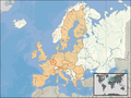 EU loc for small states.
 -
Europe loc for smaller states


Summarising some of the arguments not immediately visible on the maps:
- Scalable Vector is the preferred format for technical reasons
- Wide application and editing would benefit from unconditional release to the public domain
- The maps should be available on WikiCommons.
- Mercator projection should preferably not be used.
Based on all above, my vote goes to the Rei-Artur maps series because they are vector, released to public domain and uploaded on wikicommons, reasonably detailed but not overly so, are limited in the amount of space they require and are not in the mercator projection. Arnoutf 10:15, 20 January 2007 (UTC)
- Hi, I found this page through the AN/I about the map controversy. I did look for the aforementioned Village Pump discussion, but couldn't find one, so I'm posting this here. I don't edit Geography pages much at all, beyond requests for a few towns in the Rhineland-Pfalz of Germany(Check my contribs if needed). I went looking at a few of the EU pages, browsing edit histories, and I wanted to cast my support for the Rei-Artur maps. The pseudo-natural colors are a bit more 'legible' to the less-discerning eye, and the color, overall, attracts the eye. Just my feelings. ThuranX 22:09, 20 January 2007 (UTC)
Also coming here as an innocent bystander, I don't much care about the issue of the EU being colored differently, but the EU maps seem much too detailed for the scale at which they are being used in the articles. The relief colors, rivers, etc. all just make the map much more confusing when it is ~250px wide, without adding much relevant information. Christopher Parham (talk) 22:52, 20 January 2007 (UTC)
as somone who is new to this discussion, I prefer the Rei-Artur maps as they are in .svg format, and don't use the Mercator projection (France shows up as being less than half the size of Sweden, obviously looking incorrect unless you look at it more closely). --Bob 07:38, 21 January 2007 (UTC)
Greece
- The following was moved from Talk:Greece#Map:
The reason I am reverting back to the original map is the discussion over at Wikipedia talk:WikiProject Countries#Location Maps for European countries. In order to maintain some coherence, the decision of which map should be used should be done there. Note however that I am not a member of WikiProject Countries, nor have I participated in that discussion. For a similar discussion, see Talk:Sweden#Which map should we use?. For now, you should all consider changing the map a violation against community consensus. Jobjörn (Talk ° contribs) 10:16, 28 January 2007 (UTC)
- What consensus? On this article? Is there a consensus here to use an ugly map? Is there a Wiki policy about maps? -- AdrianTM 17:10, 28 January 2007 (UTC)
- Besides even on that page I see 23 votes for the new style and 18 for the old style, why do you talk about "consensus" what consensus? -- AdrianTM 17:16, 28 January 2007 (UTC)
- No, it is not a wiki policy - but it has been discussed by the WikiProject "responsible" for ensuring all Wikipedia's country articles are kept in line with each other. How you count 23 for the new and 18 for the old I don't quite understand - the tally is 18 for the old, 11 for the new with EU highlightning, and 14 for the new without EU highlightning. While one could interpret this as "no consensus", a lack of consensus means that it should stay until a consensus has emerged. Furthermore, you argue that there is no consensus here to use either one of the maps - well, there is no consensus to change it, either. The only two who have given an opinion is you, and me, and our opinions are equal. As there is no consensus to change it, it should remain in it's original state until the issue has been settled and a consensus reached. Jobjörn (Talk ° contribs) 18:10, 28 January 2007 (UTC)
- By the way, the tally I'm speaking of is the one found here: Wikipedia talk:WikiProject Countries#Vote. Jobjörn (Talk ° contribs) 18:13, 28 January 2007 (UTC)
- I see 23 for the new design against 18 for the old one. (as I noted in that page dividing new design vote in two is not democratic) -- AdrianTM 19:41, 28 January 2007 (UTC)
- By the way, are "WikiProject" decisions binding for us? -- AdrianTM 19:44, 28 January 2007 (UTC)
- Wikipedia is not a democracy. The "new design" is not one design - that page speaks of two entirely different designs. And if you'd count them as one, the tally would be 18 to 25, not 23... WikiProject (have you not ever heard of a wikiproject?) decisions are "binding" in the sense that they represent a community consensus. Think of them as a centralized discussions. Jobjörn (Talk ° contribs) 19:56, 28 January 2007 (UTC)
- I'm sure that Wikipedia is not a democracy doesn't mean using weasel ways to split the vote... but who knows, believe me, my count was accurate 'at the time I posted. It's 18 to 24 (actually I double voted) so... why use a minority view? Please explain. -- AdrianTM 20:36, 28 January 2007 (UTC)
- Wikipedia is not a democracy. The "new design" is not one design - that page speaks of two entirely different designs. And if you'd count them as one, the tally would be 18 to 25, not 23... WikiProject (have you not ever heard of a wikiproject?) decisions are "binding" in the sense that they represent a community consensus. Think of them as a centralized discussions. Jobjörn (Talk ° contribs) 19:56, 28 January 2007 (UTC)
- "WikiProject (have you not ever heard of a wikiproject?) decisions are "binding" in the sense that they represent a community consensus. Think of them as a centralized discussions." -- the point is that people who edit this page and other didn't even know that there's a vote taking place in other part that affects this page. That's a heck of "consensus". -- AdrianTM 01:20, 29 January 2007 (UTC)
- Well, at the top of this very talk page, there's a huge yellow box saying "This article is part of WikiProject Countries, an attempt to formulate a template for country articles. If you would like to participate, you can edit the article attached to this page, or visit the project page, where you can join the project and/or contribute to the discussion." And even if one would consider your points to be correct (which I still do not), there is still no consensus to actually CHANGE the map - and as thus, no change should be made until a consensus has been reached. I'll revert back to the original map and then I'll list this at WP:3O. Jobjörn (Talk ° contribs) 12:37, 30 January 2007 (UTC)
Third Opinion Without a working knowledge of European geography, I have to say the new maps give a clearer impression of the correct shape of each nation-state, however, this article is about Greece and not Greece's position within the EU so I see where some of the resistance could come from. A good way to resolve this dispute would be to deflect it back to Wikipedia:WikiProject_Countries and retain the old map until a consensus (a mostly-mutual agreement, not a numerical majority) is reached there. Flakeloaf 12:55, 30 January 2007 (UTC)
- How do you reach a "consensus" when people have different opinions? You can hope that people that have different opinion to change their mind or to get bored by the discussion, but the thing is clear, people don't like the old maps and the strange projection used for those old maps (the vote clearly showed that people don't like the old maps, deciding which one of the new maps is used: with or without EU highlighting is another discussion). -- AdrianTM 15:06, 30 January 2007 (UTC)
- Two points: one, the location maps are not for showing the shape of the nation, they are for showing the country's position relative to the rest of the world. A map of the country itself could perhaps be found under the header Geography or Political divisions or perhaps in subarticles dealing with those subjects. Two - AdrianTM, at least I hope you can now agree that on this talk page, the majority decision is to retain the old map until a consensus - or some form of discussion - has been reached. The count is two to one, if tallies make you happy. I've also notified Thulium of this discussion as he reverted away the old map earlier today. Jobjörn (Talk ° contribs) 20:47, 30 January 2007 (UTC)
- So you use weasel polls and counts again... you can't say that 2-1 is "consensus" besides you ignore that somebody else changed that map. If you look for most European countries you'll see the consensus is to use the new maps. -- AdrianTM 20:50, 30 January 2007 (UTC)
- Two points: one, the location maps are not for showing the shape of the nation, they are for showing the country's position relative to the rest of the world. A map of the country itself could perhaps be found under the header Geography or Political divisions or perhaps in subarticles dealing with those subjects. Two - AdrianTM, at least I hope you can now agree that on this talk page, the majority decision is to retain the old map until a consensus - or some form of discussion - has been reached. The count is two to one, if tallies make you happy. I've also notified Thulium of this discussion as he reverted away the old map earlier today. Jobjörn (Talk ° contribs) 20:47, 30 January 2007 (UTC)
I can't tell whether there's an actual policy or consensus on which map should be used (vis-à-vis the non-binding self-made interpretations of certain users), however the new graphically superior maps are still widely used, so may be they should be removed from other articles where it won't be disputed first. Thulium 20:51, 30 January 2007 (UTC)
- In response to both AdrianTM and Thulium:
- AdrianTM, I did not say that 2-1 was consensus. I specificially avoided that word as it would not be true - the term I used was "majority decision", the argument you yourself claimed in favor of the new maps.
- AdrianTM and Thulium, two wrongs do NOT make a right. Using that as an argument is a logical fallacy. I would gladly revert back to the original map on those articles too, but I have better things to do with my life, so I'll stick to watching Greece and Sweden, and some others where the original map still remains.
- The primary reason behind me reverting back to the original maps is not trying to make a WP:POINT, not because I prefer their graphical look, or anything like that - I am simply attempting to uphold a certain standard on Wikipedia, meaning that all Country articles should follow the same graphical guidelines. As it is quite obvious that no consensus has been reached either here OR on the wikiproject countries discussion to change the maps (even if one counts the two new alternatives as one, it'd still not be close to consensus), the original maps should remain in place in the meantime.
- If you care about my personal opinion in this matter, I am against the new images because of their unfree licensing. That, however, is completely irrelevant to what I'm doing here.
- Now, I'll just leave the map be - I have no intent to get into an edit war and violate WP:3RR. I hope you will read this and reconsider. Jobjörn (Talk ° contribs) 22:13, 30 January 2007 (UTC)
The above in this section was moved from Talk:Greece#Map; the following fluently continued on this WikiProject Countries talk page :
- I still don't see the point to use the old maps. There is - according to the vote that took place above - a majority that wishes to use the new ones. Why should there be a "consensus"? How do you define "consensus"? BTW nothing prevents users from Asia, Africa, etc. also to develop their own maps for their continents. The fact that currently there are only new maps available for Europe does not mean that there won't be similar ones for other continents in the future. Luis rib 22:38, 30 January 2007 (UTC)
- You ask: 'Why should there be a "consensus"?' The answer is simple, because it is an official Wikipedia policy (see Wikipedia:Consensus) and is so for good reasons. Note especially the following passage from the policy page: Formal decision making based on vote counting is not how Wikipedia works (see Wikipedia is not a majoritarian democracy) and simple vote-counting should never be the key part of the interpretation of a debate. When polling is used, it should be seen as a process of 'testing' for consensus, rather than reaching consensus. A large minority of the participants in this map poll did prefer the old maps, the poll did not include Rei Artur's SVG maps, participation was low and the debate still rages on ==> no consensus. --Bjarki 23:10, 3 February 2007 (UTC)
- I still don't see the point to use the old maps. There is - according to the vote that took place above - a majority that wishes to use the new ones. Why should there be a "consensus"? How do you define "consensus"? BTW nothing prevents users from Asia, Africa, etc. also to develop their own maps for their continents. The fact that currently there are only new maps available for Europe does not mean that there won't be similar ones for other continents in the future. Luis rib 22:38, 30 January 2007 (UTC)
- Well, thanks for pointing that out. I must confess I wasn't aware of that policy. Still, as you said, the debate is still going on. There is no consensus on the new maps, true, but at the same time there is no consensus anymore that the old maps should be kept (indeed, Rei-Artur maps begin to appear here and there, and the UK at times has its own map style). It somehow seems that this conundrum will not be solved for a while. Luis rib 23:22, 3 February 2007 (UTC)
- The concensus policy is there for good reason, but cannot resolve every problem: There is a need for a map in a country article, I think we may assume consensus for that. There is no consensus which map to use. Solution: majority decision. Else any map must be removed, since Wikipedia is not conservative, see for instance WP:BOLD, and one cannot argue that an existing situation can only change after reaching consensus. Consensus is what we seek to determine whether or not changing and if so whereto; no consensus does not stop WP's existence. — SomeHuman 4 Feb2007 20:08 (UTC)
- No it is not. Wiki is based upon reaching consensus (ie all involved parties being able to live with the solution). If no consensus is reached there is a dispute and majority voting is nowhere to be found in the official Wikipedia:Resolving disputes article; all solutions aim at solutions that all parties may live with (including arbitration by a neutral arbcom). Arnoutf 20:17, 4 February 2007 (UTC)
- In case a consensus cannot be reached, a majority can be accepted by consensus; such consensus is largely expected from people participating at a survey - and I really hope it to be a well argumented one - and people may have changed their opinion since their vote; but as explained elsewhere, it is unlikely that improved maps and freer licence could now show a consensus for old maps. I think that is clear for supporters of those as well. Then accepting a majority from the new survey is by itself a consensus. The alternative is indeed (edit-war or) arbcom. How will that go, do you think, in order to have the best acceptable if not consensus? — SomeHuman 4 Feb2007 20:50 (UTC)
- Let's hope we find a solution, but that will probably involve some giving and taking from all sides (and perhaps a different set of maps). The benefit of arbcom is that they are non-involved editors, so a decision by them maybe acceptable by everyone. Arnoutf 20:54, 4 February 2007 (UTC)
- Hmm, I was absolutely non-involved not so long ago, but when I saw the discussion and its topic, I did have a rather clear point of view and expressed it... The outcome of arbcom might largely depend on the arbitrators, because many people took part in the discussion but we did not see someone bringing arguments based on clear Wikipedia guidelines or policy, except about the former licence and that problem seems solved now. I think arbcom usually decides upon abuses, on this talk page the discussions remained relatively civil; and I do not know whether an arbitration committee would see itself fit to get out of a tie about maps: they would probably have to pick a side without convincing shelter by WP policy, and such tends to weaken the confidence in arbitrators. I hope to get out of an impasse without such: none of the map styles is so great or so terrible that a choice could be worth weakening an institution necessary for dealing with really serious disputes. — SomeHuman 6 Feb2007 19:29 (UTC)
- You are completely right. It has never been my intention to let this get out of hand and go to arbitration, treat above discussion as that of the hypothetical benefits.... Arnoutf 19:43, 6 February 2007 (UTC)
- Hmm, I was absolutely non-involved not so long ago, but when I saw the discussion and its topic, I did have a rather clear point of view and expressed it... The outcome of arbcom might largely depend on the arbitrators, because many people took part in the discussion but we did not see someone bringing arguments based on clear Wikipedia guidelines or policy, except about the former licence and that problem seems solved now. I think arbcom usually decides upon abuses, on this talk page the discussions remained relatively civil; and I do not know whether an arbitration committee would see itself fit to get out of a tie about maps: they would probably have to pick a side without convincing shelter by WP policy, and such tends to weaken the confidence in arbitrators. I hope to get out of an impasse without such: none of the map styles is so great or so terrible that a choice could be worth weakening an institution necessary for dealing with really serious disputes. — SomeHuman 6 Feb2007 19:29 (UTC)
- Let's hope we find a solution, but that will probably involve some giving and taking from all sides (and perhaps a different set of maps). The benefit of arbcom is that they are non-involved editors, so a decision by them maybe acceptable by everyone. Arnoutf 20:54, 4 February 2007 (UTC)
- In case a consensus cannot be reached, a majority can be accepted by consensus; such consensus is largely expected from people participating at a survey - and I really hope it to be a well argumented one - and people may have changed their opinion since their vote; but as explained elsewhere, it is unlikely that improved maps and freer licence could now show a consensus for old maps. I think that is clear for supporters of those as well. Then accepting a majority from the new survey is by itself a consensus. The alternative is indeed (edit-war or) arbcom. How will that go, do you think, in order to have the best acceptable if not consensus? — SomeHuman 4 Feb2007 20:50 (UTC)
- No it is not. Wiki is based upon reaching consensus (ie all involved parties being able to live with the solution). If no consensus is reached there is a dispute and majority voting is nowhere to be found in the official Wikipedia:Resolving disputes article; all solutions aim at solutions that all parties may live with (including arbitration by a neutral arbcom). Arnoutf 20:17, 4 February 2007 (UTC)
- The concensus policy is there for good reason, but cannot resolve every problem: There is a need for a map in a country article, I think we may assume consensus for that. There is no consensus which map to use. Solution: majority decision. Else any map must be removed, since Wikipedia is not conservative, see for instance WP:BOLD, and one cannot argue that an existing situation can only change after reaching consensus. Consensus is what we seek to determine whether or not changing and if so whereto; no consensus does not stop WP's existence. — SomeHuman 4 Feb2007 20:08 (UTC)
- Well, thanks for pointing that out. I must confess I wasn't aware of that policy. Still, as you said, the debate is still going on. There is no consensus on the new maps, true, but at the same time there is no consensus anymore that the old maps should be kept (indeed, Rei-Artur maps begin to appear here and there, and the UK at times has its own map style). It somehow seems that this conundrum will not be solved for a while. Luis rib 23:22, 3 February 2007 (UTC)
Comment from a dazzled Greek
I'd rather talk about the Parthenon and stuff in Talk:Greece, so here's my two drachmae:
This WikiProject has made a lousy job in dealing with this issue. Did it occur to any of you here that the editors dealing with the related articles themselves might actually have a say in all this? I recognize that this is a global WP issue, so here's my proposal:
- Stop deflecting the talk in all sorts of places.
- Construct an unbiased, non-divisive, comprehensive binary (i.e. 2 options NOT more) poll for all your issues. Namely:
- Looks/colors etc of the maps
- EU or not EU
- add yours
- Post a notification in all involved talks of countries for the editors to come and vote/comment.
I'd be happy to help if you agree. NikoSilver 22:31, 30 January 2007 (UTC)
- Such an idea has already occured to other users. See above under "Final Survey". Luis rib 22:40, 30 January 2007 (UTC)
- Excuse me. I'm really interested but I find this too complicated for fresh users to follow. (I couldn't follow it through myself). Just simplify it as follows while there is still time:
- You vote one time for each of the following three questions:
- Map style/colors
- I (link)
- II (link)
- EU-highligh
- Yes
- No
- If yes above then EU highlighted for which countries?
- for all countries of the European continent
- for EU members only
- for EU members and official candidates only
- Map style/colors
- You vote one time for each of the following three questions:
- Then you won't have to add I.c.2. to II.b.3 et al, and the freshly invited users from all involved articles of all European countries will be spared the instruction diatrebe! NikoSilver 01:08, 1 February 2007 (UTC)
- Sorry Niko, I had read this section including Luis rib's reply, and later on did not remember this section name and did not read your last comment until now. The presentation of the survey pointed out by Luis rib, asked to put for criticism in another section... Anyway, the binary would not do so well: as there are no new maps in different colours (except for what your 2nd binary asks for), the 1st binary would repeat the closed poll between 'old' and 'new'. If we would ask people to have that vote once more, this time it should also have a third option: Rei-artur maps. In case none of the three has more votes than both others together, the voters for the style with least votes should then need to be asked to vote between the two remaining styles (2nd round). If then the David Liuzzo maps would obtain a majority, it would be likely for voters of maps without such available, so far to have 'supported' their preference by voting 'No EU-highlighting'. Such preemptive voting might not occur in case they already know the new maps to have been chosen. Thus a fair decision about EU-highlighting would require a third round, which might coincide with the third binary. In fact, the third 'binary' would not be one: the presented 'final survey' offers a third possibility, this again could (like here-above mentioned 1st round three-option choice, require a final 4th round. But someone now asking people who already saw a poll open since November 16, to participate at a three-or-possibly-4-round survey... Not I ;-) — SomeHuman 7 Feb2007 03:26 (UTC)
- Thanks for the attempt to explain, but I'm afraid I need hours of homework before I understand. Anyway, I like this sort of maps. Where specifically do I vote? StillDazzledNiko :-) 15:48, 8 February 2007 (UTC)
- Also, (as a redundant outdated clarification), my previous comment refers to the method for the poll, not to the actual questions that can be asked, and "binary" is not an issue per se, but binary or close to binary helps achieve consensus (60% required -hardly attained when there are many options). NikoSilver 15:53, 8 February 2007 (UTC)
- I thought it was fairly complicated as well. Anyway YOU CAN VOTE HERE. I wish you wisdom ;-) Arnoutf 15:54, 8 February 2007 (UTC)
- I'm sorry, there are infinite codified options there where you direct me. Can someone fix this poll so that it becomes functional? I've noted only a couple of (lengthy) vote+comments (from those extensively involved?) and the poll appears to have started 3 days now! Isn't this an indication that the poll setup sucks? (sorry for shouting -poll formulation should not be a controversial issue anyway) Also, why should I forcefully express my opinion for a sum of irrelevant issues to my interests? (e.g. I don't care to investigate the issue of the older maps for non-European countries!! - let those who do decide that only!) Jeez! NikoSilver 16:09, 8 February 2007 (UTC)
- Sorry, not my idea this specific poll, I agree with you that it is very complex; and made remarks to that effect somewhere else on this page (I have forgotten where....). Arnoutf 16:16, 8 February 2007 (UTC)
- It was deep down "A short(sic) overview of the story", but it's far less complex and a lot faster than your latest suggestion. — SomeHuman 9 Feb2007 18:39 (UTC)
- Sorry, not my idea this specific poll, I agree with you that it is very complex; and made remarks to that effect somewhere else on this page (I have forgotten where....). Arnoutf 16:16, 8 February 2007 (UTC)
- I'm sorry, there are infinite codified options there where you direct me. Can someone fix this poll so that it becomes functional? I've noted only a couple of (lengthy) vote+comments (from those extensively involved?) and the poll appears to have started 3 days now! Isn't this an indication that the poll setup sucks? (sorry for shouting -poll formulation should not be a controversial issue anyway) Also, why should I forcefully express my opinion for a sum of irrelevant issues to my interests? (e.g. I don't care to investigate the issue of the older maps for non-European countries!! - let those who do decide that only!) Jeez! NikoSilver 16:09, 8 February 2007 (UTC)
- I thought it was fairly complicated as well. Anyway YOU CAN VOTE HERE. I wish you wisdom ;-) Arnoutf 15:54, 8 February 2007 (UTC)
- Sorry Niko, I had read this section including Luis rib's reply, and later on did not remember this section name and did not read your last comment until now. The presentation of the survey pointed out by Luis rib, asked to put for criticism in another section... Anyway, the binary would not do so well: as there are no new maps in different colours (except for what your 2nd binary asks for), the 1st binary would repeat the closed poll between 'old' and 'new'. If we would ask people to have that vote once more, this time it should also have a third option: Rei-artur maps. In case none of the three has more votes than both others together, the voters for the style with least votes should then need to be asked to vote between the two remaining styles (2nd round). If then the David Liuzzo maps would obtain a majority, it would be likely for voters of maps without such available, so far to have 'supported' their preference by voting 'No EU-highlighting'. Such preemptive voting might not occur in case they already know the new maps to have been chosen. Thus a fair decision about EU-highlighting would require a third round, which might coincide with the third binary. In fact, the third 'binary' would not be one: the presented 'final survey' offers a third possibility, this again could (like here-above mentioned 1st round three-option choice, require a final 4th round. But someone now asking people who already saw a poll open since November 16, to participate at a three-or-possibly-4-round survey... Not I ;-) — SomeHuman 7 Feb2007 03:26 (UTC)
- Excuse me. I'm really interested but I find this too complicated for fresh users to follow. (I couldn't follow it through myself). Just simplify it as follows while there is still time:
Overuse of progress arrows
I noticed the overuse of the progress arrows ![]()
![]()
![]() in country infoboxes, manely in the HDI field. I'm against their use not only because they mess up the box with flashy colors but because they might be used also for all numbers that appears in the infobox (population, GDP...). It's the problem when Users try to fit too much information in an infobox. Any thoughts? CG 15:25, 31 January 2007 (UTC)
in country infoboxes, manely in the HDI field. I'm against their use not only because they mess up the box with flashy colors but because they might be used also for all numbers that appears in the infobox (population, GDP...). It's the problem when Users try to fit too much information in an infobox. Any thoughts? CG 15:25, 31 January 2007 (UTC)
- I don't see the problem (yet, anyway). When it comes to a rating like the HDI, it seems relevant to show if the number is going up or down. If the use of these arrows spreads into other infobox entries, then I might reconsider, but at the moment, I don't see a problem. Just my thoughts. Valentinian T / C 01:02, 8 February 2007 (UTC)
So-called countries
Are so-called countries, like Abkhazia in this project's scope? - Patricknoddy 4:18pm, January 31, 2007
- I assume only UN recognized countries within the recognized territories should be represented on the maps. If there's an article about a separatist region then is normal to show a map with that region, but otherwise when the article presents the recognized country is should display it in its entirety. -- AdrianTM 21:26, 31 January 2007 (UTC)
Regional Bloc Infobox
I propose that we create a common infobox for all regional blocs, so that we won't have disparities in the way infoboxes appear and are implemented, as you would see if you contrast the two articles Association of Southeast Asian Nations and European Union. However, I know only basic Wikimedia syntax. Ariedartin JECJY Talk 12:27, 1 February 2007 (UTC)
Social issues/human rights abuses
Does this project have a consensus on whether main-level country articles should have sections describing social or human-rights issues? I'm working on getting Cameroon up to FA-level, and I'm not sure if the article should or shouldn't have such a section. My concern is that such a section will most likely consist entirely of negative information about the country and will potentially violate WP:NPOV. Another user recently added such as section to the Cameroon article, but I removed it pending a request for consensus from the folks here. What's considered our best practices? — Brian (talk) 01:38, 3 February 2007 (UTC)
- In principal I like the idea of adding social / human rights issues everywhere, but I don't think every country needs one as bad as any other, if it is truly not an issue in the country, why spend a whole section stating that; this probably means that the countries with the most problems will get these sections more often. Of course if human rights/social issues are truly that bad in Cameroon stating the truth is not really violation of NPOV (is it); otherwise we could remove human right issues from all Nazi articles as well as that would also be almost entirely negative. Arnoutf 08:04, 3 February 2007 (UTC)
- I agree with Arnoutf. A consensus on this WikiProject Countries should not even be the primary concern here: the NPOV policy is not negotiable, one should "simply" abide to its section on undue weight. Articles on countries do not need to be copying one another, an article is not a template. — SomeHuman 3 Feb2007 15:20 (UTC)
- That's the question, though: Is the presence of the section in and of itself a NPOV violation? Note that only two or the featured country articles have such a section. And there is a recommended template that this project has agreed to support; it's on the project page. But I'll go ahead and add the section per your recommendations. Perhaps a bigger question is how does one determine which subsections to create in an article once one strays from this project's recommended template? I note that some country articles include "Eduation", "Military", "Human rights issues", "Ecology", etc., etc., and all of these could conceivably be added to Cameroon's page. But that would make the article too long. What's the solution here? I've never worked on a broad country article like this, so your help and advice is much appreciated. — Brian (talk) 02:26, 4 February 2007 (UTC)
- I agree with Arnoutf. A consensus on this WikiProject Countries should not even be the primary concern here: the NPOV policy is not negotiable, one should "simply" abide to its section on undue weight. Articles on countries do not need to be copying one another, an article is not a template. — SomeHuman 3 Feb2007 15:20 (UTC)
- Of course you could add all those. In general I think much of this information maybe relevant, to mention at least in a single paragraph. Perhaps you can use a summary and create an article where the specific issue is explained in depth (see e.g. the Netherlands). What to take in, that is a tough question and is mainly at the editors discretion, it is a thin line between putting in irrelevant details and creating a (too) long article, and omitting essential information. I think these are choices we all have to make, and the multi-editor involvement in Wiki may help there to balance these questions. Good luck Arnoutf 10:24, 4 February 2007 (UTC)
- That so-called 'template' is in fact a structure, advisory only as the project page explictly states; not a Wikipedia template that enforces an identical structure as part of the article it is used in: an article is not any template but needs to describe its topic as well as possible; it may help to start from a basic sample so as not to forget a section and it makes sense to use a same order of sections unless there would be a very important reason to deviate from it. Depending on the intercontinental and well-sourced perception, and on the historically lasting or highly contemporary character of such, the human rights issue could have an entirely separate section, or be a subsection of for instance - depending on the factual situation in a particular country - 'Politics' (if mainly perceived as caused by or as a clear responsibility of the government), of 'Subdivisions' (if the problem is typical for a specific subdivision), of 'Demographics' (when mentioning religions or ethnicities in case the human rights issue is mainly of such nature) etc., or as a mere paragraph if the problem is notable but not quite the main thing people normally associate with the country or if it appears to be a very temporary issue (other than a near genocide); if such paragraph cannot be clearly associated with one of the specific sections, it can be in the 'Miscelllaneous topic' section (where it might be the main issue of the subsection on foreign relations).
Your real problem is to establish the proper weight to be given by verifying how (recent) general sources e.g. not articles on human rights or at the contrary touristy articles) handle the country and its human rights issues (and compare that with such for other countries), and then verify whether in sources that specifically handle human rights issues, the country has a more or less dominant part. — SomeHuman 4 Feb2007 10:49 (UTC)
- That so-called 'template' is in fact a structure, advisory only as the project page explictly states; not a Wikipedia template that enforces an identical structure as part of the article it is used in: an article is not any template but needs to describe its topic as well as possible; it may help to start from a basic sample so as not to forget a section and it makes sense to use a same order of sections unless there would be a very important reason to deviate from it. Depending on the intercontinental and well-sourced perception, and on the historically lasting or highly contemporary character of such, the human rights issue could have an entirely separate section, or be a subsection of for instance - depending on the factual situation in a particular country - 'Politics' (if mainly perceived as caused by or as a clear responsibility of the government), of 'Subdivisions' (if the problem is typical for a specific subdivision), of 'Demographics' (when mentioning religions or ethnicities in case the human rights issue is mainly of such nature) etc., or as a mere paragraph if the problem is notable but not quite the main thing people normally associate with the country or if it appears to be a very temporary issue (other than a near genocide); if such paragraph cannot be clearly associated with one of the specific sections, it can be in the 'Miscelllaneous topic' section (where it might be the main issue of the subsection on foreign relations).
Turning the map issue upside down
The current debate on the maps show little progress. I suggest to hold a discussion the other way around. Let us just discuss what the new maps need to conform to, and then determine which set of maps fits that best; or perhaps that a new set of maps need to be created. Let me put in a few categories up for discussion. Arnoutf 10:34, 4 February 2007 (UTC)
Discuss your ideal maps below. Please try not to write towards one of the existing maps, but towards a truly ideal map. Feel free to ask more topics. Thanks Arnoutf 10:40, 4 February 2007 (UTC)
Aesthetics
- Colour, scheme, general looks and feel should be discussed here.Arnoutf 10:40, 4 February 2007 (UTC)
Usability
- How should we deal with small countries?
- Where should the map be centered upon, (the country and its neighbours or a larger structure)?
- How detailed should borders and coastlines be defined?
- What other structures should be presented on the map (e.g. ocean depth, mountains, rivers, or none)?Arnoutf 10:40, 4 February 2007 (UTC)
Technical
- What map projection should be used?
- What licensing, and allowance for editing by other editors should be adopted?
- What format (bitmap or vector) should be adopted? Arnoutf 10:40, 4 February 2007 (UTC)
- What is a locator map? To me, a locator map is used in an article about a country to illustrate its location compared with its neighbouring countries. Any more detailed information should be provided either in a separate map further down the article or elsewhere: follow the KISS principle.
- Therefore, the only information on a locator map should be:
- Country to illustrate.
- Neighbouring countries.
- (Optional) large bodies of water.
- Illustrating ocean depths, every river in a country, land elevation, etc. is completely unnecessary for a knowledge of where a country lies. Look up the elevation structure of Switzerland in the Geography of Switzerland article. See the depth of the North Sea in the North Sea article. It is not necessary to add all this information to the locator maps, and just makes for distracting pretty colours and headaches for when the geopolitical situation changes (the status of Kosovo, for instance, will most likely end up affecting all European locator maps).
- It is pretty clear where I stand on current maps suggestions, based on my comments here. I hope my explanation has clarified on why I stand as such, and convince some other people on the necessity of simplicity in this matter. Kelvinc 01:30, 5 February 2007 (UTC)
- I entirely agree with this. Matthew 11:43, 5 February 2007 (UTC)
- I see this from another point (and I'll mention a particular aspect not mentioned lately, if ever, on this talk page), to me the main goal of a locator map is:
- I must easily spot the country to illustrate; not necessarily its shape (not a location matter) but where it is on the map (strong colour contrast helps best). I have no complaints for either 'old', 'Rei-artur', or 'David Liuzzo' style maps, while my eyes are not what they used to be.
- Its location, not as an answer on which are its neighbouring countries (often mainly a political/cultural/economical interest), but on where is it: which continent and where on the continent (north? central? southeast? - those are the terms we normally first use to say where a country is located, its geographical location - though often that will give political/cultural/economical information as well).
- My major new point is that this locating of a country on a continent is not well served if I see an area of the world that I first need to identify, and then still have to figure out scale and which unnamed surrounding countries might those be. The advantage of the David Liuzzo maps is, that a map of any country at the continent shows exactly the same contours of Europe: not only is it by most people immediately recognized as 'Europe', but after once having seen one such map, later I do not need to study it for a second, I'll spot the orange-red dot or spot at first sight and simply know the location.
As the number of continents is very limited and their shapes very distinguishable, that principle would work elsewhere just as well. I cannot visualize the location of a country (unless I already know it) that quickly by the old style or by the Rei-artur style maps. If my interest would not be, or not only be, the location, then clicking a David Liuzzo map shows a large scale map with more details that stands much more chance of fulfilling such (further) interest. (And I'll spot the Alps not only more quickly that way than finding a link to 'Geography of Switzerland', as someone had suggested, but also where the rest of them is.) - Another matter is the often criticized Mercator projection. It has its known disadvantage of blowing up areas towards poles, but my sense of locating something is rather vectoral: I'm the guy that immediately sees a painting hanging just a notch out of line or a slightly leaning door post. For me it's clear that Gibraltar is south of Lands End, not somewhere under Mizen Head - and the old maps get still worse near the poles. A 45 degree angle to the upper right is northeastward; that's how I visually remember a relative location and keep seeing meaning in it. It works on a Mercator projection, not on the 'old' maps. A vectoral distortion further away from the central meridian that gets incredible towards the poles is just as clear as the distortion of a west-to-east distance towards the poles, preference for general usage appears subjective. — SomeHuman 6 Feb2007 00:21 (UTC)
- I see this from another point (and I'll mention a particular aspect not mentioned lately, if ever, on this talk page), to me the main goal of a locator map is:
- Honestly, besides the pretty colours, I have no problems with the DL maps. The license issue is pretty much resolved, and the matter of their implementation wasn't pleasant but it's nothing against the maps themselves. Vector graphics would be much easier, both on servers and scaling, though. The differences in country sizes make should the same continent for each map tricky, but your point is well taken. As for Mercator, I think there are projections that preserve the latitude-longitude grid without the excessive size distortions in Mercator. The problem right now is that there is a very very visually different set of locator maps being suggested for Europe, which would be difficult to transfer to other continents unless the creator is willing to do all this work again for the other continents, which is unlikely. Simplicity and consistency are the main driving forces behind my views. Kelvinc 00:42, 6 February 2007 (UTC)
- Just in order not to mislead outsiders, my usage of 'vectoral' has nothing to do with the technical issue of 'vectoral' graphics (which are not used for the old maps either). I also assume there are better projections: simply put, the Mercator type applied starting from the middle of a particular map (approximately Germany for the European continent) instead of an equatorial view - though I don't know very much about this, I admit). I think that the usage of maps for Europe will rather sooner than later stimulate creation of similar (or even better) maps for other continents, and I assume a few others can do such just as well: but compare the likelihood of such effort while not even knowing whether the work will become used... would it be reasonable to wait until some crazy maniak does that for the whole world? — SomeHuman 6 Feb2007 01:13 (UTC)
- In the absence of a clear consensus and the provision of a generalised solution for all countries (including any outside Europe), it makes no sense to use any version of the new maps, as far as I see it. On top of this, a survey in a wikiproject has shown not to be the best way to create any kind of consensus. I suggest to lay this to rest, restore any old wikipedia standard maps (in order not to break the unity and style of the whole encyclopedia) and revisit the whole issue in six month time at Wikipedia:Village Pump so to gain a broader expose and hopefully a consensuated solution by then. Regards, --Asteriontalk 22:37, 7 February 2007 (UTC)
- Not having a consensus does not change the fact that fewer supported the old maps than the new ones, knowing the arguments like 'unity and style'. Anyway, the green box at top of the 'Final survey' had asked to criticize the survey presentation in #Proposal to close this poll, and since voting became open to Criticism on ongoing new survey, I answered a few points there. — SomeHuman 9 Feb2007 02:53 (UTC)
- Well it is clear brute force, non summarised edits have won. There has never been consensus for a change in maps, none of the technical problems (with which everyone agreed) have been solved nevertheless by stubborn and aggressive editing the new maps have become the standard. Now my challenge mto you all as you apparantely have limitless energy in pushing the maps, solve the main technical problems and provide the maps for world wide implementation within the next year otherwise the locator map issue will be a lasting inconsistency in wiki, and will lead to new controversies in the future (not even the EU article is provided with a 'new style' locator map).Arnoutf 21:53, 2 May 2007 (UTC)
- Ironic, n'est pas? You'd have thought that would have been the first map made...—MJCdetroit 01:47, 3 May 2007 (UTC)
- Well it is clear brute force, non summarised edits have won. There has never been consensus for a change in maps, none of the technical problems (with which everyone agreed) have been solved nevertheless by stubborn and aggressive editing the new maps have become the standard. Now my challenge mto you all as you apparantely have limitless energy in pushing the maps, solve the main technical problems and provide the maps for world wide implementation within the next year otherwise the locator map issue will be a lasting inconsistency in wiki, and will lead to new controversies in the future (not even the EU article is provided with a 'new style' locator map).Arnoutf 21:53, 2 May 2007 (UTC)
- Not having a consensus does not change the fact that fewer supported the old maps than the new ones, knowing the arguments like 'unity and style'. Anyway, the green box at top of the 'Final survey' had asked to criticize the survey presentation in #Proposal to close this poll, and since voting became open to Criticism on ongoing new survey, I answered a few points there. — SomeHuman 9 Feb2007 02:53 (UTC)
- In the absence of a clear consensus and the provision of a generalised solution for all countries (including any outside Europe), it makes no sense to use any version of the new maps, as far as I see it. On top of this, a survey in a wikiproject has shown not to be the best way to create any kind of consensus. I suggest to lay this to rest, restore any old wikipedia standard maps (in order not to break the unity and style of the whole encyclopedia) and revisit the whole issue in six month time at Wikipedia:Village Pump so to gain a broader expose and hopefully a consensuated solution by then. Regards, --Asteriontalk 22:37, 7 February 2007 (UTC)
- Just in order not to mislead outsiders, my usage of 'vectoral' has nothing to do with the technical issue of 'vectoral' graphics (which are not used for the old maps either). I also assume there are better projections: simply put, the Mercator type applied starting from the middle of a particular map (approximately Germany for the European continent) instead of an equatorial view - though I don't know very much about this, I admit). I think that the usage of maps for Europe will rather sooner than later stimulate creation of similar (or even better) maps for other continents, and I assume a few others can do such just as well: but compare the likelihood of such effort while not even knowing whether the work will become used... would it be reasonable to wait until some crazy maniak does that for the whole world? — SomeHuman 6 Feb2007 01:13 (UTC)
- Honestly, besides the pretty colours, I have no problems with the DL maps. The license issue is pretty much resolved, and the matter of their implementation wasn't pleasant but it's nothing against the maps themselves. Vector graphics would be much easier, both on servers and scaling, though. The differences in country sizes make should the same continent for each map tricky, but your point is well taken. As for Mercator, I think there are projections that preserve the latitude-longitude grid without the excessive size distortions in Mercator. The problem right now is that there is a very very visually different set of locator maps being suggested for Europe, which would be difficult to transfer to other continents unless the creator is willing to do all this work again for the other continents, which is unlikely. Simplicity and consistency are the main driving forces behind my views. Kelvinc 00:42, 6 February 2007 (UTC)
Gibraltar
There is a considerable difference between Gibraltar and the Canary Islands. As Asterion says these are an integral part of Spain, albeit as far away as Gibraltar is from the United Kingdom. However Gibraltar is not part of the UK except for EU purposes. Apart from this, Gibraltar has its own Internet tld and exists as a seperate entity to the UK. You pass through UK immigration and Gibraltar immigration when transiting between the two places.
--Gibnews 18:28, 26 February 2007
Four unassessed articles.
It looks like something is wrong with the template added to article talk pages. If no rank is given, the template gives a default value indicating "This article has been rated as NA-Class on its quality ", which can't be correct. I've cleaned up the template on the affected articles, but they still need assessment. This affects Iceland, Iraq, Kuwait, and Tuvalu. Valentinian T / C 10:18, 7 February 2007 (UTC)
People's Republic of China FAR
People's Republic of China has been nominated for a featured article review. Articles are typically reviewed for two weeks. Please leave your comments and help us to return the article to featured quality. If concerns are not addressed during the review period, articles are moved onto the Featured Article Removal Candidates list for a further period, where editors may declare "Keep" or "Remove" the article from featured status. The instructions for the review process are here. Reviewers' concerns are here. SandyGeorgia (Talk) 17:22, 7 February 2007 (UTC)
Motion to strike
This poll that is taking place here is too complex and too ill-formatted:
- The voters are required to study a diatrebe of instructions.
- The voters are obliged to vote for combinations of multiple issues. This is obligatory, even if they may not wish to express an opinion on certain issues! I'd resort to random voting for those issues that don't concern me!
- As an indication, only 3 users (the immediately involved?) have voted since it started (3 days now) compared to the c.40 that voted on the previous.
I propose:
- We cancel this poll while it's still early (in terms of votes).
- We throw several polls; each poll for each issue.
- We invite all WP:XX (where XX=country) and post messages to all talks of all counties concerned. NikoSilver 11:15, 9 February 2007 (UTC)
- and conduct the polls here (or central spot), and centralize everything here. Corticopia 22:56, 8 February 2007 (UTC)
I hereby declare that I boycott this procedure because I refuse to vote on issues I'm not interested/educated/aware/eager-to-learn etc in order to also express my opinion for those that I do care. Anybody who agrees is welcome to sign below, and I promise I'll do my democratic best to help sort this complicity out with a decent poll!NikoSilver 16:41, 8 February 2007 (UTC)
- ..."The first part of the party of the first part shall be known in this contract as the first part of the party of the first part..." Now, seriously, this is completely mental. Either we get a simpler poll or we let this to rest as I proposed above. Asteriontalk 21:11, 8 February 2007 (UTC)
- Sorry, I agree -- the current poll is too complex and too limiting (e.g., not addressing original flawed interpretation justifying newer maps, excluding Rei Artur's maps), and should be scuttled/devised anew. Corticopia 21:29, 8 February 2007 (UTC)
- Furthermore, the vote is nearly unfindable, tucked away somwhere in the middle of the page, and the options do not include the Rei Artur maps as far as I can tell, which have been quite well received lately, and would be my choice. -- Eugène van der Pijll 22:19, 8 February 2007 (UTC)
- I have to agree. I tried to find out where to place my vote, but I couldn't find the place. The breakdown into so many minutely different options is really confusing and too much hair-splitting in my opinion. And I don't see an option for "Scrap 'em all and use the classic maps". — Brian (talk) 22:35, 8 February 2007 (UTC)
- I agree with this motion...the poll is poorly structured, both in the sense that it excludes popular options (which may serve as a useful basis for developing consensus), and in the sense that the options are barely comprehensible -- "for any country for which the new style map is or (with equally appropriate licence) becomes available but even for a member of the European Union without indicating the EU in any way." could be interpreted any number of ways. Christopher Parham (talk) 10:41, 12 February 2007 (UTC)
The green box at top of the 'Final survey' had asked to criticize the survey presentation in #Proposal to close this poll, and since voting became open the green box linked to Criticism on ongoing new survey, I answered a few points there. — SomeHuman 9 Feb2007 02:49 (UTC)
Method
SomeHuman, please! This is just not workable! More people have expressed agreement to that, than have actually voted above!! Let's work together and list the issues below. I'm making an attempt, please correct me:
1. Type of maps:
- Ray Arthur's
- David Liuzzo's
- Whoever Else's
2. EU:
- Not higlighted
- Highlighted
3. If EU highlighted:
- Highlighted for EU members only
- Highlighted for EU members and candidates
- Highlighted for all European states irrespectively
4. Non European countries:
- Same as European (whichever is chosen)
- Different than European (will be decided in different poll)
Now if we make 4 polls, per above, (and per whatever else I may have missed), I'm sure the results will be non-ambiguous, and they will need no further interpretations! Plus, users not concerned with either of the issues above, may just not vote for those issues, while expressing their opinion for the ones that do concern them. Finally, as a bonus, users won't have to be the New York Times crossword puzzle 60" solvers to participate!
Let's just comment on the poll method first, and then we see which issues and options are eligible for listing. Does everybody agree that the above method will help build consensus? NikoSilver 10:59, 9 February 2007 (UTC)
- That method seems much better! --Boivie 11:02, 9 February 2007 (UTC)
- NikoSilver had suggested the multiple-round poll before and by the anwers should realize its intrinsic caveats. The first selection by NikoSilver would require each voter's second-choice indication as well. The suggestion to 'archive the whole thing and start afresh' cannot be taken seriously: the first poll started in November and was decisive in chosing between map styles. Rei-artur maps came too late in the discussion, and my answers in the subsection linked in my earlier comment above, point out Rei-artur maps to have severe problems as well (follow the links in that subsection).
There could well be a new fresh start (properly designed, presented, discussed and agreed upon before voting starts) when new maps would become available that address the problems that neither 'old', 'David Liuzzo' or 'Rei-artur' maps tackle properly; meanwhile there are location maps at countries's articles. The current survey continues to find a minimal consensus for what to do with those articles regarding what remained totally undecided by the first poll. (25:18 for new maps is workable especially as new maps became improved and obtained a better licence and thus one has no reason to expect a new poll to reverse that preference; 13:12 on where to apply which version of new maps was not workable). The current survey runs for a short time and will give a practical solution till really good maps are no longer pure science fiction, and those may stand a chance to gather consensus instead of a majority-of-the-month. — SomeHuman 9 Feb2007 14:03 (UTC)
- NikoSilver had suggested the multiple-round poll before and by the anwers should realize its intrinsic caveats. The first selection by NikoSilver would require each voter's second-choice indication as well. The suggestion to 'archive the whole thing and start afresh' cannot be taken seriously: the first poll started in November and was decisive in chosing between map styles. Rei-artur maps came too late in the discussion, and my answers in the subsection linked in my earlier comment above, point out Rei-artur maps to have severe problems as well (follow the links in that subsection).
- I think Niko has a good point. Although I would make his structure slightly different sorry slightly more complex but now only binary choices. Ie a majority will be more easily gained.
- 1. Type of maps:
- No change keep the old maps
- New maps
- 1.a. Two new maps styles are available, which do you prefer at this time (note you are allowed to vote even if you favour the old maps, these votes will ONLY be considered if the new maps are favoured)
- DavidLiuzzo's (include image example)
- Rei Artur's (include image example)
- 2. EU:
- Not higlighted
- Highlighted
- 3. If EU highlighted:
- Highlighted for EU members only (the status of candidate members to be discussed on their own article)
- Highlighted for all European states irrespectively
- 4. Non European countries:
- Same as European (whichever is chosen)
- Different than European (will be decided in different poll)
- Or something like this
- As a post-scriptum. I suggest to collect all topics of the map issue into a single map-discussion archive, and leave a short summary, with a hyperlink to the archive on this page. Arnoutf 17:02, 9 February 2007 (UTC)
- As a good map is not available, better set out issues (how to get near distortionless projection for each country; identical large area per continent/American subcontinent/Middle East that makes it easy to locate each country in its typical reference area, or else a per country separate small area with country central and only (part of) neigbouring countries; in the first case, how to indicate small countries; in the latter case, should names of the neighbours occur; sufficient dark/light contrast for colours that might otherwise confuse the colour-blind, while colours should be intuitive for water/land areas; all maps having toponomical details (major rivers, mountain ranges, large lakes within a country) or better having a set of maps without these details for location as well as an identical set with such details; in the latter case, does WP offer a technique to show the simple map in the infobox but the large detailed map if one clicks on that small one; the advantage of scalable vector graphics (is svg also required for a small map version designed for being shown only at a fixed scale in infoboxes?); ...
Then new maps can be created and after proper presentation be discussed. NikoSilver's and Arnoutf's suggested multi-sequence polls would keep us running around in circles forever: if anything was proven so far, it is that none of the (partially) available maps can gather a real consensus. A few choices have to be made, most unsatisfactory aspects however do not require a compromise but just a good design. Take care of that before having people voting once more while not even having proper licences or svg etc which makes people choose maps for reasons that should be made irrelevant in the first place. And the EU highlighting would be either a de facto accepted thing, or should be determined only after having proper and no longer disputed maps for at least the European continent and best for the entire world. — SomeHuman 9 Feb2007 18:39 (UTC)
- As a good map is not available, better set out issues (how to get near distortionless projection for each country; identical large area per continent/American subcontinent/Middle East that makes it easy to locate each country in its typical reference area, or else a per country separate small area with country central and only (part of) neigbouring countries; in the first case, how to indicate small countries; in the latter case, should names of the neighbours occur; sufficient dark/light contrast for colours that might otherwise confuse the colour-blind, while colours should be intuitive for water/land areas; all maps having toponomical details (major rivers, mountain ranges, large lakes within a country) or better having a set of maps without these details for location as well as an identical set with such details; in the latter case, does WP offer a technique to show the simple map in the infobox but the large detailed map if one clicks on that small one; the advantage of scalable vector graphics (is svg also required for a small map version designed for being shown only at a fixed scale in infoboxes?); ...
Straw Poll
Users with more than 20 edits prior to Feb 1st, 2007 are eligible to vote. Poll ends Feb 14, 2007 midnight UTC.
Statement: Scrap existing poll taking place right now above because it's complex, ill-formatted and forces users to vote for multiple issues for some of which they may not be willing to do so; and implement multiple simultaneous polls that will result after healthy discussion per the above methods described by NikoSilver and Arnoutf.
Sign below in the respective column if you agree or disagree with the above statement:
Support
- NikoSilver 21:13, 9 February 2007 (UTC)
- Make it a quick, straight slice. Corticopia 00:57, 10 February 2007 (UTC)
| class="col-break " |
Oppose
Comments to straw poll
- Per my position in #Motion to strike section right above. NikoSilver 21:13, 9 February 2007 (UTC)
- No straw poll here would reach consensus, no matter how it is rephrased. At the moment, the ongoing one does not lead the voter through closed options. No proper debate can take place when people stop assuming good faith and accussing others of sabotage. In all honesty, I am not sure whether a wikiproject talk page is the right place to discuss all this. Also a reminder that Wikipedia is not a Democracy, so this is not about "the new maps got more votes than the old ones", but on trying to reach a workable solution. IMHO, Liuzzo's maps have proven in the past far too controversial to be considered in this sense (you only need to revisit any country edit history to come to realise). Therefore, I insist we take this somewhere else, opening a Request for Comments, properly announce it and stop voting at all. Regards, Asteriontalk 11:38, 10 February 2007 (UTC)
- A Request for Comments could hardly bring something that has not yet been presented as comment. Perhaps you should have a look rather deeper down in this talk page's section 'Greece': the discussion about 'consensus' and where also Arbitration Committee had been considered. — SomeHuman 10 Feb2007 14:20 (UTC)
Sabotage attempt
It's bad enough if one cannot accept the outcome of a poll at which 46 people took part while it was open for 2 1/2 months. It's worse to disrupt an ongoing survey that was presented in detail a week before it started, while it had provided ample room for criticism. It's simply ridiculous for one editor today having tried to reach two to four others, to put up a poll to strike the survey on which already eight people voted in less than 5 days time, and which is to close by itself in another 11 days. Thereafter, provided the outcome would not clearly show it to be inappropriate, the dissatisfied editor(s) might run the multi-sequence series of polls that were presented just today. Remember that the current survey was left open to prior discussion after being presented, for a duration not much less than it takes from today till the closing of the current survey. Trying to strike the latter and/or launch a newly designed poll instead before the current is closed, is a clear sabotage attempt and disrupting normal Wikipedia procedure, and cannot possibly result in obtaining any consensus whatsoever. — SomeHuman 9 Feb2007 22:18 (UTC)
- SomeHuman, I ... have .... no ... idea ... about ... the ... previous ... poll's ... results. If you feel that the interpretation of these results makes certain questions or options in my proposed #method non-eligible, feel free to remove them. Now this poll running up there, is totally mental. Just simplify the darn thing!
- As a side note, your comment is rather insulting, and I suggest you revise. Also, your poll forces people to vote on things they don't want (along with the things they do want). This is highly un-democratic! NikoSilver 22:46, 9 February 2007 (UTC)
- You had created a new section for a multi-stage suggestion, to which a quick response came (quote): "Such an idea has already occured to other users. See above under "Final Survey". Luis rib 22:40, 30 January 2007 (UTC)" (end quote). You then rephrased your suggestion, but still did not make any comment in the section linked from the green Final survey box that asked for reactions before the survey would be open. The next reaction on your suggestion came not before the third day that the current survey was opened, and was from me arguing not to agree with your suggestion. Your concerns had 0 (zero) support, till it was too late as several users already had voted. On the fourth day of the survey, the next user reacted (quote): "I thought it was fairly complicated as well. Anyway YOU CAN VOTE HERE. I wish you wisdom ;-) Arnoutf 15:54, 8 February 2007 (UTC)" (end quote). Thus all three users that appear to have noticed your suggestion explicitly referred you towards the survey you call totally mental.
And yet, you started another new section "Motion to strike"... and you call my poll "highly un-democratic"... As can be expected after my calling in about 70 people ever having shown a relevant interest, including those of an opinion very different from both the outcome of the first poll and of my own opinion, and whom I had provided links to each relevant section including the one with your suggestion on their talk page, a few people supported you.
Today (actually yesterday, it's that late now), you once more started a new section attempting to strike a survey that had 8 voters by then... — SomeHuman 10 Feb2007 01:53 (UTC)
- You had created a new section for a multi-stage suggestion, to which a quick response came (quote): "Such an idea has already occured to other users. See above under "Final Survey". Luis rib 22:40, 30 January 2007 (UTC)" (end quote). You then rephrased your suggestion, but still did not make any comment in the section linked from the green Final survey box that asked for reactions before the survey would be open. The next reaction on your suggestion came not before the third day that the current survey was opened, and was from me arguing not to agree with your suggestion. Your concerns had 0 (zero) support, till it was too late as several users already had voted. On the fourth day of the survey, the next user reacted (quote): "I thought it was fairly complicated as well. Anyway YOU CAN VOTE HERE. I wish you wisdom ;-) Arnoutf 15:54, 8 February 2007 (UTC)" (end quote). Thus all three users that appear to have noticed your suggestion explicitly referred you towards the survey you call totally mental.
- Please note that I have voiced my concern about the impossibility of opponents of any map change (mind you a minority; but not a small minority) are not presented with a choice in your poll that reflects their sentiment. I did this well before the poll opened; but you decided not to include an option - None of the above.
- Just let me suggest this: Let the poll run its due course (close on feb 21 as announced). Then try to interpret the votes. That will be hard enough as there appears to be some argumented (ie more than I don't like the colors) criticism on the maps, and it also appears David Liuzzo is not happy to overhaul his maps; whatever we do here. Arnoutf 08:41, 10 February 2007 (UTC)
- As I had answered your concern: with a number of opponents of David Liuzzo maps, a single 'None of the above' option is bound to have more votes than any single one of the 7 options for how to use David Liuzzo maps. The so far only supporter of NikoSilver's straw poll to strike the 7-options survey had before that survey openened already objected to counting the first poll's two options for David Liuzzo maps together (25 votes) because the single 'old' map option had more votes (18) than either of the two (13 and 12). That split of options by an opponent of David Liuzzo maps had been strongly criticized by several voters of the first poll who saw this as an unfair attempt to make the single 'old' maps option appear to be most supported. The current survey builds on the result of the first poll, allowing also opponents to vote for the best or least bad of the options that remained; it does not attempt to keep repeating the first poll and definitely not the flaw that was by an 'old' map supporter build into its design. We know that 18 preferred the 'old' maps, 25 the David Liuzzo maps; in case we would now obtain for instance 31 votes for all 7 options together, this would not mean that 'new' versus 'old' would have come at a 31:18 ratio, for all we know that stays 25:18. The current survey just tries to get out of the first poll's impasse of 13:12, while offering not just the 2 options for 'new' that had been shown not even to offer the actual preference of some David Liuzzo map supporters. — SomeHuman 10 Feb2007 12:07 (UTC)
- Note that I expect and hope choice b (I.b.1., I.b.2. and II.b) to stand little chance, but we should not disallow the possibility, hence the more complex set of options. By democratically correctly inviting not only the first poll's supporters of 'new' but also supporters of 'old' maps —as the latter did not offer EU highlighting— I'm afraid the non-EU highlighted option c (I.c. and II.c) is more likely to be the final outcome. That's a fair consequence as democratic polling is concerned; though to my opinion it highly incorrectly breaches NPOV towards EU matters, and on November 2, 2006, before the first poll, NikoSilver had most clearly expressed to share that aspect of my opinion. Nevertheless, if I can't convince others, I'll simply have to accept whatever (even if little) consensus that may be the outcome. — SomeHuman 10 Feb2007 13:17 (UTC)
- Your suggestion is precisely in line with my own expectation: I already pointed out at several occasions that none of the available map styles is really good; but till there are clearly better ones, we still need location maps and the current closed-options survey allows making a decision for the time being. We shouldn't blame David Liuzzo, his maps are rather well accepted on some other than the English-language Wikipedias; the licence allows anyone to make adjustments, though I think one (or David Liuzzo himself) cannot start from his maps because the projection is at least here not well received and that is the basis for any style of maps — see under the invitation there and my first comment here. — SomeHuman 10 Feb2007 12:47 (UTC)
- You "invited 70 persons" and only 6 unrelated users have voted in 5 days... That's is simply pathetic. Reading and responding to your humongous comments (like reading and understanding the humongous poll instructions) will not help either of us. I quit. Have it your way. I really don't care so much anyway. NikoSilver 20:34, 10 February 2007 (UTC)
- Playing naive? As three had voted before, the 69 by February 7, 2007 20:44 (UTC) informed about the results of the first poll while being asked to first thoroughly examine argumentations and discussions before finally making up their mind and vote, included you. You put up your 'Motion to strike' at February 8, 2007 16:41 (UTC) (see [3], you later modified it and changed the date), well before I had modified the infocomments to clearly invite everyone with a direct link to the vote section by February 9, 2007 00:36 (UTC). When people go check an invitation and spot there is a very recent 'Motion to strike', one cannot expect many to vote immediately — the 5 votes on February 9, 2007 between 00:47 & 16:17 (UTC) then were many considering all these European times for maps of the European continent (and 46 voters in 77 days for the first poll). So far, no-one voted after your putting up the 'Straw Poll' of February 9, 2007 21:13 (UTC). Mission accomplished, why should you care. Perhaps a few people will still have a look later on and are wise enough to see here above that you had acted alone and realize that taking away a rail in front of on oncoming train, is not generally considered to be very nice, and doing it twice (having one supporter)... another act of good faith regarding the eight passengers that survived? — SomeHuman 11 Feb2007 02:01-02:06 (UTC)
- SomeHuman, I really don't understand why you keep supporting this carnival of a poll. As you pointed out, we don't disagree on the poll option supported. It's the poll method that is crazy. I just want to help de-sabotage, a self-sabotaged poll.
- Re "un-democratic", you haven't explained: How can I vote on the map that I wish for the European countries without expressing opinion also on the non-European countries? How can I vote on whether I want EU highlighted without selecting a particular map design? Aren't these four issues totally unrelated? Why do I definitely have to express opinion on all of them, rather than some of them?
- These are independent issues, and I believe that the reason you had so little response (apart from the insane poll complexity) is that people don't want to be forced to respond on issues for which they're not educated or interested to do so. So kindly spare us the witch-hunt on why this charade went wrong in the first place.
- When this finishes, I look forward in cooperating with you in order to establish indisputable consensus by means of a method that doesn't force people choose irrelevant options randomly in order to vote for the options that do concern them. I would further advise you be more Laconic. Greeks say that's where the true philosophy lies. NikoSilver 09:49, 11 February 2007 (UTC)
- This survey builds on results of the first poll, and those David Liuzzo maps exist only for Europe. It appears that David Liuzzo is working at maps for the Middle East. Perhaps other people might adapt that style for other continents. We don't like the edit-warring as you know very well from the Greece article (you moved the section from its talk page here). Hence we try to find out whether one tends to accept new maps to replace 'old' style maps as soon as maps in the David Liuzzo style become available, or else better to have these properly presented and discussed before putting them in articles. That's the choice between I and II. (For Europe, that choice was made by the first poll.)
There are only 2 versions of David Liuzzo maps; these are identical except that on one version, the European Union is so-called highlighted (in fact shown in a light orange shade, while the one specific country of each map is deep orange as always). Thus in particular for the European continent (the only maps now available) we need to know for which countries to use the version with EU highlighted, for which countries the other version. That means that in fact mainly the practical choices are I.a or II.a, or I.c or II.c. For completeness in the light of future development and to avoid another discussion then, I.b (.1 and .2) and II.b are offered as well. I don't say you should vote for option I (which as you seem to express, gives a kind of blanco cheque to use future maps): like I expressed in my own vote for II, such maps can better be presented and discussed first. By your comments of early November, I would expect your vote in the same choice of a/b/c as my own, definitely not on c.
When this all ends (and it will be soon, the survey specifically intends to give a practical solution on the short term), as all available maps have serious flaws, polling 'which maps' or 'which version' is not to be our primary concern: we need to find a consensus on what we expect from a location map, and thus we can guarantee that someone going through the trouble of creating a decent map, will see the result of his/her work being used. Calling off the sequence of first poll and current survey, or starting another sequence - even if it were better designed - cannot deliver good maps on which we can find a proper consensus, thus we cut through that phase quickly and live with the result for some time, which offers an opportunity of building a better result as soon as possible. — SomeHuman 11 Feb2007 14:01 (UTC)
- This survey builds on results of the first poll, and those David Liuzzo maps exist only for Europe. It appears that David Liuzzo is working at maps for the Middle East. Perhaps other people might adapt that style for other continents. We don't like the edit-warring as you know very well from the Greece article (you moved the section from its talk page here). Hence we try to find out whether one tends to accept new maps to replace 'old' style maps as soon as maps in the David Liuzzo style become available, or else better to have these properly presented and discussed before putting them in articles. That's the choice between I and II. (For Europe, that choice was made by the first poll.)
- Playing naive? As three had voted before, the 69 by February 7, 2007 20:44 (UTC) informed about the results of the first poll while being asked to first thoroughly examine argumentations and discussions before finally making up their mind and vote, included you. You put up your 'Motion to strike' at February 8, 2007 16:41 (UTC) (see [3], you later modified it and changed the date), well before I had modified the infocomments to clearly invite everyone with a direct link to the vote section by February 9, 2007 00:36 (UTC). When people go check an invitation and spot there is a very recent 'Motion to strike', one cannot expect many to vote immediately — the 5 votes on February 9, 2007 between 00:47 & 16:17 (UTC) then were many considering all these European times for maps of the European continent (and 46 voters in 77 days for the first poll). So far, no-one voted after your putting up the 'Straw Poll' of February 9, 2007 21:13 (UTC). Mission accomplished, why should you care. Perhaps a few people will still have a look later on and are wise enough to see here above that you had acted alone and realize that taking away a rail in front of on oncoming train, is not generally considered to be very nice, and doing it twice (having one supporter)... another act of good faith regarding the eight passengers that survived? — SomeHuman 11 Feb2007 02:01-02:06 (UTC)
- You "invited 70 persons" and only 6 unrelated users have voted in 5 days... That's is simply pathetic. Reading and responding to your humongous comments (like reading and understanding the humongous poll instructions) will not help either of us. I quit. Have it your way. I really don't care so much anyway. NikoSilver 20:34, 10 February 2007 (UTC)
- I had to revert your totally undiscussed modification of the current survey: First of all, you mispresented II.a as if it would not have the Eu highlighted; it has the members highlighted (exactly like I.a). Second: the style of presentation was open to discussion before the survey opened and (by lack of criticism) was accepted as it is. Options of a survey that is open should never be reworded while it is going on; it is too late then and is bound to cause disputes on interpretation - unless a clear flaw can be helped but only after a short discussion with people that designed and examined it. Third (in fact closely related to Second): you offer as text what is your major concern (EU highlighted or not) but you do not express the choice between I and II: people in favor of highlighting the EU would tend to automatically take your first title to say it all and thus vote under I.a while in fact II.a offers an identical choice as far as highlighting the EU is concerned: the headings invalidate the choice between I and II. Fourth: Its complexity is why the options are first presented as a group of 7, to have a good overview and make proper distinction there, make one's choice, and only then go to that option and vote. Having subtitles invites people to pick from the incomplete information by headings shown in the 'Contents' box at top of the talk page, and directly jump to what there appears fit. (The latter is a problem for many polls: Wikipedia should offer a way to jump from the presentation towards the appropriate vote, without automatically showing that link in the 'Contents' box as well). — SomeHuman 11 Feb2007 14:01 (UTC)
- Jesus, I don't understand a word. May the force be with you. NikoSilver 17:22, 11 February 2007 (UTC)
- Calling upon either supernatural phenomenon, may not bring understanding; try reading. ;-) — SomeHuman 11 Feb2007 19:26 (UTC)
- Sorry SomeHuman, but I understand Niko here, your prose is often very complex and hard to read. If people don't understand a written message there are two options. (1) the reader is stupid andor lazy (2) the author wrote an incomprehensiblelong/complex text. Assuming option 1 is not true (or otherwise you would find another way to spend your time compared to editing Wiki)....... Arnoutf 21:04, 11 February 2007 (UTC)
- Thank you Arnoutf. I did address NikoSilver, in immediate response of his edit comment Λακωνίζειν εστί φιλοσοφείν as well as thereafter. ;-) — SomeHuman 11 Feb2007 22:08 (UTC)
- It says Lakonizein, not Cryptographein (and that includes the poll instructions). NikoSilver 22:18, 11 February 2007 (UTC)
- I thought I had made up for my 11 Feb2007 14:01 texts, at 19:26 (UTC). ——— Anyway Niko, the lengthy text tried to answer your questions: the EU highlighting is only available for David Liuzzo maps; his maps exist without EU highlighting as well; his map style had most support by the first poll; his style is only available for countries in Europe; he is working at similar maps for the Middle East. Thus it is hard to separate issues while 1) ensuring a practical solution for immediate needs (stopping edit wars), 2) prevent edit-warring once again in the (near) future, and 3) prevent calling in people to vote too many times while some are dissatisfied for keeping another new style of maps (Rei-artur) out [not yet available when the first poll started, no EU highlighted version, a projection worse than David Liuzzo maps that many had criticized for the projection]. I did not see an elegant solution.
Really hoping to cooperate, primarily in establishing priorities for a properly designed set of maps; if we can get those made, polling for a consensus will be much easier. — SomeHuman 12 Feb2007 01:09-02:21 (UTC)
- I thought I had made up for my 11 Feb2007 14:01 texts, at 19:26 (UTC). ——— Anyway Niko, the lengthy text tried to answer your questions: the EU highlighting is only available for David Liuzzo maps; his maps exist without EU highlighting as well; his map style had most support by the first poll; his style is only available for countries in Europe; he is working at similar maps for the Middle East. Thus it is hard to separate issues while 1) ensuring a practical solution for immediate needs (stopping edit wars), 2) prevent edit-warring once again in the (near) future, and 3) prevent calling in people to vote too many times while some are dissatisfied for keeping another new style of maps (Rei-artur) out [not yet available when the first poll started, no EU highlighted version, a projection worse than David Liuzzo maps that many had criticized for the projection]. I did not see an elegant solution.
- It says Lakonizein, not Cryptographein (and that includes the poll instructions). NikoSilver 22:18, 11 February 2007 (UTC)
- Thank you Arnoutf. I did address NikoSilver, in immediate response of his edit comment Λακωνίζειν εστί φιλοσοφείν as well as thereafter. ;-) — SomeHuman 11 Feb2007 22:08 (UTC)
- Sorry SomeHuman, but I understand Niko here, your prose is often very complex and hard to read. If people don't understand a written message there are two options. (1) the reader is stupid andor lazy (2) the author wrote an incomprehensiblelong/complex text. Assuming option 1 is not true (or otherwise you would find another way to spend your time compared to editing Wiki)....... Arnoutf 21:04, 11 February 2007 (UTC)
- Calling upon either supernatural phenomenon, may not bring understanding; try reading. ;-) — SomeHuman 11 Feb2007 19:26 (UTC)
- Jesus, I don't understand a word. May the force be with you. NikoSilver 17:22, 11 February 2007 (UTC)
[resetting indent]
SomeHuman, that's exactly where our misunderstanding lies. We have fundamentally different views on the approach for this issue. Your approach starts from what I consider to be the end. Let me explain:
Map makers in WP have started to create maps without knowing what they're supposed to do: Some have highlighted EU, some have not. Some make vectors, others make bitmaps... It is time for WP to set the standard for how maps should look like. Then, all those people's work will not be in vain! They won't have to adapt their maps to our peculliarities every time. Having created numerous maps myself, I understand their frustration and disappointment, because this is a very tedious business! The worst part is when people come to criticize your hard work.
Starting from the maps at hand is also bad for the project because it forces us limit our expectations and makes us weigh incompatible issues. For example, one may resort to accept highlighting the EU contrary to his opinion, because he just likes the style and color better.
Now, if these map-makers had specific guidelines, then the only issue to discuss would be a beauty contest. I long for this guideline formulation so as to free the hands of our (apparently numerous) artists, and help them work in a direction where their hard effort is more likely to be appreciated and distinguished. NikoSilver 11:22, 12 February 2007 (UTC)
- NikoSilver, you're idea that "We have fundamentally different views on the approach for this issue" is most incorrect: our views on a proper approach are identical. (See my 1st paragraph here, my 2 comments here, my comment of 12:08-12:16 here, my comments of 00:21 & 01:13 here, and clearly the very last sentence of my latest comment here above — please do take the time read these references). It is precisely why I let the current survey quickly finish what was started in November (before I came to this page) by the first poll. That process does need some outcome to serve while determining what would be better maps and making those.
Our differences lie in my acceptance of reality having gone a wrong way while keeping such as short as possible, and your attempt to strike that process while it is near its end of 3 months of discussions and voting.
I say, starting afresh can obtain a proper consensus more easily and quickly after (as everyone sees) an imperfect outcome, than by abruptly rejecting methods that people had trusted so as to discuss and vote. It's not healthy for people to have the impression that their efforts have been futile, because neither is a proper set of maps clearly displayed nor a decision made about less perfect maps. — SomeHuman 12 Feb2007 15:41 (UTC)
Projections
About projections. The Rei-artur maps are basically zoomed in versions of Image:World map pol 2005 v02.svg in Robinson projection. The "zoomed-in" explains why some lakes are strangely shaped (it's easy to fix in some SVG editor), and the projection explains why some parts of the world looks strange, like Chile, Alaska and New Zeeland. For Europe, Middle East and Africa the Robinson projection is good. The Liuzzo maps are in the Mercator projection, which is good for areas around the equator, but is bad for Europe, where the northern parts becomes oversized. It's impossible to find a world map that will look good in all parts of the world, so maybe the projection should be adjusted for each continent? --Boivie 14:00, 12 February 2007 (UTC)
- Yes, I suppose there's a way people are used to see each continent emulated in 2D. I'd say that Asia being the largest would have the biggest problem (and Oceania the smallest). I propose this issue becomes continent specific (rather than global). NikoSilver 14:14, 12 February 2007 (UTC)
- The problem is the creation of maps by cropping from a world map. See (also just referenced in the section here above) my 2 comments here. Is the blank scalable vector graphics world map sufficiently detailed to allow scanning, computing for a projection as if any particular area of the globe were photographed from above it, drawing the result in svg? — SomeHuman 12 Feb2007 15:55 (UTC)
- No it isn't but local vector maps can be easily adapted by reshaping the vector nodes. Arnoutf 18:07, 12 February 2007 (UTC)
- The problem is the creation of maps by cropping from a world map. See (also just referenced in the section here above) my 2 comments here. Is the blank scalable vector graphics world map sufficiently detailed to allow scanning, computing for a projection as if any particular area of the globe were photographed from above it, drawing the result in svg? — SomeHuman 12 Feb2007 15:55 (UTC)
Environment, Wildlife, Conservation and Nature
Wildlife of Iraq
Kindly contribute to this article when you get time, and request others too.
Thanks — Atulsnischal 17:53, 13 February 2007 (UTC)
Please create more "Wildlife of ....." articles for all countries.
.... and kindly contribute to these new articles when you get time, and request others too.
See Wildlife of India for reference.
Thanks — Atulsnischal 18:13, 13 February 2007 (UTC)
Invitation for Wikipedia:WikiProject Protected areas of India & Conservation
If you are interested in Environment, Wildlife, Conservation and Nature etc. please join in to contribute, even starting off with making new stub class articles will be a great contribution.
Sincerely — Atulsnischal 16:36, 5 February 2007 (UTC)
- We need senior administrators or people who are long in Wikipedia to help us with the templates and for other further helps. Details can be seen in its talk page. IT's urgent. We want this wkiproject to be added to the exsisting WP:IND banner. Amartyabag TALK2ME 05:02, 8 February 2007 (UTC)
Locator maps
I notice many countries are using non-standard locator maps in the infobox (France, United States). Shouldn't the locator maps be standardised? (We'd need to convert to svg format first) =Nichalp «Talk»= 07:23, 19 February 2007 (UTC)
- LOL thousands of bits have been sacrificed in continued squabbling over the issue: just scroll through half of the current page! I seriously suggest reading through at least some of that stuff (as tedious as it is), because it covers a whole spectrum of issues with locator maps and you would avoid repeating what's already been discussed if you go through it. Personally I just got exasperated after a while and stopped giving a damn once the David Liuzzo license issue was resolved. Kelvinc 08:46, 19 February 2007 (UTC)
Maps look Great
These maps are great, what is the situation regarding the nonrecognised countries Abkhazia, and South Ossetia, how are they to be dealth with. Buffadren 13:51, 20 February 2007 (UTC)
- Euhm which maps are you talking about, the original Gray-Green ones, the DavidLiuzzo maps, or the ReiArtur maps. Arnoutf 13:52, 20 February 2007 (UTC)
- David's new maps. But some countries are currently controlled yet claimed by neighbours. Moldova legally 'owns' Transnistria, yet Transnistria has complete independence for 16 years and claims its own statehood. Other regions like Abkhazia also claim they too are independent countries but their sovreignty remains in dispute. like Buffadren 16:10, 20 February 2007 (UTC)
- The problem is identical for any type of map: if it is not an internationally recognized country, e.g. belonging to the United Nations, there is little chance of a map being available. It is not Wikipedia's task to depict such area as if it were an established nation-state, and it could be more useful to have a map that shows both the mother-state and the de facto state (as for Moldova and Transnistria). On the other hand, the licences of maps do not reserve the right to make similar maps only for nation-states, and Wikipedia guidelines do not appear to reserve a particular style for a particular purpose either, thus anyone might be willing to produce such style map for any region or for any would-be or de facto nation-state. Which map could best be used is open for discussion but not necessarily directly related to which location map is generally used for nation-states. If however the article on such disputed area handles its topic in a way closely following the WikiProject Countries model including an infobox as for countries etc, I suppose usage of a location map in the style of its neighbouring countries would be the most logical. — SomeHuman 20 Feb2007 20:26 (UTC)
The survey
I disagree with the way the survey has been run. There is no option to use Rei-Artur maps or others. We are made to choose between Liuzzo or Liuzzo, completely disregarding the great opposition against this kind of maps that many country articles experienced. This voting system is an abomination. --Asteriontalk 21:10, 20 February 2007 (UTC)
- I think people may have noticed:
I do oppose the new style maps. The EU is not a country, depicting it otherwise is simply POV. Besides, the Spain new map is terrible, it does not even show the Canary Islands. Regards, Asteriontalk 17:52, 4 November 2006 (UTC) PS: Any massive scale implementation like this should be consensuated and agreed beforehand. This is not the way.
- And your vote for old maps (not David Liuzzo's):
6. Old style was far clearer and NPOV. Asteriontalk 23:31, 23 November 2006 (UTC)
- And then:
Can we please make our minds? I am growing fatigued of people reintroducing the EU maps to articles without even bothering to check neither the talk page of each individual country nor the edit history. Not only I consider the EU png maps as highly POV but they take an eternity to load. Those maps may be OK for the Commons atlas or even for the EU article but using them for each European country defies logic. Besides, the old style map makes more sense for countries which span across two continents, such as Spain. The new EU-style maps are simply too Eurocentricly POV. Regards, Asteriontalk 22:39, 17 January 2007 (UTC)
- As well as:
There were edit summaries on the issue on Spain, even if no actual debate on the talk page. I find particularly annoying that someone keeps reverting to the EU map when it is obvious by the edit history that this is not welcome. My reasons to oppose the new map are that it is too POV (being a Spain location map, why should it show Finland much more than let's say Morocco?), they disregard the Canary Islands and they use an outdated Mercator projection. I would rather stay with Rei-Artur's. Asteriontalk 00:33, 20 January 2007 (UTC)
- Followed with:
Excuse my frustration in the previous post. I think this is simply going too far, with people reporting each other for 3RR, not assuming good faith and so on. Not sure what the way forward is but I reckon any systematic series of changes need community approval. Not really sure whether a wikiproject talk page is the right place either. Should this be taken to the Village Pump instead? --Asteriontalk 10:00, 20 January 2007 (UTC)
- And again:
In the absence of a clear consensus and the provision of a generalised solution for all countries (including any outside Europe), it makes no sense to use any version of the new maps, as far as I see it. On top of this, a survey in a wikiproject has shown not to be the best way to create any kind of consensus. I suggest to lay this to rest, restore any old wikipedia standard maps (in order not to break the unity and style of the whole encyclopedia) and revisit the whole issue in six month time at Wikipedia:Village Pump so to gain a broader expose and hopefully a consensuated solution by then. Regards, --Asteriontalk 22:37, 7 February 2007 (UTC)
- And:
..."The first part of the party of the first part shall be known in this contract as the first part of the party of the first part..." Now, seriously, this is completely mental. Either we get a simpler poll or we let this to rest as I proposed above. Asteriontalk 21:11, 8 February 2007 (UTC)
- After another contributor's comment followed with:
Agree. Why excluding Rei Artur's maps? Asteriontalk 07:11, 9 February 2007 (UTC)
- And not not forget:
No straw poll here would reach consensus, no matter how it is rephrased. At the moment, the ongoing one does not lead the voter through closed options. No proper debate can take place when people stop assuming good faith and accussing others of sabotage. In all honesty, I am not sure whether a wikiproject talk page is the right place to discuss all this. Also a reminder that Wikipedia is not a Democracy, so this is not about "the new maps got more votes than the old ones", but on trying to reach a workable solution. IMHO, Liuzzo's maps have proven in the past far too controversial to be considered in this sense (you only need to revisit any country edit history to come to realise). Therefore, I insist we take this somewhere else, opening a Request for Comments, properly announce it and stop voting at all. Regards, Asteriontalk 11:38, 10 February 2007 (UTC)
- Fortunately this new section you created here today, throws a more clear light on your opinion than all your preceeding comments on this same talk page. Do I understand you correctly, you do not fully appreciate David Liuzzo maps?
Just in case someone jumps to the latest created section, the action till 23:59:59 (UTC) today is there — SomeHuman 20 Feb2007 22:31 (UTC)
- I appreciate your respect for other editors' opinions. It is hard to assume good faith after comments like this or previous accusations of sabotage issued against NikoSilver, who also pointed out the form defects of such a survey. Asteriontalk 20:26, 21 February 2007 (UTC)
- PS: Well, the point is that we are back to square one with no clearer solution that at the beginning. It would be a good idea that you stop aggressively pointing the blame at other people and accept that the whole survey was not properly drawn and run once and for all.
- In my opinion Asterion makes some valid comments. Most problematic (as I myself have announced prior to the poll) is that the no-new-map (which was a large minority opinion in the first survey) was completely excluded from this poll. Also I made remarks about the complexity of the poll. Although Somehuman tried to do something with that, this problem was never completely countered (see NikoSilvers and Asterions comments).
- If I look at both polls in conjunction I can conclude 2 things about the David Liuzzo maps (1) There is no clear consensus that they should be used at all (2) Even if they are used there is no consensus whether EU should be highlighted. In summary -> There is strong opposition, and no consensus whatsoever.
- However, I agree with Asterion that we should not overly trust this democratic polling; but should try to come to a consensus from arguments. When looking at the comments of people who object to the DavidLiuzzo maps, there are several serious problems (besides liking or disliking) with the DavidLiuzzo maps. Just a summary: Cyprus does not show its immediate neighbours; parts of Spain are not shown at all; Mercator projection is unreasonalbe for Scandinavia; Rivers seem included or excluded randomly; Level of detail of mountains and ocean depth hinders usability; maps are in .PNG while for this type of graphic .SVG is considered better.
- How furhter. Well I think we have a problem. There are several options.
- Stick with the old maps. But this goes against many editors sentiments; so that is not really an option.
- Go with either version of the David Liuzzo maps. Again this goes against many editors sentiments; and that supporters are pushing their POV by inserting the new maps everywhere is not an argument. Again not really an acceptable option for many
- Adjust the maps by DavidLiuzzo to accomodate the argumented objections. Here, again is a problem as David Liuzzo himself has more or less announced he is fed up with the critisism on his maps and won't make a new version for Europe. Looking at the sheer amount of work involved in adapting the existing maps to account for all those points, I am afraid the maps by David Liuzzo can never accomodate to all (technical) problems that were mentioned.
- Do something else; e.g. adopt the ReiArtur maps; initiate a project - new locator maps - where several editors can cooperate to share the workload and make maps according to agreed upon principles; other ideas welcome....... At this stage, this also is impossible, as these options are not discussed in depth.
- So in my opinion we have landed in an anarchy, I don't know a way out. Suggestions welcome. Arnoutf 21:19, 21 February 2007 (UTC)
- I like the suggestion from ... not sure who ... but it said that we were looking at the maps from the wrong angle. Instead of doing what we are doing and trying to decide which maps best fit our needs, we would be better to arrive at consensus on what we want from a set of maps, and then to find or create maps that suit these needs. Matthew 22:13, 21 February 2007 (UTC)
- We did not land in an anarchy. The first poll was badly organized but took too long a time to neglect it, thus my survey built on what could be used and appeared complex - which is not a good reason to try and stop or discredit it the way it has been done ; it is not as complex as wild suggestions had indicated: there came votes for only 3 out of 7 options (I had expected one more kind, but certainly not many votes for any 'b' option) and adding the results of both 'a' does not seem disputed even by my strongest opponents: it was simple logic but that requires a precise and detailed presentation (even for unlikely events), else the results would be disputed (as happened after the first poll though adding votes of Liuzzo map supporters was very logical as well, it should have been clearly stated from start). We're actually rather fortunate: despite a very unclear EU-highlighting outcome of the survey (just as of the earlier poll), the EU countries' articles ended up by maintaining one style. The survey gives no right to start changing every article's map, and one can expect people to have a look on what other EU countries did before committing changes (or else be quicky reverted without much sympathy by other regular contributors); Sweden was waiting for the survey's outcome and will probably follow the other countries as 'Sweden' did not suffer a particularly vicious edit-war. As such, there may become a de facto consensus (just as most people had accepted the 'old' maps without discussing those till a new design came up). 'Spain' might remain an exception, at least it can claim a reason, though I personally am not convinced it to be a valid one. I had hoped the survey to deliver an answer about EU highlighting or not for EU member states... see my answers to Arnoutf, but knew very well that we all prefer better maps than what is available. If the need is as real as it appears immediately after being involved in long discussions (might there be more important improvements possible at Wikipedia?...), I suggest reading through all discussions once more and have a good look into the talk pages of the European countries, mainly putting attention on what is mentioned about what a location map is supposed to be. Let's read and think for a couple of weeks or so instead of losing our time and energy in futile discussions (some aspects of what people want are contraditory and will remain disputed, a map that suits everyone just fine cannot exist, but let's be aware of all considerations before pushing for a specific design). — SomeHuman 21 Feb2007 23:28 (UTC)
- I like the suggestion from ... not sure who ... but it said that we were looking at the maps from the wrong angle. Instead of doing what we are doing and trying to decide which maps best fit our needs, we would be better to arrive at consensus on what we want from a set of maps, and then to find or create maps that suit these needs. Matthew 22:13, 21 February 2007 (UTC)
No outcome, stay with old maps
Somehuman started to push his own POV; the EU-location map series, while this has a clear minority over BOTH polls (ie first poll 12 in favour 14-18 for other options / in his own poll 8 in favour 9 for maps without higlighting). The only argument is that it is accepted in other pages (for now); and that this has become status-quo; hence the TRUTH; however as I tried to find arguments on talk pages and could not find any; this renewed status quo is just the result of a number of FANATIC new map supporters. Accepting this new status-quo is just giving in to agressive POV pushing; if the world had done that the whole of Europe would have been part of the Deutsches Reich; so that CAN NEVER BE AN ARGUMENT. David Liuzzo provided a legend for his maps, which was understandingly was in German (1st) and English (2nd) as David himself is German. However; due to his choice of languages I am of the strong impression that this legend CAN NEVER BE REFERRED to on English Wiki for countries that do not have German as first language (ie germany, Austria and Switzerland). Hence ANY REFERENCE TO THIS LEGEND MUST BE REMOVED FROM ALL OTHER COUNTRIES. Arnoutf 21:48, 23 February 2007 (UTC) PS Sorry for shouting and rude language, but SomeHuman took his interpretations of as the polls and the POV pushing by other editors as a reason to push his own POV all-over; this must be stopped here and now.
- I agree completely, A.: there was NO consensus for the changes to begin with, so a renewed consensus cannot exist to reaffirm. Nor has any arisen from the recent poll. In actuality, and using the pollster's logic, the original PNG maps are the consensual maps because they were in place for months before the recent morass. Nonetheless, change will happen. Anyhow, there's no need to shout: after all, in cyberspace, noone can hear you scream. ;) Corticopia 22:56, 23 February 2007 (UTC)
- It is hard to keep believing in the good faith of some editors, a poll that I had not conducted and was open for several months had shown 25 people to prefer a David Liuzzo style map, only 18 the old style. I recognized that fact and started a survey to finds out which of the two versions (different in only one aspect) should be used, and for which countries (especially if a similar style map would become available for non-European countries). By the time the survey ended at the precise moment that was said before it was started, just about all countries of the European continent have the David Liuzzo style map put in the article - sometimes after edit-warring but never by me, I never touched the maps during the poll and survey. And the survey had not given a very convincing answer with 8 against 9 votes, but 25 out of 27 !!! EU countries had the map defended by those 8 and was still disputed in only a very few countries' talk pages, for the very large majority there was no controversy any more. The poll, the survey, this Wikiproject Countries article, and general Wikipedia guidelines, all clearly stated to keep a sense of uniformity. That is not my pushing my POV, is it?
- Your accusations of POV pushing... I know of about 5 people to have gone through great lengths to jeopardize the survey or the introduction of maps at a countries page: User:The Professor-User Talk:The Professor on the UK article, User:Asterion on the Spain article and on this WikiProject talk page, User:NikoSilver on this WikiProject talk page (but might have become more moderate, we had quite sensible discussions later on), and (at first seemingly moderate) User:Arnoutf at this WikiProject talk page and suddenly at the Netherlands article and elsewhere, and User:Corticopia on this WikiProject talk page. Only the latter four seem to have been in a clear conflict with me. For the survey I had contacted 69 people on their personal talk pages after 3 others had already voted, and I put a note in each of the 27 EU countries' talk pages... 4 out of who knows how many people, does not sound like I am the one overly pushing my personal POV, does it? Especially since I tend to take clear undubious stands in argumentations, without weaselry, and I clearly conducted the highly visible and discussed survey and my signature is at every of the nearly 100 invitations to it.
- Arnoutf suggests that I introduced a "primarily" German 'legend' at the maps. That 'legend' link already was introduced for nearly all articles (I think it was for Germany and for Ireland that I introduced it, about 3 countries did not yet have that link). For all other countries I simply rephrased the map caption text and maintained the existing link. That bilingual legend was there all the time during a long discussion and I think it may have been David Liuzzo himself who pointed at it. Never one comment. But now the overwhealmingly important capitalized argument should suddenly allow disregarding everything else because a few people cannot accept a de facto consensus... ??? Funny coming from Arnoutf who had earlier strongly emphasized that a poll is not a voting machine and should only be used in order to obtain consensus.
— SomeHuman 24 Feb2007 00:08 (UTC)- By the way, Corticopia, you should have a look at Wikipedia talk:WikiProject Countries#Comments following the 'final survey' that was closed before February 21, 2007, which is where Arnoutf should have formed his further criticism. Perhaps my argumentations there would not make it seem all so obvious. Please note that I only knew about the Liuzzo maps and came to the WikiProject page when the discussion had been going on for a while and I never changed an article's map or so until a few hours ago.
Your argument as if the old maps would deserve being kept because they were there a long time, makes very little sense: there was no competition. The David Liuzzo maps became inserted in many an article as soon as their existence became known, they were discussed and for some countries caused rather serious edit-warring. Under such hard conditions coming to a nearly total practical usage of the Liuzzo's and his EU type for nearly all EU members, usually without further problems, is about the best consensus one can expect.
As I already explained in several sections (users keep creating new sections for old topics), the even more recent maps like those by Artur-rei did not gather equal enthousiasm as Liuzzo's (though some contributors did receive the former very well), and have very serious flaws that would not survive an in-depth scrutinizing as was done for the Liuzzo's. This appears also the case for TharkunColl's map style that received very little support on the UK talk page.
And not I was introducing the Liuzzo map anywhere, I just reverted to it on one article after checking its discussion page, and then Arnoutf suddenly put an Artur-rei map in the Netherlands article he and I were in an edit war for a few hours. For the two EU countries that had not yet adopted the Liuzzo maps undisturbed for at least several days, I joined the discussion on these countries' talk page. Though in the case of the UK, I would have changed the map if the article had not been protected for totally unrelated edit-warring shortly after one person had forced the wrong David Liuzzo map in, to average readers presenting the UK as a non-EU member (no other EU country used that map), which is not just POV but a straightforward false statement. I'm not touching the 'Spain' map (the article is not protected) because it uses an Artur-rei style map and thus does not appear to make any statement regarding Spain's EU membership. The discussion there is still going on, on nationalistic grounds, I assume. — SomeHuman 24 Feb2007 01:34 (UTC)- Mind you, I tried to be reasonable, but not only did the D-L map appear (without any of the many technical problems mended); suddenly there was also an unwieldy caption and IMHO unacceptable reference to a German+English legend added (it was not there before in the Netherlands article). Hence I cannot but conclude that SomeHuman overinterpreted the leeway his own poll gave him in a major way. Something I have protested against from his first version. That he disregarded the protests of everyone against the flaws in his survey; and that he labels anyone standing up against his actions afterwards as vandalism and bad faith, seems to be bad faith in it self.
- For now I will accept a EU-location map for the Netherland, but not as official policy, only not to pollute Wiki with edit warring; and because I truly am not looking for any kind of edit-war. However, this solution is not satisfactory to me at all; and I think it is essential to keep looking for maps that have none of the many many flaws of the David Liuzzo maps; I hope that if we ever find such maps they can be accepted without such problems. Arnoutf 09:52, 24 February 2007 (UTC)
- Frankly, this is a morass -- grandiloquence, contested conduct of the poll and fcuked interpretation of results, and editorial involvement in this issue has further conflated it and not yielded an iota of consensus. My opinion has not changed -- thus, I or someone else should request third-party review (e.g., by a bureaucrat) of this entire situation. Until then ... Corticopia 10:00, 24 February 2007 (UTC)
- Good idea, I am getting too much involved to see the (undoubtedly present) good side of some others. Some outside interference may diffuse the situation. Please go ahead. Arnoutf 10:09, 24 February 2007 (UTC)
- A bit late to come up with, but I think we (myself included) fell for almost all of the pitfall the Polling is evil essay warns against. Arnoutf 10:16, 24 February 2007 (UTC)

Poll, anyone? - Polls aren't evil per se: their conductors and participants are. :) I'm unsure I can lead the charge on this, but I want other editors to comment as well. In the meantime, someone must judiciously archive this talk page. Corticopia 10:27, 24 February 2007 (UTC)
- True the poll is just a tool; but if you read the essay you will immediately recognise our ways of the last few weeks :( Arnoutf 10:30, 24 February 2007 (UTC)
- Polls aren't evil per se: their conductors and participants are. :) I'm unsure I can lead the charge on this, but I want other editors to comment as well. In the meantime, someone must judiciously archive this talk page. Corticopia 10:27, 24 February 2007 (UTC)
- A bit late to come up with, but I think we (myself included) fell for almost all of the pitfall the Polling is evil essay warns against. Arnoutf 10:16, 24 February 2007 (UTC)
- Good idea, I am getting too much involved to see the (undoubtedly present) good side of some others. Some outside interference may diffuse the situation. Please go ahead. Arnoutf 10:09, 24 February 2007 (UTC)
- By the way, Corticopia, you should have a look at Wikipedia talk:WikiProject Countries#Comments following the 'final survey' that was closed before February 21, 2007, which is where Arnoutf should have formed his further criticism. Perhaps my argumentations there would not make it seem all so obvious. Please note that I only knew about the Liuzzo maps and came to the WikiProject page when the discussion had been going on for a while and I never changed an article's map or so until a few hours ago.
- It is hard to keep believing in the good faith of some editors, a poll that I had not conducted and was open for several months had shown 25 people to prefer a David Liuzzo style map, only 18 the old style. I recognized that fact and started a survey to finds out which of the two versions (different in only one aspect) should be used, and for which countries (especially if a similar style map would become available for non-European countries). By the time the survey ended at the precise moment that was said before it was started, just about all countries of the European continent have the David Liuzzo style map put in the article - sometimes after edit-warring but never by me, I never touched the maps during the poll and survey. And the survey had not given a very convincing answer with 8 against 9 votes, but 25 out of 27 !!! EU countries had the map defended by those 8 and was still disputed in only a very few countries' talk pages, for the very large majority there was no controversy any more. The poll, the survey, this Wikiproject Countries article, and general Wikipedia guidelines, all clearly stated to keep a sense of uniformity. That is not my pushing my POV, is it?

hm, isn't this a clear case of "case by case"? "No consensus" always means "argue case by case". The new maps were an improvement in some cases (Germany, Armenia), while they were no improvement in others (Malta, Iceland, Greece). Can't we keep the maps that were an improvement? And maybe do "new style" maps also for cases like Iceland and Greece that address the concerns (location maps should put the thing highlighted in the center). dab (𒁳) 10:33, 26 February 2007 (UTC)
- And who would decide for which countries one map is better and for which that map isn't good? That causes edit-wars all over, I'm afraid. No country's article is 'owned' by its long-time regular contributors, those normally working at a neighbouring country might come in to force the(ir) standard there as well.
Anyway, there is a clear consensus on having and using a set of location maps. I know of at least 8 different kinds of map, while most do not have maps available for several countries in each other's neighbourhood; at least one country is still using such. Occasionally there might be a really good reason for not following a standard, but in general the need for a standard (if not world-wide, at least for countries near one another) is obvious, and was a much used argument in the poll and survey.
For Europe, the availability problem eliminates everything except 'old' style and 'David Liuzzo' style. As many (I think all but one) countries have adopted (more or less eagerly but by now nearly everywhere without reverting) the EU-shaded Liuzzo type on EU members and the non-shaded for non-members, that makes it a consensus; and a much more valued one than the outcome of polls or surveys, the latter could only be a starting point so as to achieve what appears now accomplished. Obviously, whatever map would be chosen, even a completely new and near-perfect design, there will always be people who really dislike them or who would have liked another type more. This does not imply that the presently used maps are near-perfect, just that they are found to be acceptable. — SomeHuman 27 Feb2007 01:19 (UTC)- There are 3 of your arguments you gave that I would like you to consider (mind you not as a personal attack, but just to think over whether the arguments you use are as strong as you put them).
- (1) If the one set of maps if so important, then we should have waited untill it became available for the whole world. Apparently you don't agree with a country article making its own decision, but think it is a good idea if a region does. Although there is something to be said about a complete region, the argument contains some subjectivity (how large should the region be, e.g.).
- (2) Have you considered an alternative explanation for your 'so-called' consensus, namely that supporters are just more aggressive POV pushers compared to opponents; and that opponents have just given up to prevent (in their opinion) harmful revert wars. If you browse the pages you will see that on hardly any of the talk pages this issue has been treated in detail, and nowhere as far as I could see a few weeks ago has consensus been achieved. Consensus is not about badgering the other party into submission, it is about mutual respect and taking into account minority opinion. This has clearly not happened.
- (3) I agree, there may be problems with new maps, whatever the quality. However, a better map may get closer to a larger consensus (i.e. unanimous) or at least a minor consensus (i.e. almost unanimous about 20 to 1; or grudging acceptance of the minority group). Please acknowledge that the David-Liuzzo maps are highly controversial (i.e. not acceptable in the view of a large minority) with only a relatively small majority liking them better compared to the old maps. Arnoutf 08:29, 27 February 2007 (UTC)
- Obviously, the larger the region using similar maps the better, but as in particular the discussed area is the entire continent, there cannot be a problem. With the possible exception of islands in an ocean, a map suitable for a continent and showing that continent entirely as well, makes sense: location of a country is mainly done by realizing it's 'in the West of South America', 'in Central Africa', 'in Northwestern Europe', 'in Southeast Asia'. For the latter continent, its large size may even allow for instance maps locating countries in generally used areas such as Southeast Asia or the Middle East. But of course, there is no need to have other aspects than the depicted area, to be different for each area. Europe will probably be just a start.
Your majority respecting a minority sounds nice and I'm most strongly anti-fascist so I realize very well that even a large majority must allow a minority to exist and live well. But it makes no sense to use that argument when deciding on which one map there is, or to decide whether we drive on the right or on the left side of the road.
Whether one side would be pushing harder than the other is an unfair argument: it can be (ab)used for any decision on any subject. Fact is that for instance Corticopia who strongly worked against Liuzzo maps, got suspended for 24 hours for pushing ("4RR", actually it was 5RR), within 24 hours after which once more violating 3RR on a different matter (edit warring with an equally stubborn user, both still got a second[sic] chance); that author was also reported for "profanity" even elsewhere all in a day's job (not exactly an argument I would have used). So I have no reason to believe that Liuzzo maps were enforced or defended more fiercely, though rather by more authors. Note also that while the splitting of votes for Liuzzo maps was disputed, none of the Liuzzo maps defenders tried to strike the poll, but opponents did try to strike the survey that continued after it. Perhaps your argument, unfair as it is, explains why the results on this talk page could not obtain a consensus on this talk page. With no more such pushers available on the wider scale, even with myself as defender of Liuzzo maps here never touching maps on articles during the polling and surveying, on that larger scale the relatively less envolved contributors apparently could come to a de facto consensus. — SomeHuman 28 Feb2007 15:36 (UTC)- If there were truly consensus there would be no edit wars, no blocks and no problems. Hence the existence of edit wars alone is a sure sign of lacking consensus (mind you I have not gone out and changed everything either)
- Even in a decision on maps consensus should be achieved. Under Wikipedia:Resolving disputes; you will find that a majority vote is never ever considered. Hence that is not even a valid option here.
- I think the main opposition against your vote was the a priori assumption that one type of David-Liuzzo map would achieve consensus afterwards. Hence it is not strange that opponents protest to that (in their opinion biased) poll. Note that again under the Resolving dispute guideline, there was no reason to assume consensus or even a supermajority was reached for that decision. Hence it was logical that only opponents protested (as supporters saw their vision being affirmed one way or the other by the poll). Arnoutf 15:50, 28 February 2007 (UTC)
- There are no edit wars going on. For countries having Liuzzo maps for a while, only the mentioned opponent started one recently (three others reverted his unilateral action at the 'Malta' article). Having been stopped shows what consensus was reached. Your second argument does not make the least sense: the undisputed consensus of having a map requires to pick one. There is no discussion against your last paragraph, taking the first poll into account follows by what I say about the second: a decision was required because not having a map or having both maps was never even suggested. It's like choosing on which side of the street one should drive: the precise outcome is less important than having a decision, we all want to drive safely (read: have a map with a minimum of edit wars). — SomeHuman 28 Feb2007 16:14 (UTC)
- The problem is that we delegate the power to make the street decision to the state; in wiki we have to make the decision by ourselves. Arnoutf 17:47, 28 February 2007 (UTC)
- There are no edit wars going on. For countries having Liuzzo maps for a while, only the mentioned opponent started one recently (three others reverted his unilateral action at the 'Malta' article). Having been stopped shows what consensus was reached. Your second argument does not make the least sense: the undisputed consensus of having a map requires to pick one. There is no discussion against your last paragraph, taking the first poll into account follows by what I say about the second: a decision was required because not having a map or having both maps was never even suggested. It's like choosing on which side of the street one should drive: the precise outcome is less important than having a decision, we all want to drive safely (read: have a map with a minimum of edit wars). — SomeHuman 28 Feb2007 16:14 (UTC)
- Obviously, the larger the region using similar maps the better, but as in particular the discussed area is the entire continent, there cannot be a problem. With the possible exception of islands in an ocean, a map suitable for a continent and showing that continent entirely as well, makes sense: location of a country is mainly done by realizing it's 'in the West of South America', 'in Central Africa', 'in Northwestern Europe', 'in Southeast Asia'. For the latter continent, its large size may even allow for instance maps locating countries in generally used areas such as Southeast Asia or the Middle East. But of course, there is no need to have other aspects than the depicted area, to be different for each area. Europe will probably be just a start.
China vs. Taiwan
Please see this map dispute. Your input would be helpful. Thanks. Xiner (talk, email) 20:36, 28 February 2007 (UTC)
Captions with locator maps
In the current version of the locator maps of for EU-members a map caption is given along the lines of:Location of Countryname (deep orange)– on the European continent (light orange & white)– in the European Union (light orange) [Legend].
I think we should be very careful adding captions as this clutters the infobox; and I think most readers are sufficiently intelligent to understand the map without the caption.
If we nevertheless decide on any caption I would prefer a shorter caption that reads Location of Countryname (dark orange) within the EU (light orange) and the larger European continent (white).
I think the reference to the legend should not be used for 2 reasons. First of all, the map is pretty much self-explanatory; so no need for a legend. Second and in my opinion essential is that the legend is bilingual German-English. In my opinion this combination of languages can be used in German wiki for articles that deal with English speaking countries, or on English wiki for German speaking countries. It is however very strange to refer to e.g. Italy or the Netherlands on English wiki using a legend containing German texts. As the legend is not essential anyway, I suggest to remove reference to the legend from the caption.
If people think there is a need to maintain the legend, a solo-lingual (if such a word exists) version should be made in English for use on English wiki. Arnoutf 21:57, 3 March 2007 (UTC)
- PS User:Noira has taken prompt action and made an English only version. Without objections, I will start replacing the wikilinks on the other EU countries toward this En only legend soon. Arnoutf 09:29, 4 March 2007 (UTC) File:EU location legend en.png
- You could simply use {{legend}} and keep legends off the maps. Zocky | picture popups 10:54, 9 March 2007 (UTC)
- This is about locator maps inside a country infobox (e.g. see Netherlands). I think you suggestion would inflate the size taken up by the locator map to unreasonable proportion. I would prefer no legend at all, as it was in the good ol' days of the green-gray maps; but the new maps are much more complex. Arnoutf 15:57, 9 March 2007 (UTC)
- You could simply use {{legend}} and keep legends off the maps. Zocky | picture popups 10:54, 9 March 2007 (UTC)
Getting Spain to Peer review and GA status
Editors at WikiProject Spain have undertaken the task of getting Spain through a Peer review process and up to GA status (and up to FA if possible). If any editors in this WikiProject would like to lend a hand, or offer any advice and suggestions, your assistance is solicited. EspanaViva 00:01, 7 March 2007 (UTC)
Cameroon at peer review
I requested that Cameroon be peer reviewed. The subpage is Wikipedia:Africa-related regional notice board/Peer review/Cameroon. I would be most appreciative of comments from the members of this project. You know better than anyone what it takes to make a featured article on a country. Thanks, — Brian (talk) 11:10, 7 March 2007 (UTC)
Éire FAR
Éire has been nominated for a featured article review. Articles are typically reviewed for two weeks. Please leave your comments and help us to return the article to featured quality. If concerns are not addressed during the review period, articles are moved onto the Featured Article Removal Candidates list for a further period, where editors may declare "Keep" or "Remove" the article from featured status. The instructions for the review process are here. Reviewers' concerns are here. SandyGeorgia (Talk) 01:13, 11 March 2007 (UTC)
City coat of arms in the Template:Infobox Country
I have noticed that many of the country articles have the Coat of arms of the capital city in the infobox I have started removing them as they serve no point what so ever in fact they can make the infobox look messy but they seem to keep getting added in, there is no need for them to be included if the user wants to see the city coat of arms then they can go to the city page is there any consensus as to whether they should be removed from the infobox --Barry O'Brien entretien 03:59, 31 March 2007 (UTC)
- I agree with your argument, we should not overfill the infoboxes with irrelevant details; that will only diminsh readability and the overall quality of Wiki country articles. Arnoutf 15:47, 31 March 2007 (UTC)
- F.Y.I.: This exact discussion seems to be occurring in more than one location. The bulk of the discussions were moved over to Template talk:Infobox Country. You should comment over there and for the record I think they are unnecessary. —MJCdetroit 00:24, 1 April 2007 (UTC)
Cameroon
Hey, folks. I've nominated Cameroon as a featured article candidate. Feedback of all kinds is welcome on the nomination page. Thanks, — Brian (talk) 05:29, 6 April 2007 (UTC)
Bilateral relations discussion
I would like to invite you all to participate in a discussion at this thread regarding bilateral relations between two countries. All articles related to foreign relations between countries are now under the scope of WikiProject Foreign relations, a newly created project. We hope that the discussion will result in a more clean and organized way of explaining such relationships. Thank you. Ed ¿Cómo estás? 17:56, 8 April 2007 (UTC)
Busness sections in country articles.
World Bank has setup a website (doingbusiness.org) with very useful information that might be of interest of anyone wishing to expand the "business climate" coverage of an article. Just an FYI... ---J.S (T/C/WRE) 00:39, 16 April 2007 (UTC)
Belgium FAR
Belgium has been nominated for a featured article review. Articles are typically reviewed for two weeks. Please leave your comments and help us to return the article to featured quality. If concerns are not addressed during the review period, articles are moved onto the Featured Article Removal Candidates list for a further period, where editors may declare "Keep" or "Remove" the article from featured status. The instructions for the review process are here. Reviewers' concerns are here. LuciferMorgan 11:33, 24 April 2007 (UTC)
Bhutan FAR
Bhutan has been nominated for a featured article review. Articles are typically reviewed for two weeks. Please leave your comments and help us to return the article to featured quality. If concerns are not addressed during the review period, articles are moved onto the Featured Article Removal Candidates list for a further period, where editors may declare "Keep" or "Remove" the article from featured status. The instructions for the review process are here. Reviewers' concerns are here. --Victor12 00:47, 6 May 2007 (UTC)
Government type
What are the guidelines for "government type" information within this project? One editor's "golden paradise" is another editor's "totalitarian dictatorship." Are we primarily interested in what the country officially calls itself (in which case, the Soviet Union would have been listed as a Democracy) or in terms more relevant to political scientists? I'm asking because the North Korea article has an editor who insists on calling it a Juche state (after the leader's published philosophy) rather than anything useful like "dictatorship" or the more apt "Communist state one-man dictatorship". Thoughts? Rklawton 16:48, 8 May 2007 (UTC)
- In general I would say use the name the country uses itself under the condition the used concept is generalisable beyond the border of that country. In the case of North Korea I would say the Juche is NOT generalisable and is a NK relevant only. So I would suggest to go to the first acceptable overarching category (that may well be "one-man communism" althoug CIA factbook not necessarily have a NPOV). If we start with adding Juche, we might as well call the US state form "Bushian Democracy", or the UK's "Blairian Democarcy" or the Cuban rule "Castroist Communism" etc etc, that is a nonsensical part and we should not go there. Arnoutf 17:17, 8 May 2007 (UTC)
- Here's the response I received after posting objections in the article's talk page. In short, it doesn't look like the editor wishes to discuss the matter. It's his way or the highway. Rklawton 17:24, 8 May 2007 (UTC)
- Question - while I've implemented your idea exactly as you suggested, it just occurred to me that "one-man" seems to be an awfully nice way of saying "dictatorship". Is there a difference? Is that the standard for country articles? Rklawton 17:38, 8 May 2007 (UTC)
- Sorry not necessarily the best suggestion, just a brainstorm. I "dictator" is not necessarily correct as the government type is not standard dictatorship. Typical seems to be the almost "divine" power attributed to the leader. How we exactly word this maybe subject of dicussion, but I think that should be on the North Korea page not here. Arnoutf 17:44, 8 May 2007 (UTC)
- I'm not opposed to discussing it on the North Korean talk page, but I thought that the current government type is such an aberration to the country project that it might bear some discussion here with some resolution added to the project page. Rklawton 23:17, 8 May 2007 (UTC)
- I agree with treating it as a generic issue here, but we were going into the NK specific details, and I think that should not be here. Arnoutf 20:47, 9 May 2007 (UTC)
- I'm not opposed to discussing it on the North Korean talk page, but I thought that the current government type is such an aberration to the country project that it might bear some discussion here with some resolution added to the project page. Rklawton 23:17, 8 May 2007 (UTC)
- Sorry not necessarily the best suggestion, just a brainstorm. I "dictator" is not necessarily correct as the government type is not standard dictatorship. Typical seems to be the almost "divine" power attributed to the leader. How we exactly word this maybe subject of dicussion, but I think that should be on the North Korea page not here. Arnoutf 17:44, 8 May 2007 (UTC)
Chad Peer review
After a major overhaul of the Chad article, if anybody has some time to spare I would greatly appreciate to hear the opinions of the major number of people possible at Wikipedia:Africa-related regional notice board/Peer review/Chad. Ciao,--Aldux 00:13, 24 May 2007 (UTC)
Infobox footnotes
Why does your Infobox, Template:Infobox Country, use footnotes? What are their purpose? Should other Infoboxes support footnotes? We request your comments at Template talk:Infobox CVG. Taric25 04:59, 24 May 2007 (UTC)
- Probably, I'd say, to avoid the information presented in the main body of the template being cluttered by (<small>) clarifications, annotations, etc. I suppose <ref>-style footnotes could be used, but, if I recall correctly, it was not favored as the infobox footnotes tended to be of a different kind (i.e. clarifications rather than providing reference information).
- Whether or not other infoboxes should support footnotes depends, I guess, on whether or not they (could) include similar clarifications, annotations, etc.
- Hope that helps. Regards, David Kernow (talk) 04:45, 5 June 2007 (UTC)
external links for contries
An external link tha is great finding out things about contries is [4] but um ya I thought some one mite want to add it to some countries because i dont want to incase i would mess something up. --Sivad4991 02:13, 4 June 2007 (UTC)
- CIA factvook s indeed often used as a reference in the country articles. Arnoutf 16:58, 4 June 2007 (UTC)
New European vector maps
I've made these new maps in inkscape, and the purpose was basically to vectorise David Liuzzo's maps in a good way. You know; SVG=sharpness, PNG=blurry rendering..
I know the issue with gray/green standard wikipedia map colours, but I think Liuzzo's orange/camel/white are brilliant, and his maps have obvoiusly survived many months in every European country articleSsolbergj 22:36, 18 June 2007 (UTC)
 |
 |
 |
 |
 |
 |
I've allready been notified (by Krator) with these problems: "The lines of the red boxes on small states' maps are too large, and some are not neat. (for example, the top line of the small Cyprus box is larger than the others) Perhaps the Swedish lakes should be coloured blue?"
If people here in general think theese new maps are OK; i'll fix those things..Ssolbergj 22:40, 18 June 2007 (UTC)
- These maps are definite and logical improvements over their predecessors, and I would support their prompt placement in lieu of D Liuzzo's maps. I think these maps have lingered for months longer than necessary since this is a big topic/project to chew on and has been divisive in the past (and even now), but I'm glad you have weighed in. In addition to comments above, I believe these maps can be enhanced as follows:
- since the map appears some sort of azimuthal equidistant projection (a huge innovation), the perpendicular latitude/longitude lines should be removed
- simplify the globe, and clearly demonstrate (and colour) the relevant country on it
- no need for bathymetric lines in ocean: render all waters a single shade of (lighter) blue.
- perhaps fine-tune Europe/Asia continental border; looks a little off (e.g., at Ural junction with Caspian; portion of Kazakhstan) and the map cuts off (European) Russia at the Gulf of Kara
- related point: perhaps expand the scope of the map all around somewhat to include all of Europe: extend it northward to include Svalbard; southward to include all of the Mediterranean (that way, insets for Malta and Cyprus can be designed to be placed unobtrusively in Africa and not in Europe); east ward (perhaps through insets) to include Madeira islands
- One more considerable issue: I also began creating a series of locator maps, but (based on some comments above) which are more in line with the original locator maps (i.e., green/grey colour scheme). Amidst some rigmarole at Netherlands, I was intending on developing a few variant maps, one harking of your designs. For consistency with other locator maps within the scope of the wikiproject, I believe the colour issue must be addressed. Thoughts? In any event, I'd be happy to assist or retrofit. Quizimodo 22:47, 18 June 2007 (UTC)
- I don't think marking the individual country on the globe would be the best. Now it tells where Europe is. I'm sitting here with my cheap HP laptop and I'm not intending to kill myself while drawing small borders on that globe.. But i'll make the white seaborders on it thinner.
- Yes i'll remove those bathymetric lines. though would it look better then?
- I'll make the eurasian border more precise.
- I don't think drawing what's beyond would be necessary because we've got the dillemma with zoom vs detail - and i've as of now zoomed further out from what was the case in Liuzzo's. We don't need to see Egypt and all of Svalbard IMO..Ssolbergj 23:12, 18 June 2007 (UTC)
But if the colour issue needs to be adressed now is the time.. Before I'm starting to produce and upload 27+ new files. It takes hours.